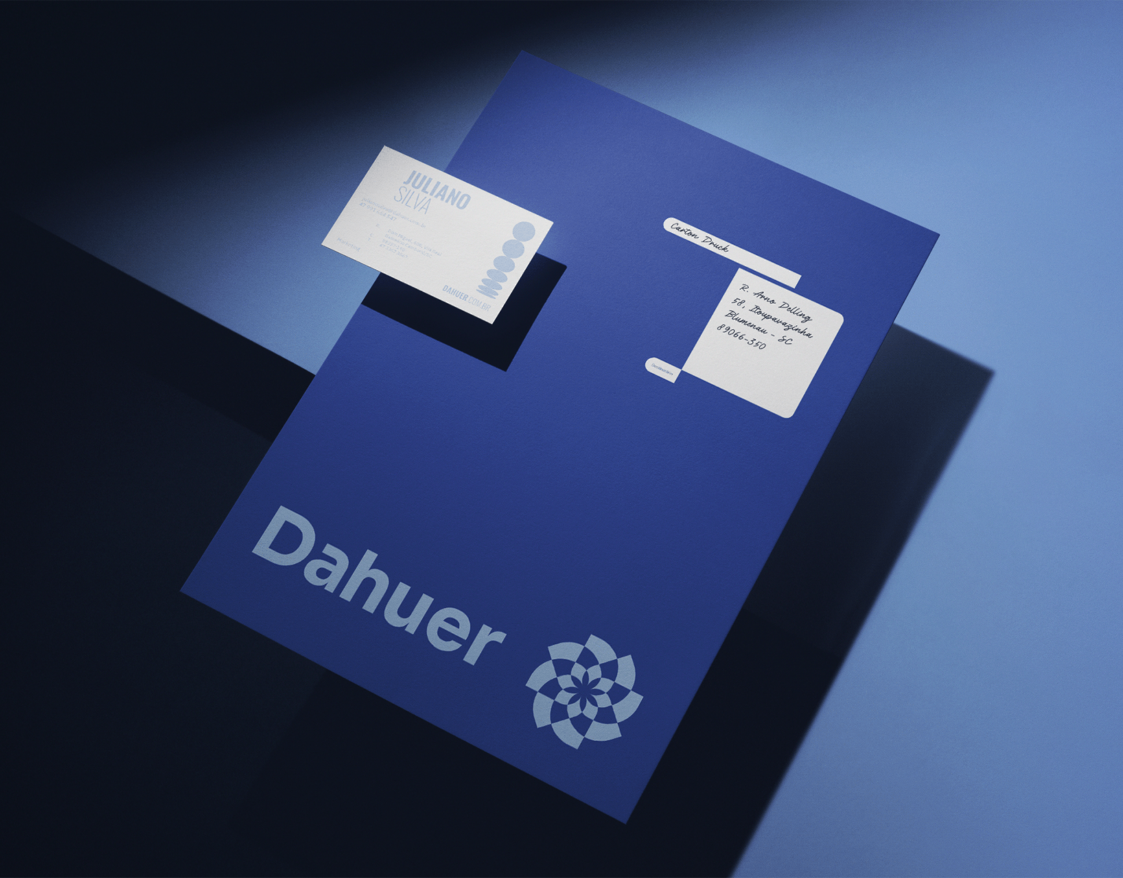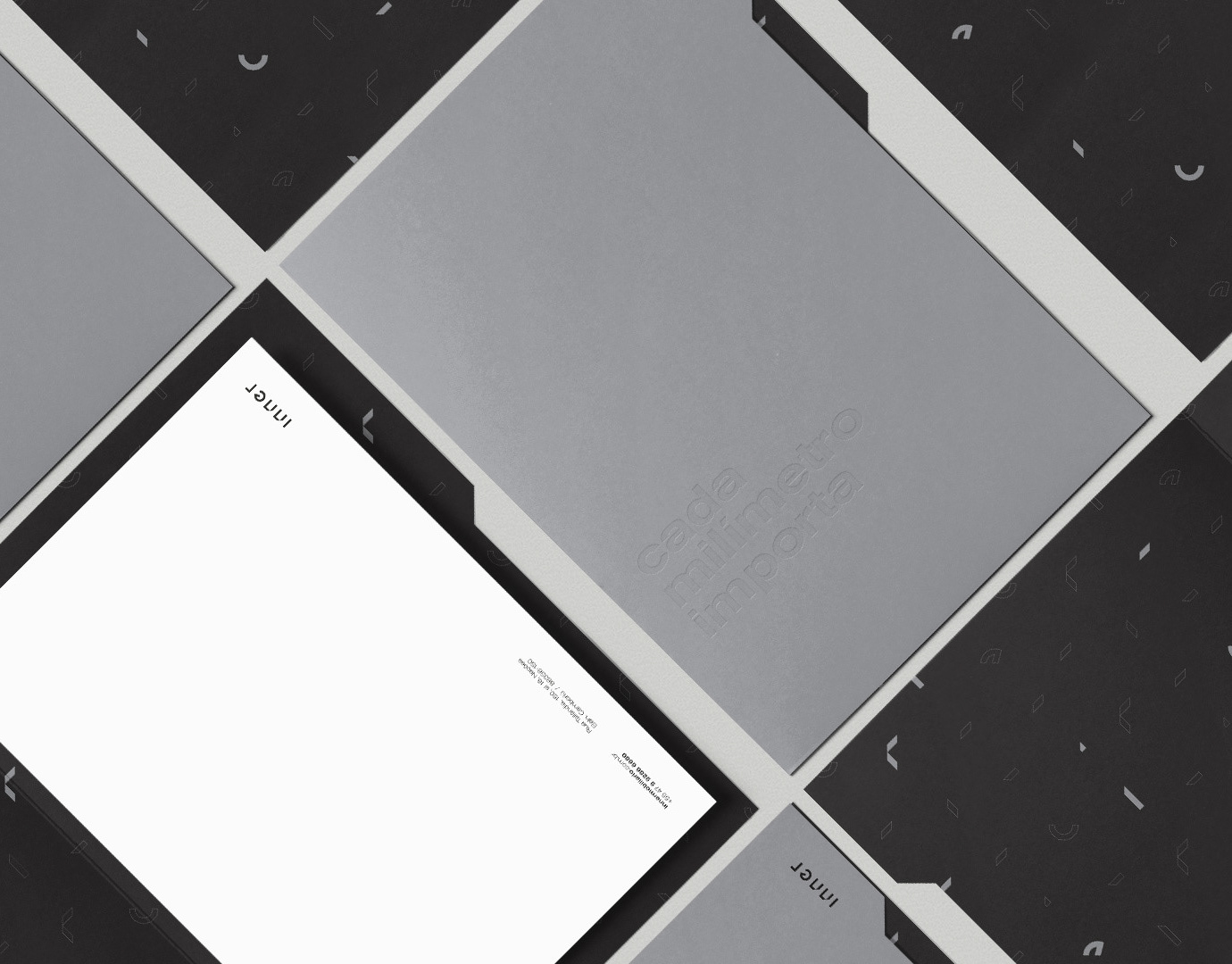
WILLRICH TINTURARIA
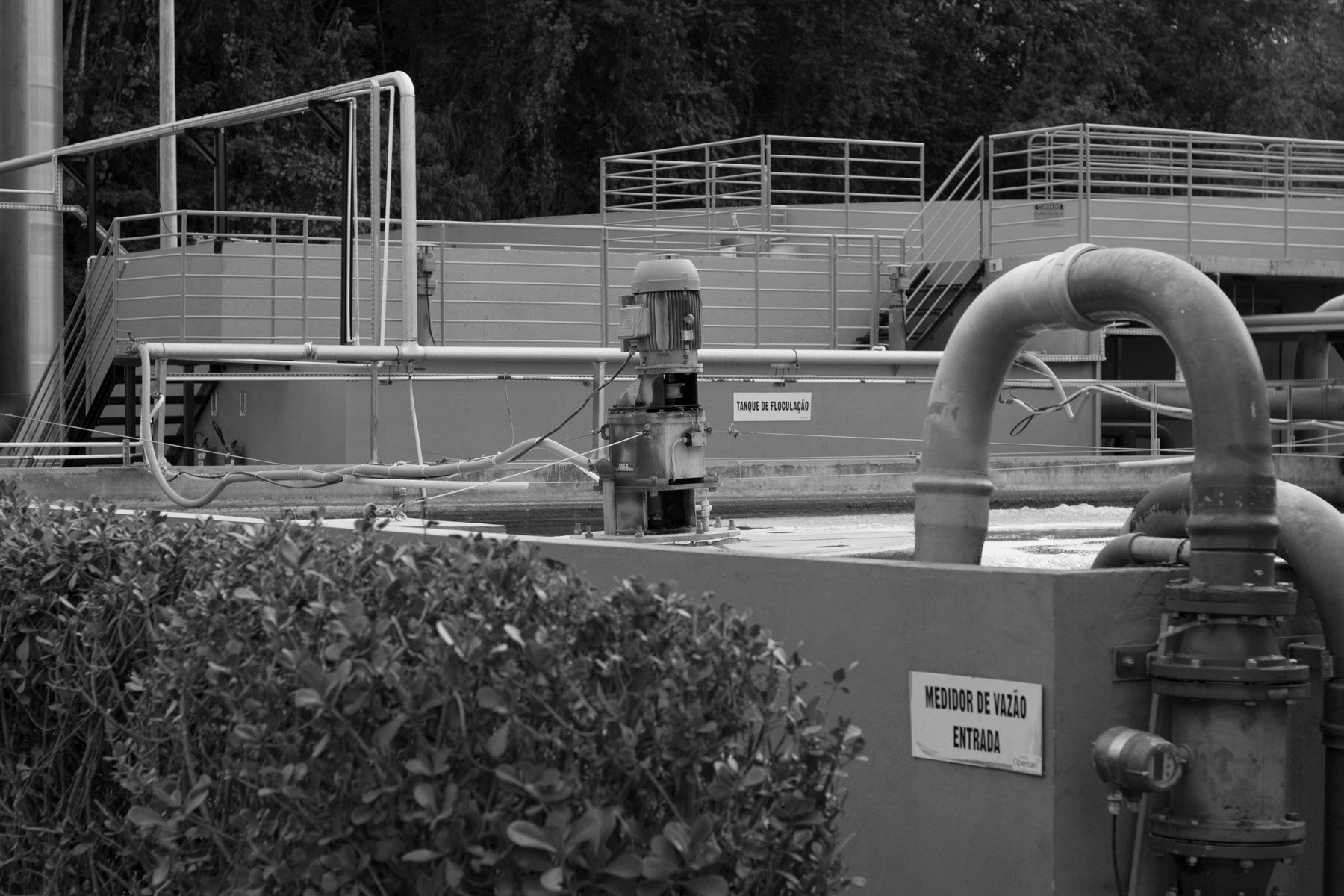
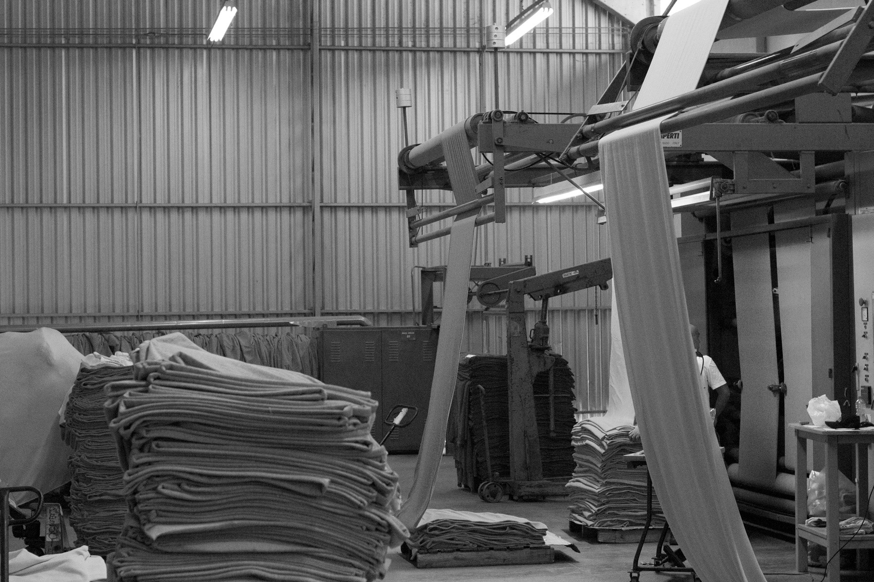
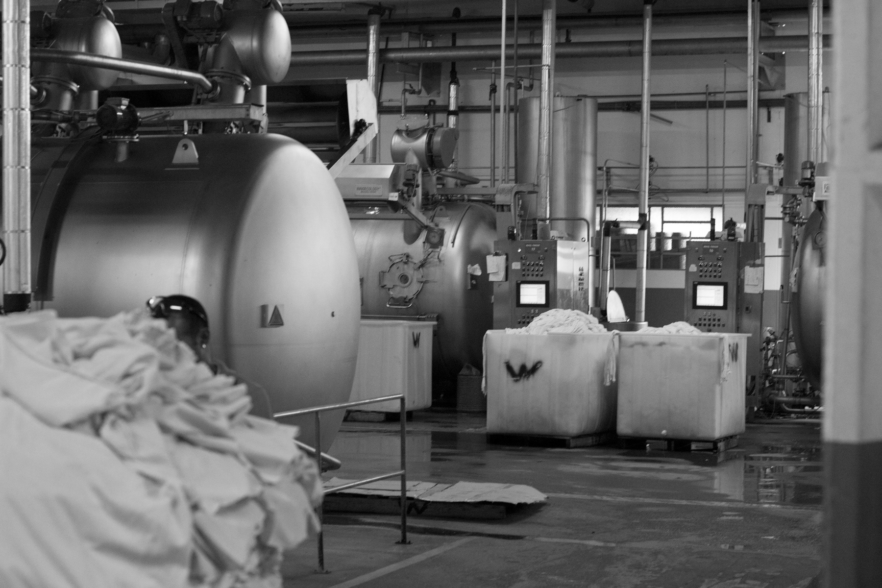
The Willrich Tinturaria is one of the oldest and largest textile dyeing operating in Brazil. It is a family business having core values within the company’s DNA - hard work, honesty and commitment. These words are constantly spoken in the company’s routine, and they were the starting point for the brand’s redesigning made by Feitoria.
Our main objective during the redesigning process was to create momentum, although preserving the intrinsic values of the old graphical representation such as shape, colors and typography. The challenge was to distinguish Willrich Tinturaria from two other “sisters” companies that used to be represented by the same brand.
Our main objective during the redesigning process was to create momentum, although preserving the intrinsic values of the old graphical representation such as shape, colors and typography. The challenge was to distinguish Willrich Tinturaria from two other “sisters” companies that used to be represented by the same brand.

Accordingly, key points for the brand’s development and visual identity were discussed and determined along with the directors
of the company.
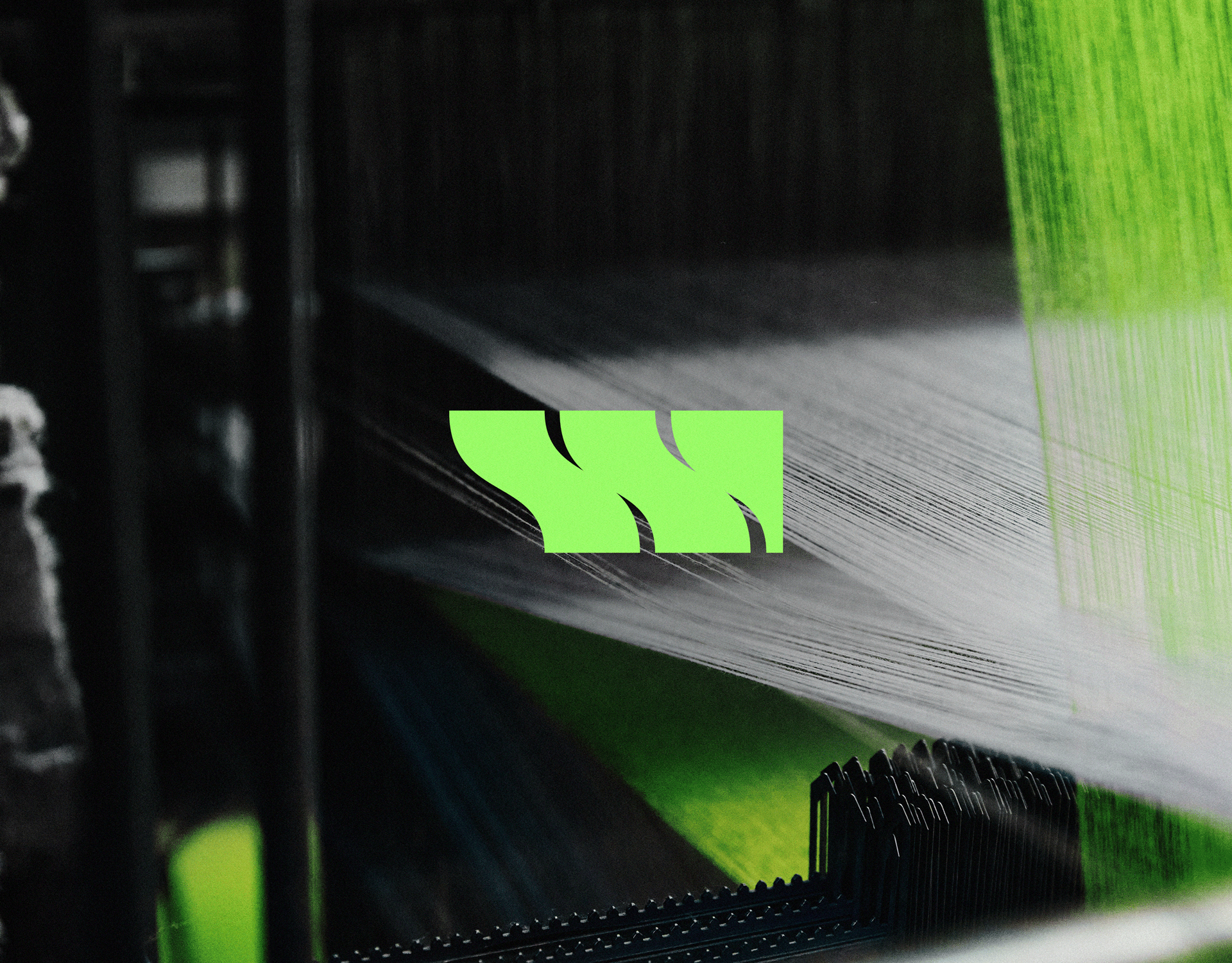
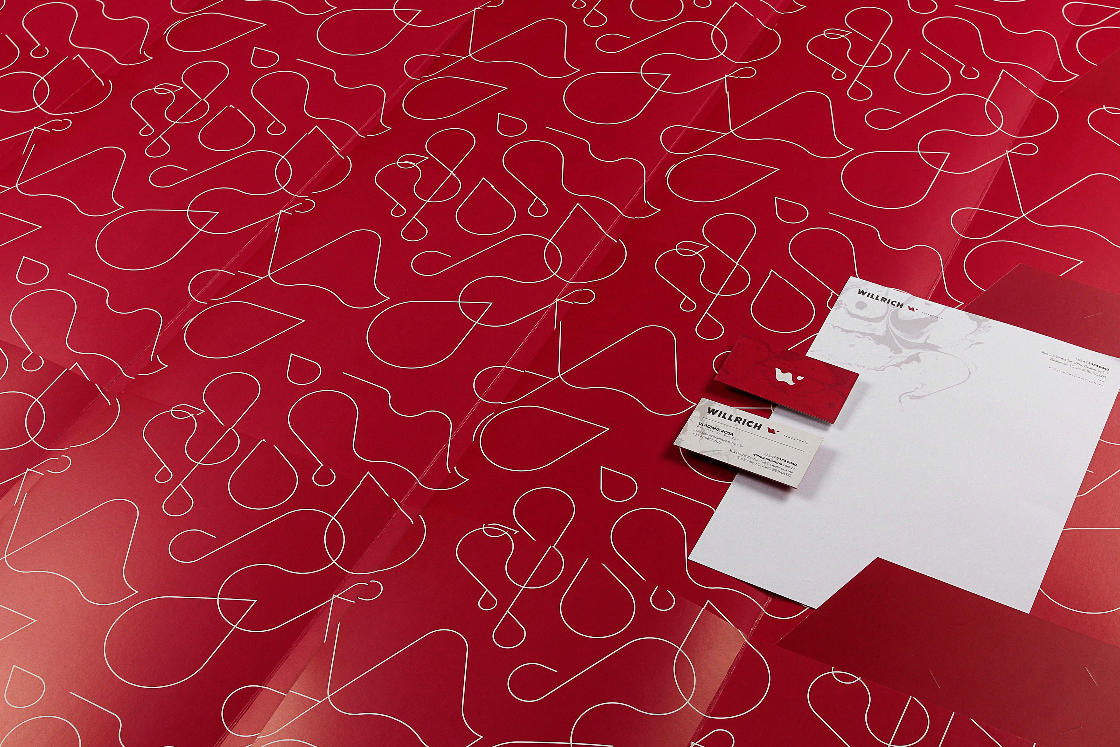
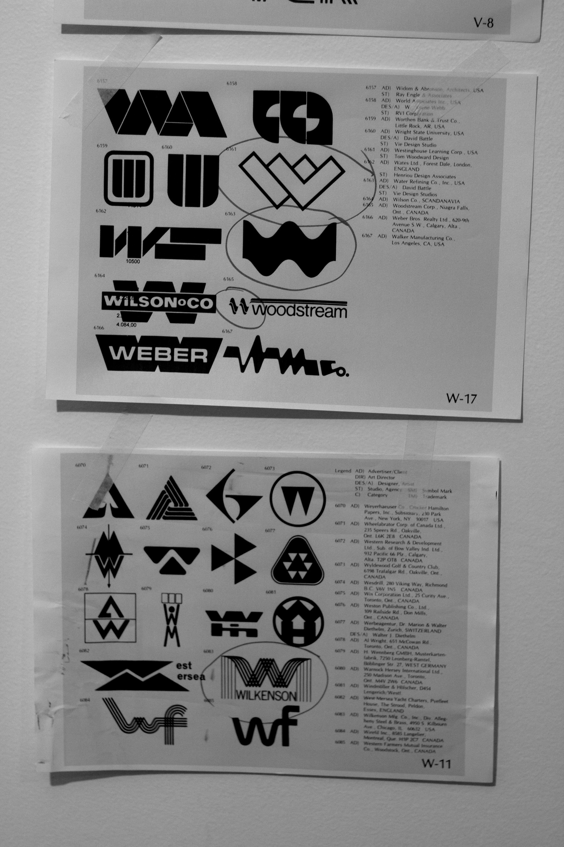
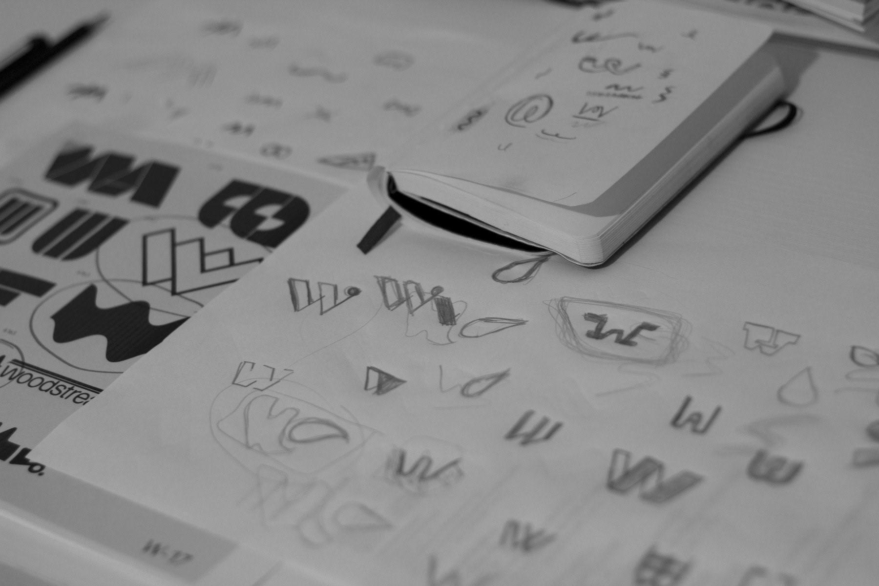
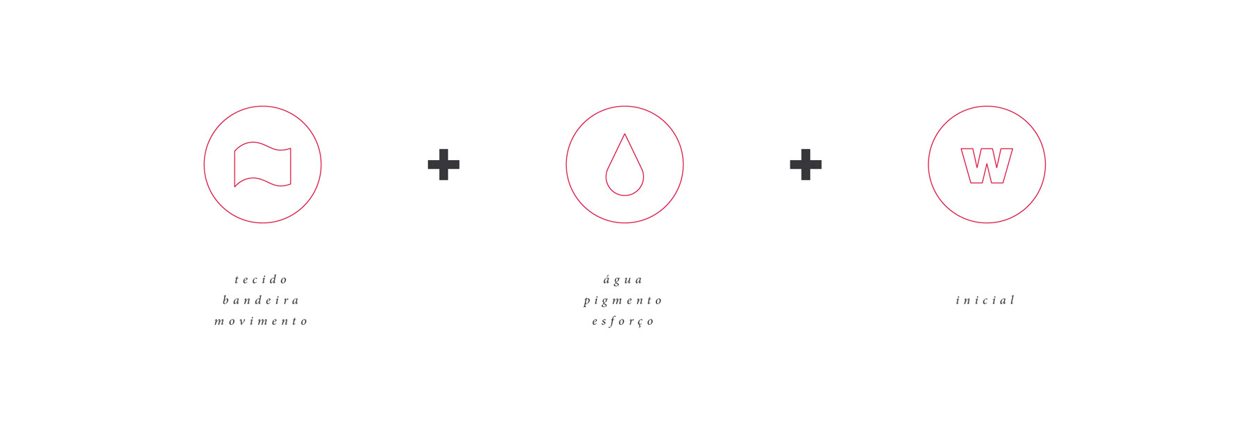
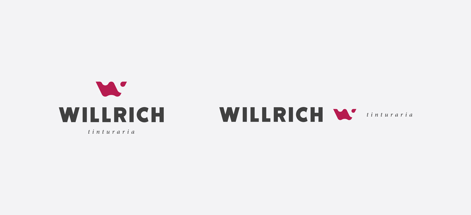
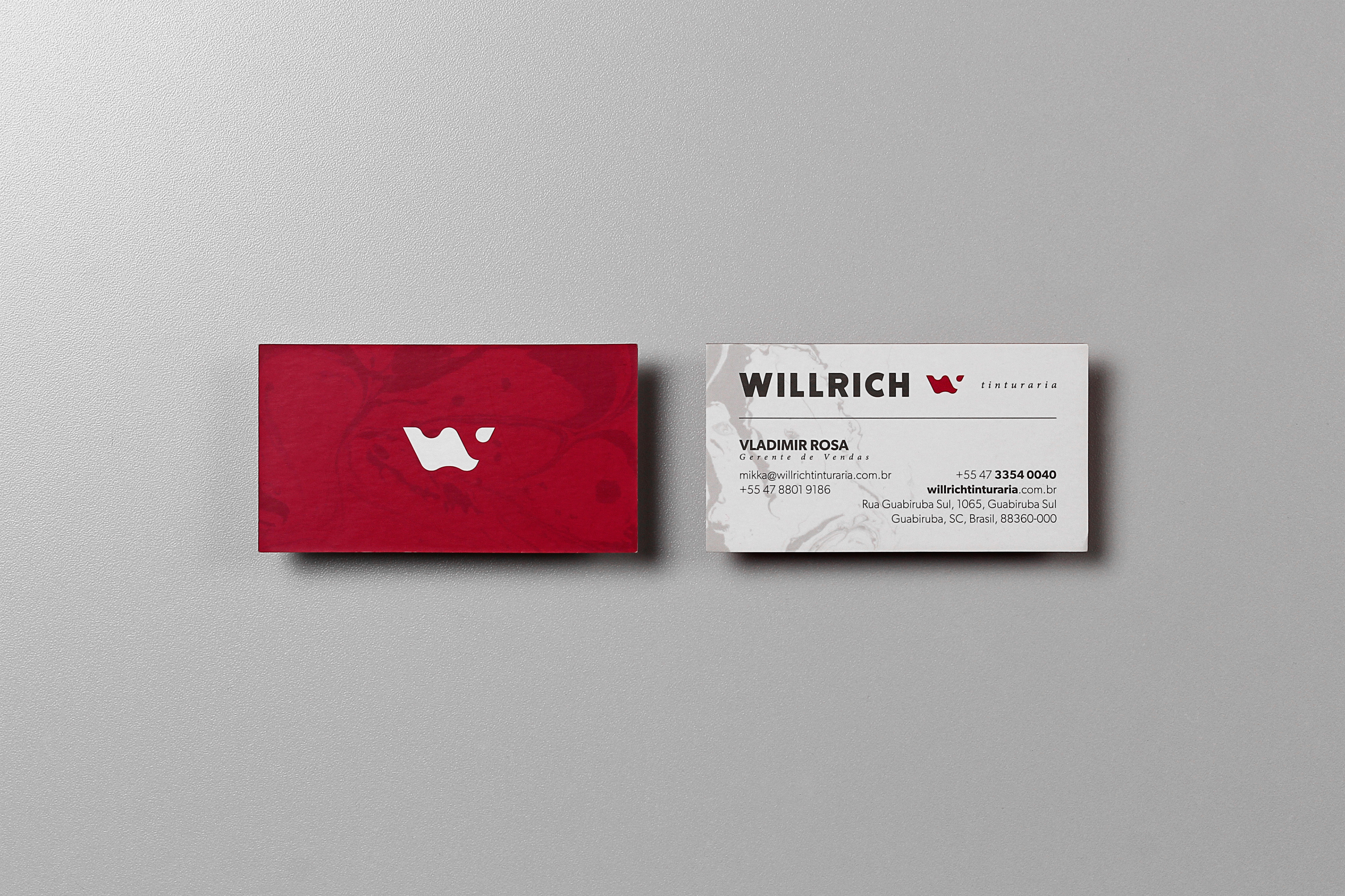
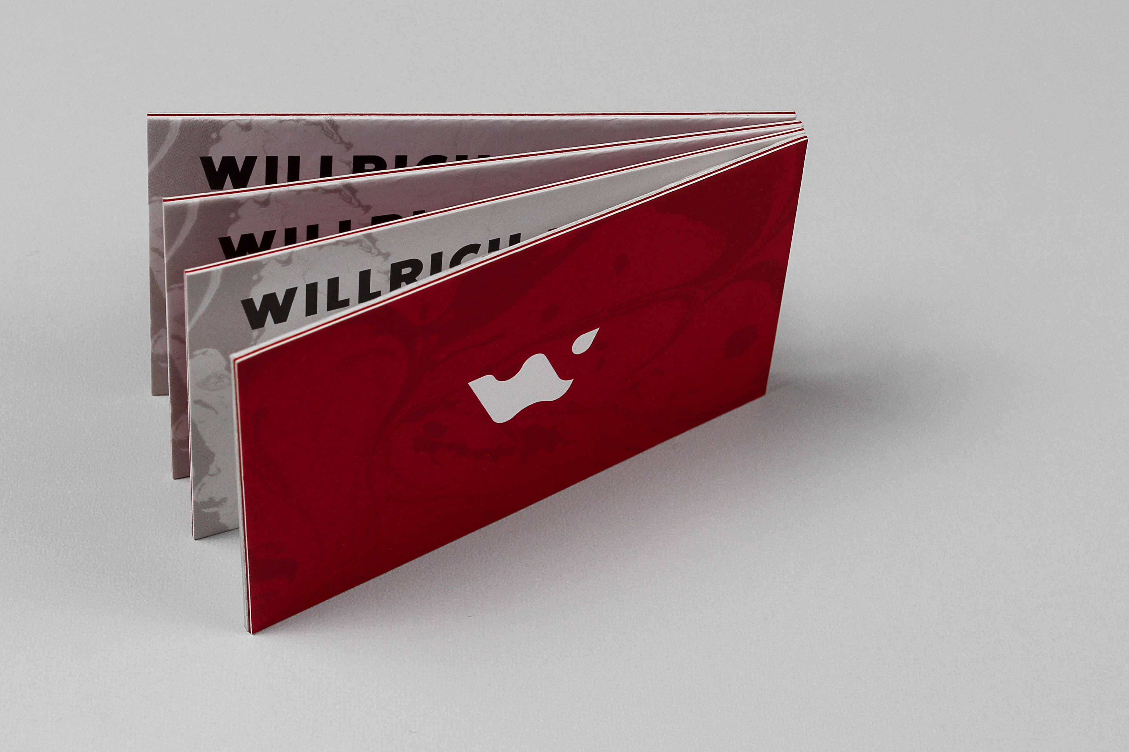
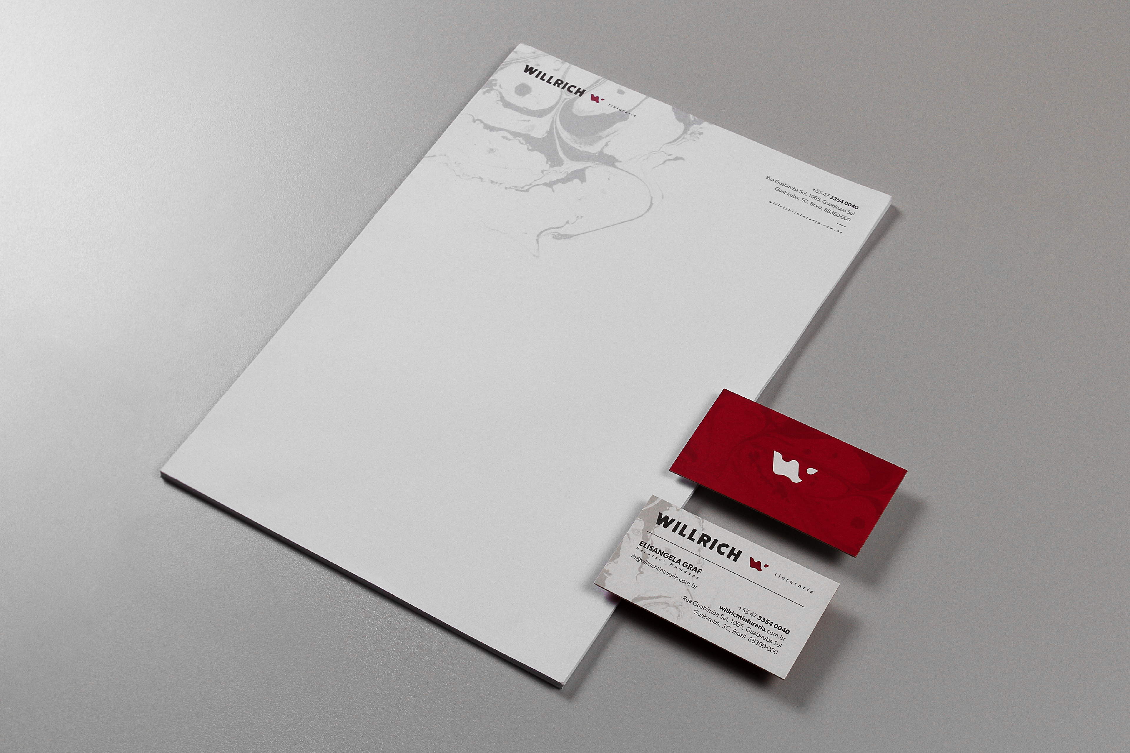
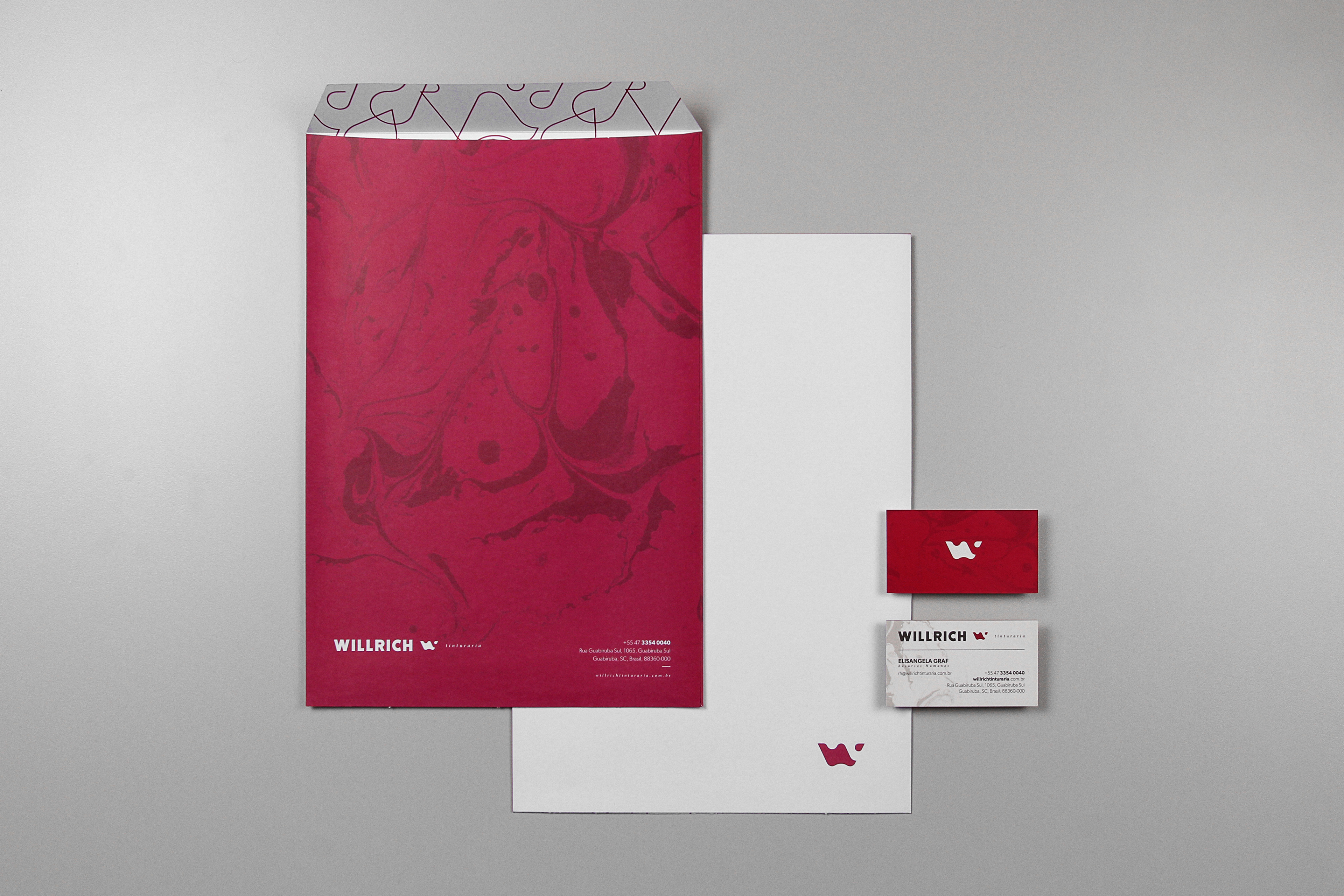
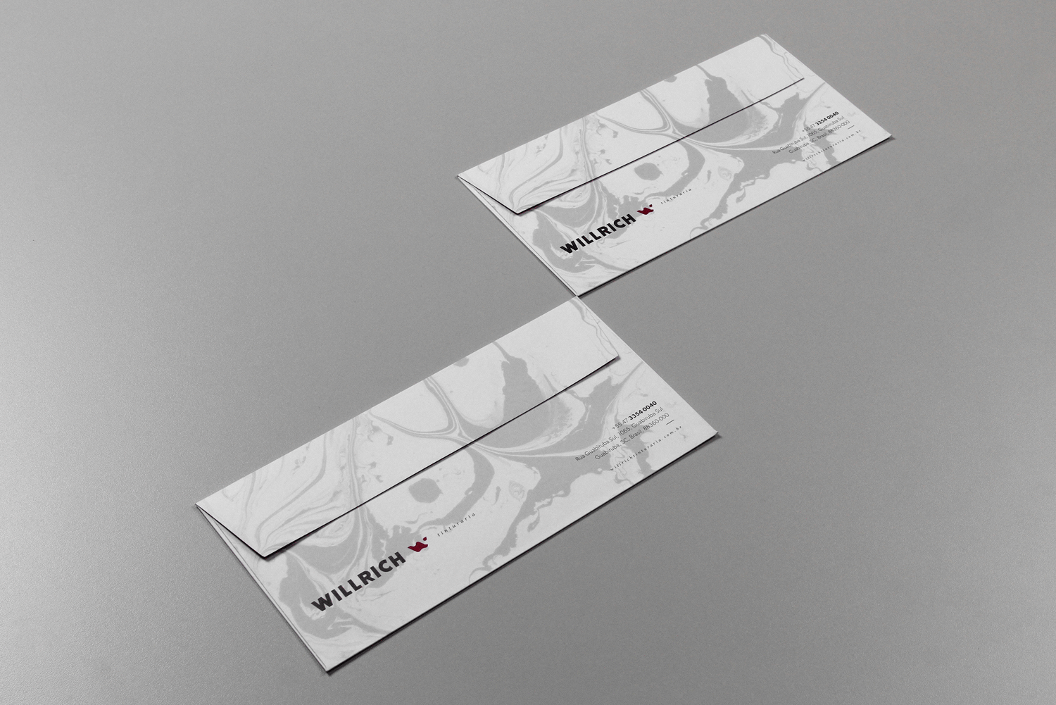
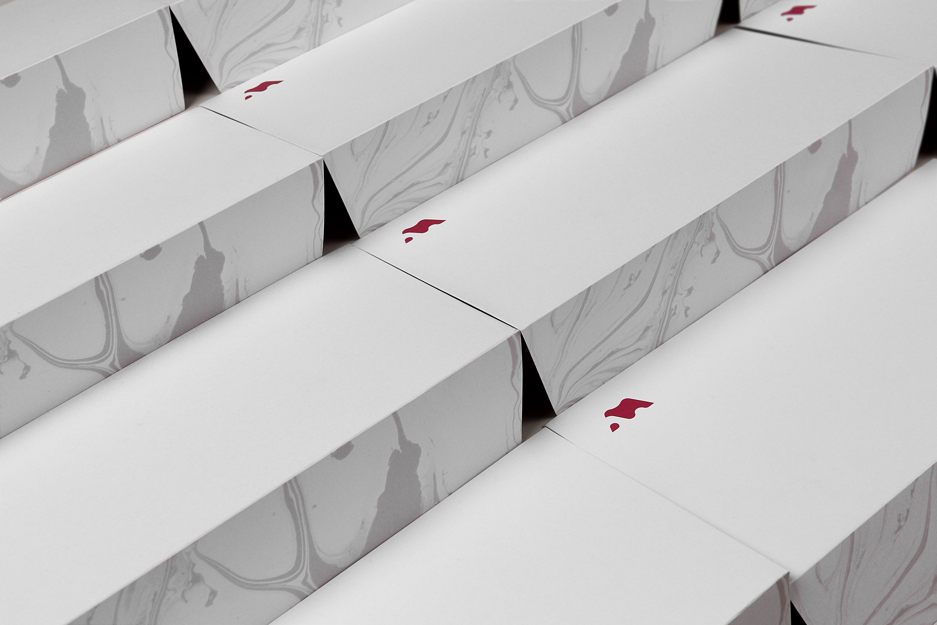
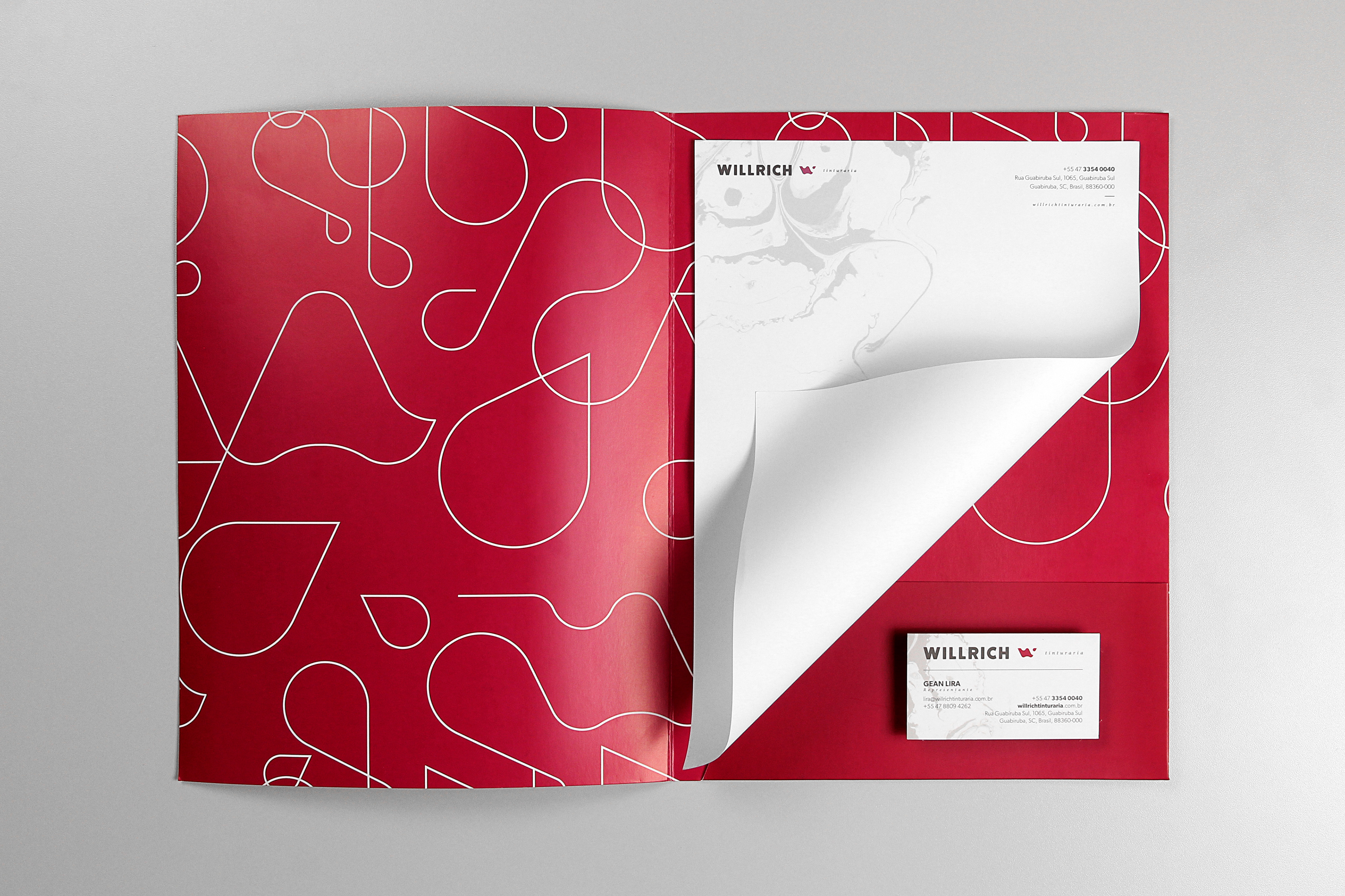
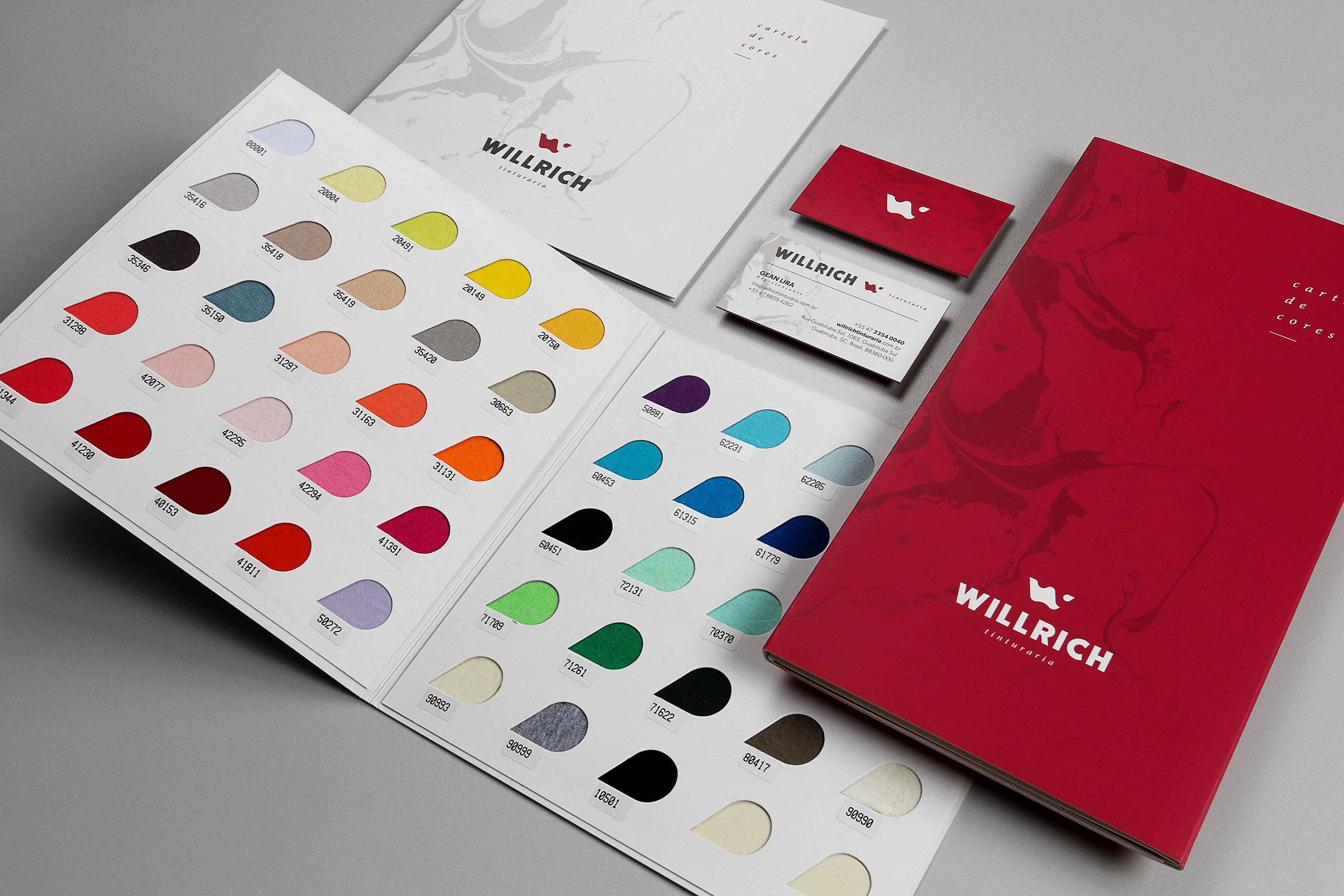
The resulting icon highlights the fundamental raw materials for the company. We subconsciously created the letter W - from Willrich - by merging two graphic elements representing the tissue and the drop of ink.
of the company.
The resulting icon highlights the fundamental raw materials for the company. We subconsciously created the letter W - from Willrich - by merging two graphic elements representing the tissue and the drop of ink.
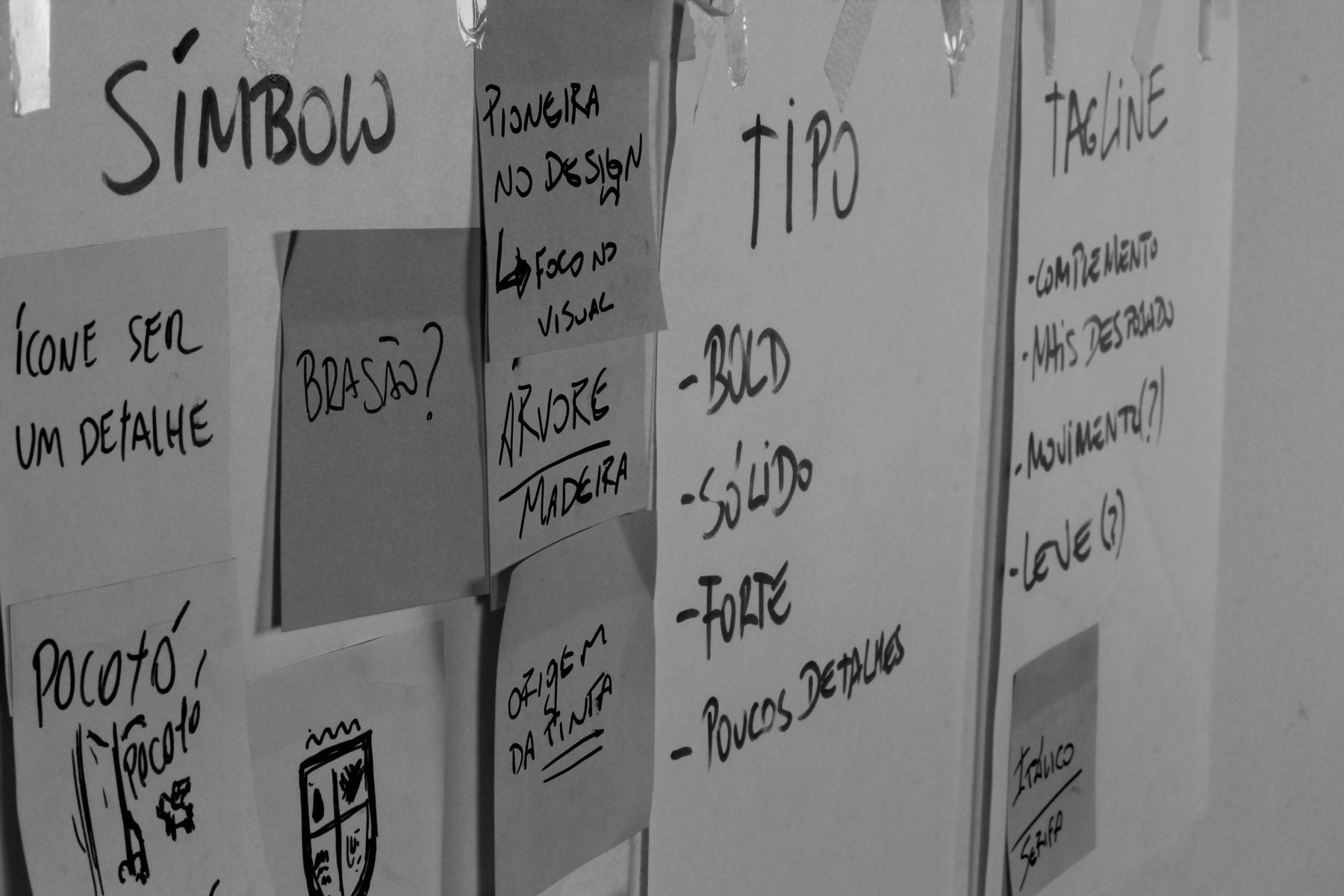
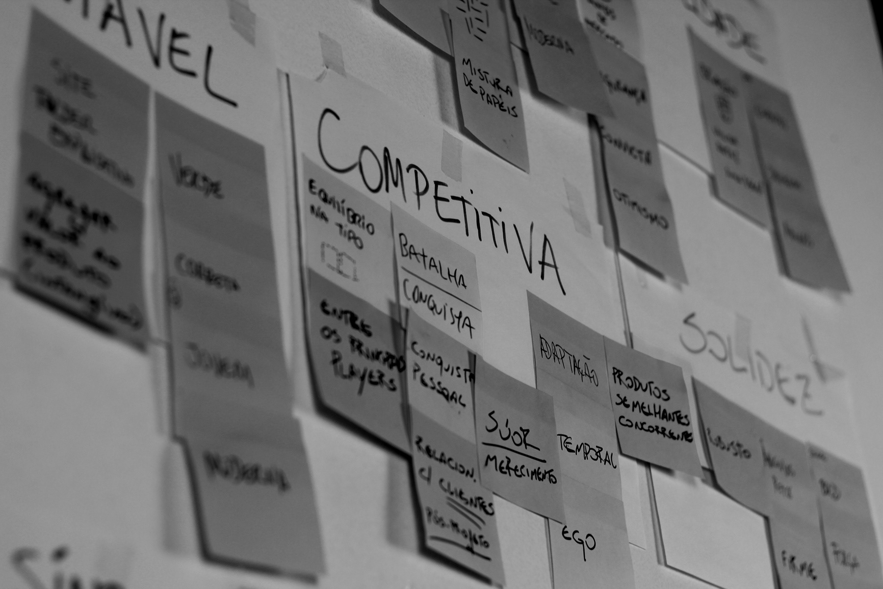
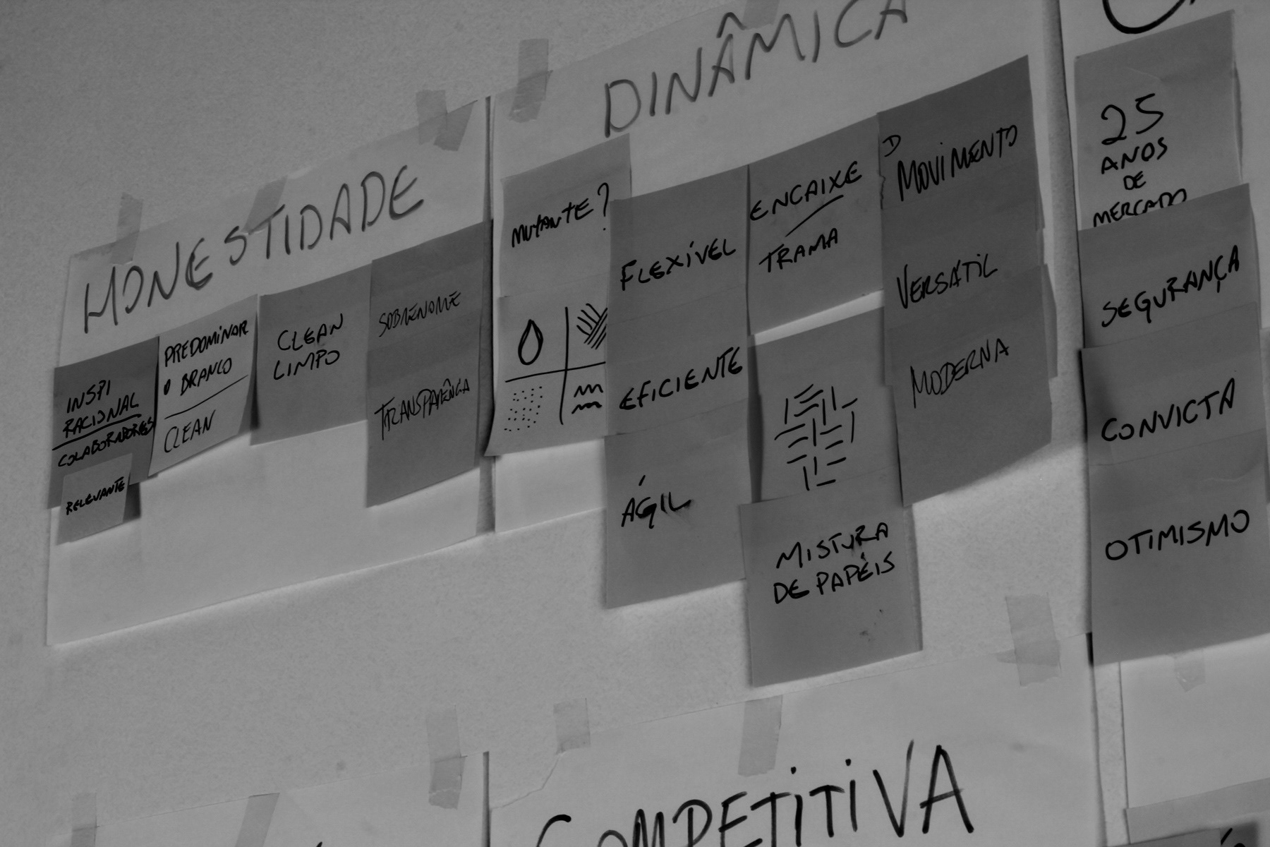


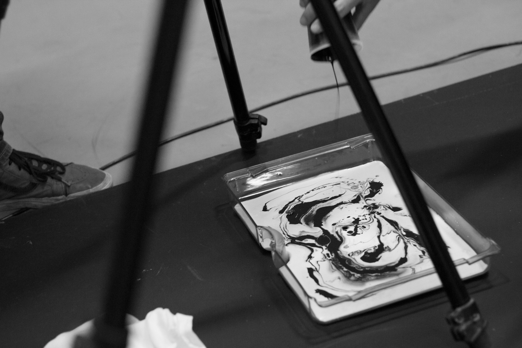
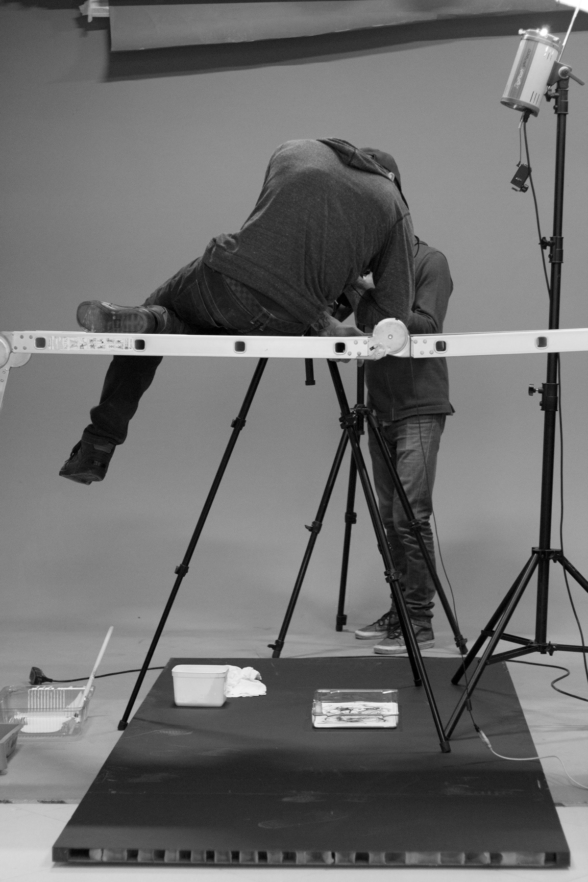
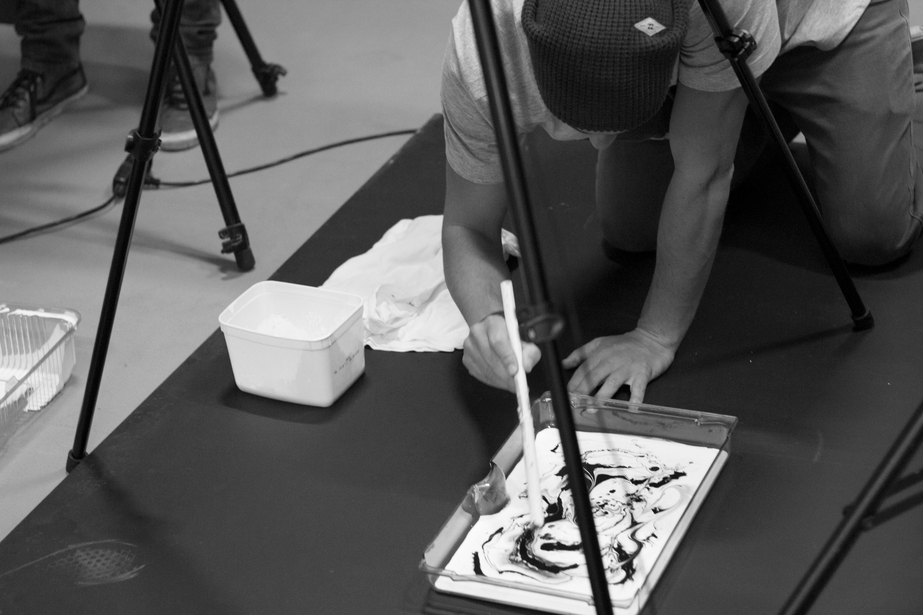
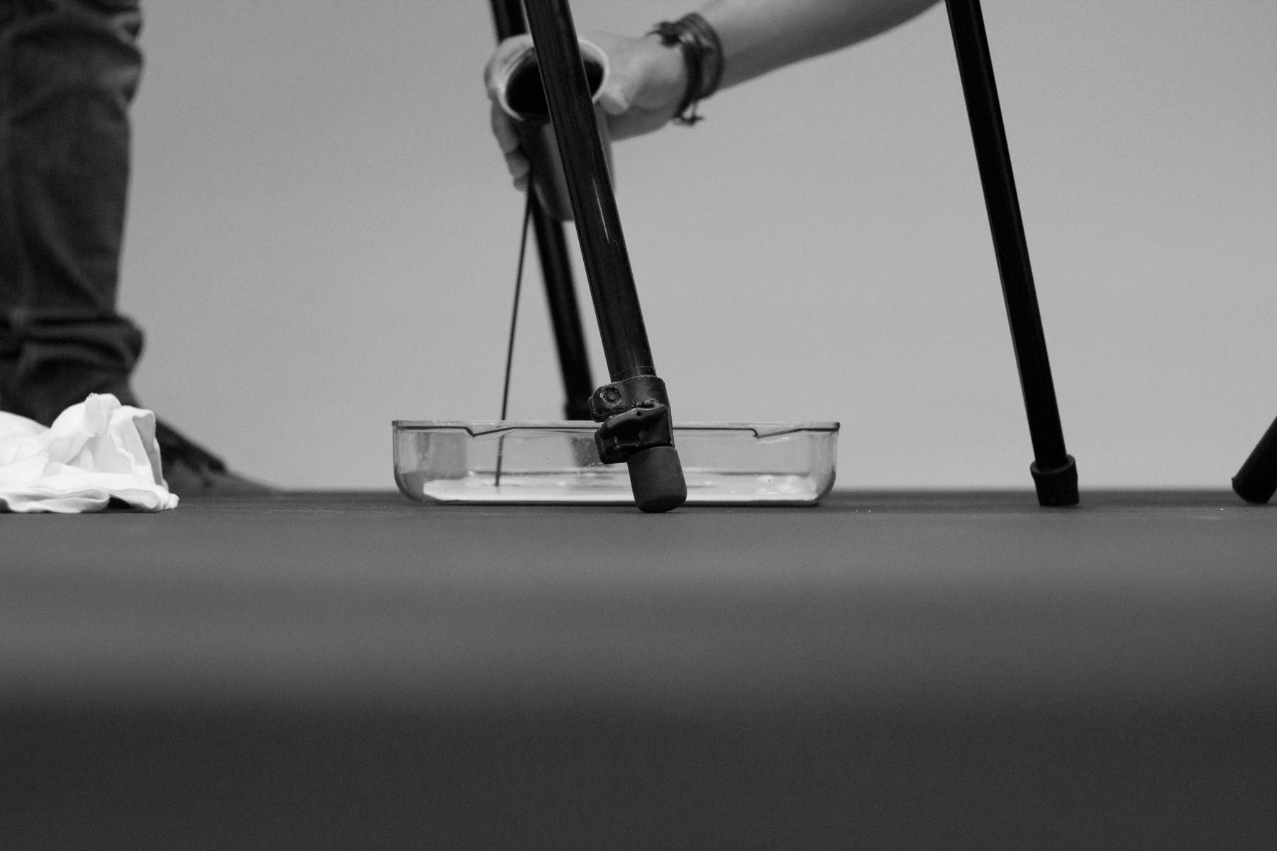
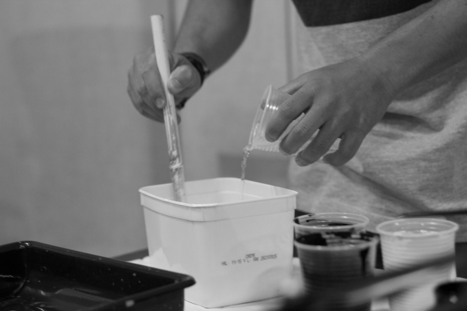
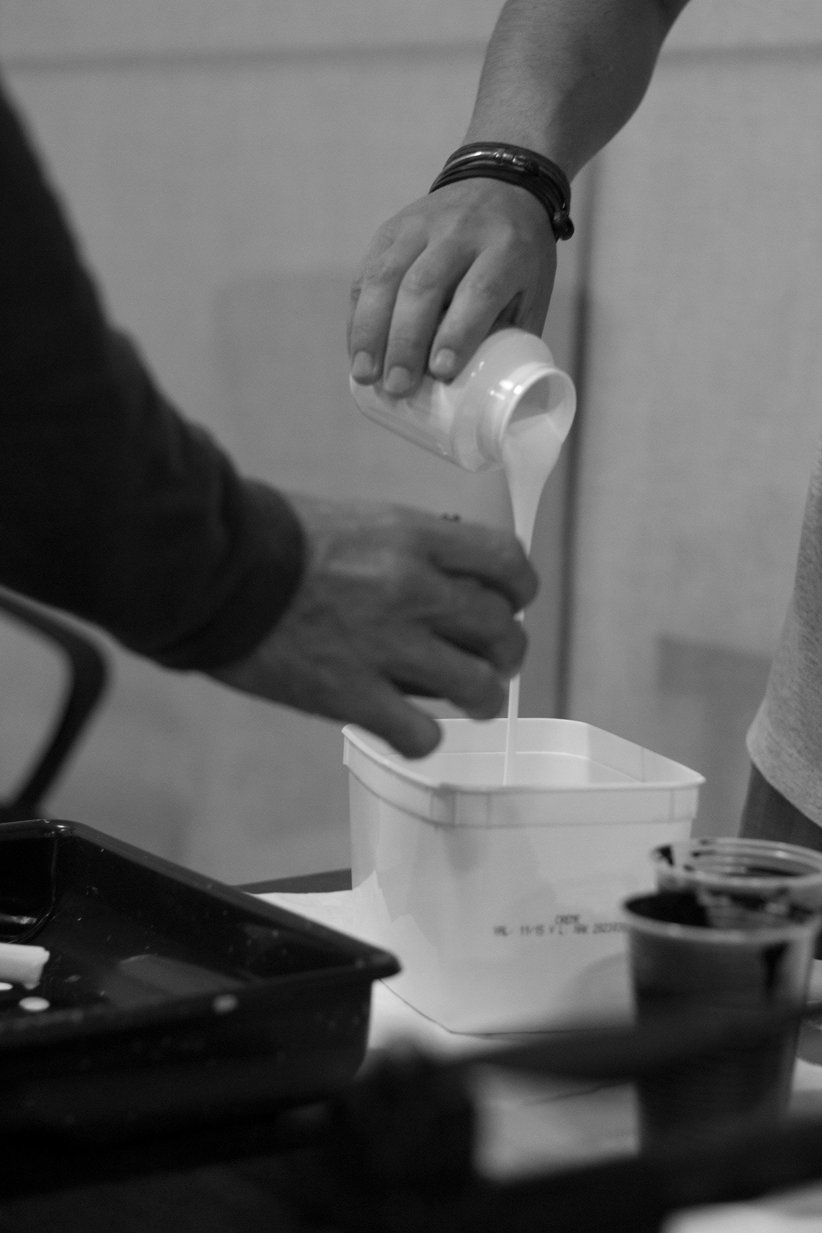
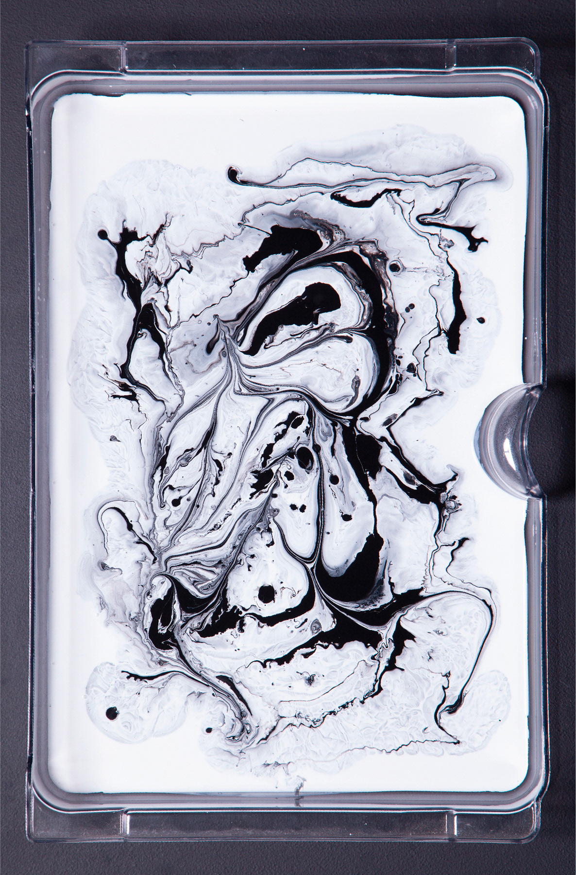
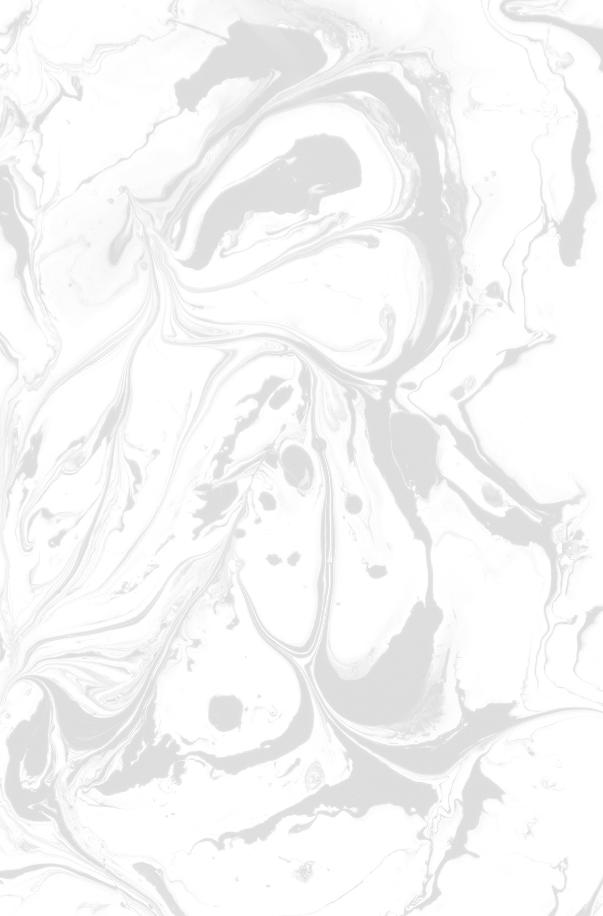
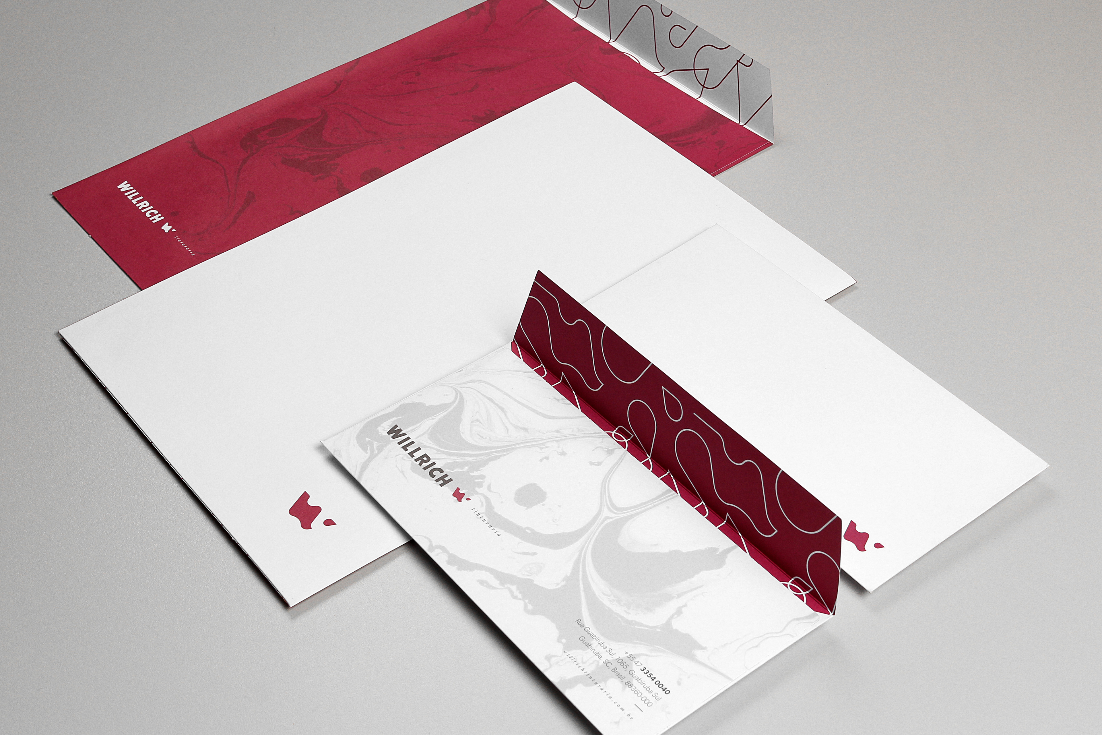
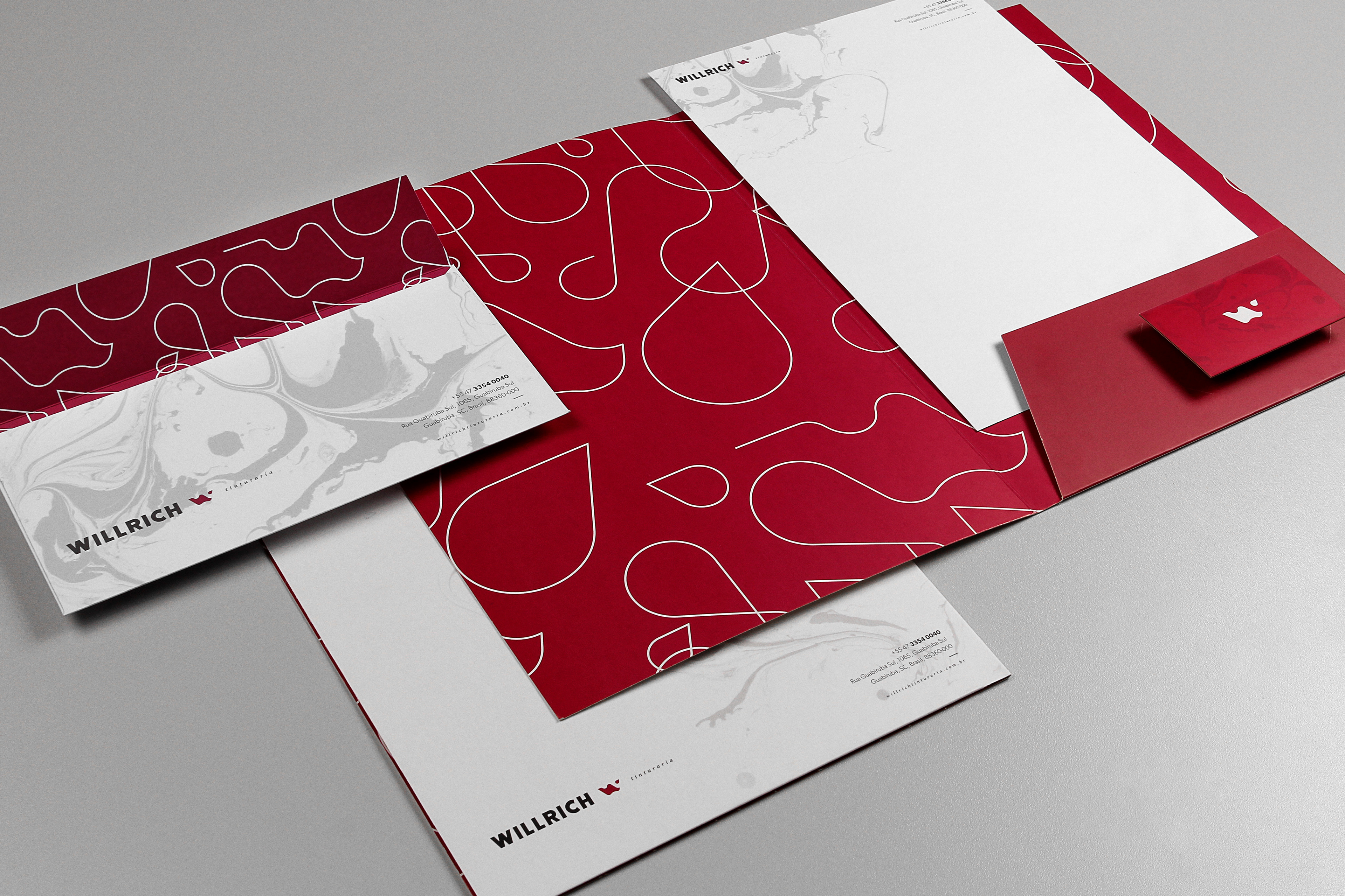
The complementary elements create an even stronger link between the brand and the essence of the services offered by Willrich Tinturaria. In fact, we were able to symbolically experience a process related to our costumer when we developed one of the textures by mixing paints. Such technique produced a unique element to the brand, with desired personality.

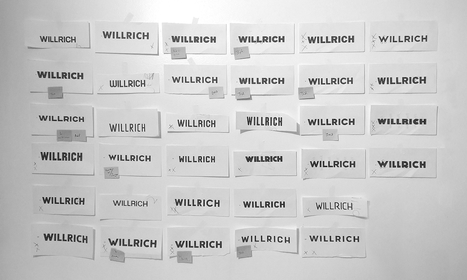
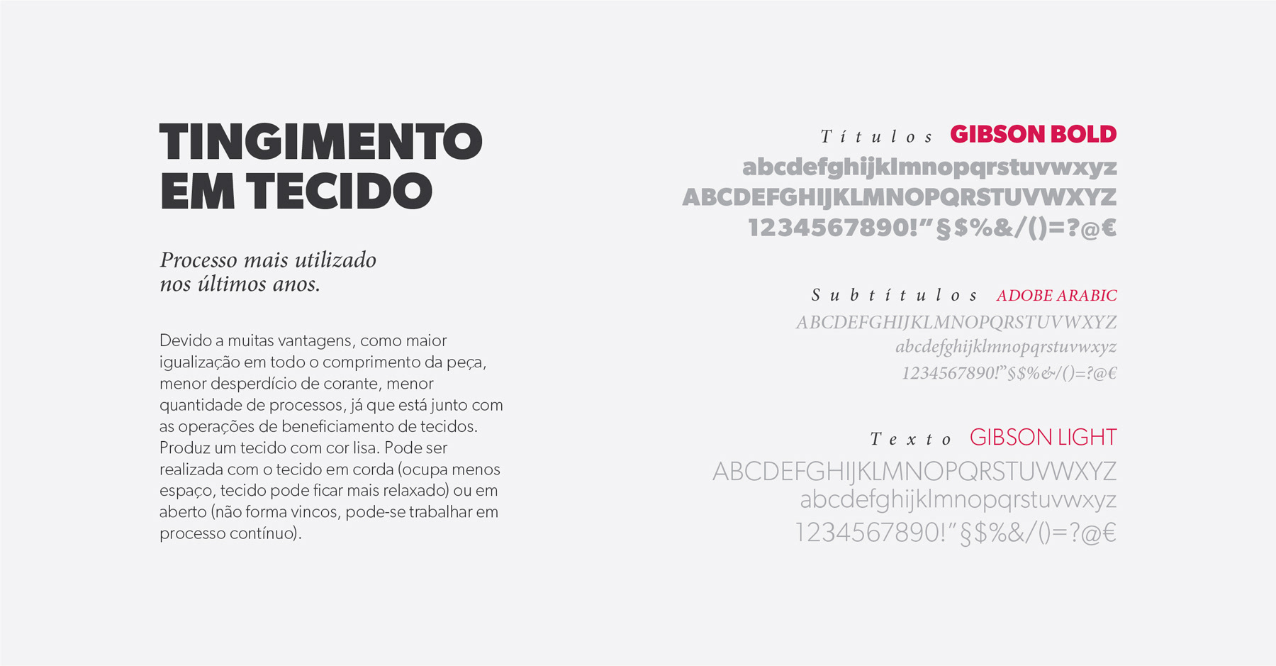
The typography is essential in visual identity system: it brings personality, legibility and invigorate the brand because the style. Therefore, choosing typography family should be align to strategic questions and brand position. Typography family defined for a system of visual identity can’t, no matter what, be changed, because it deprive the characteristics of the brand.
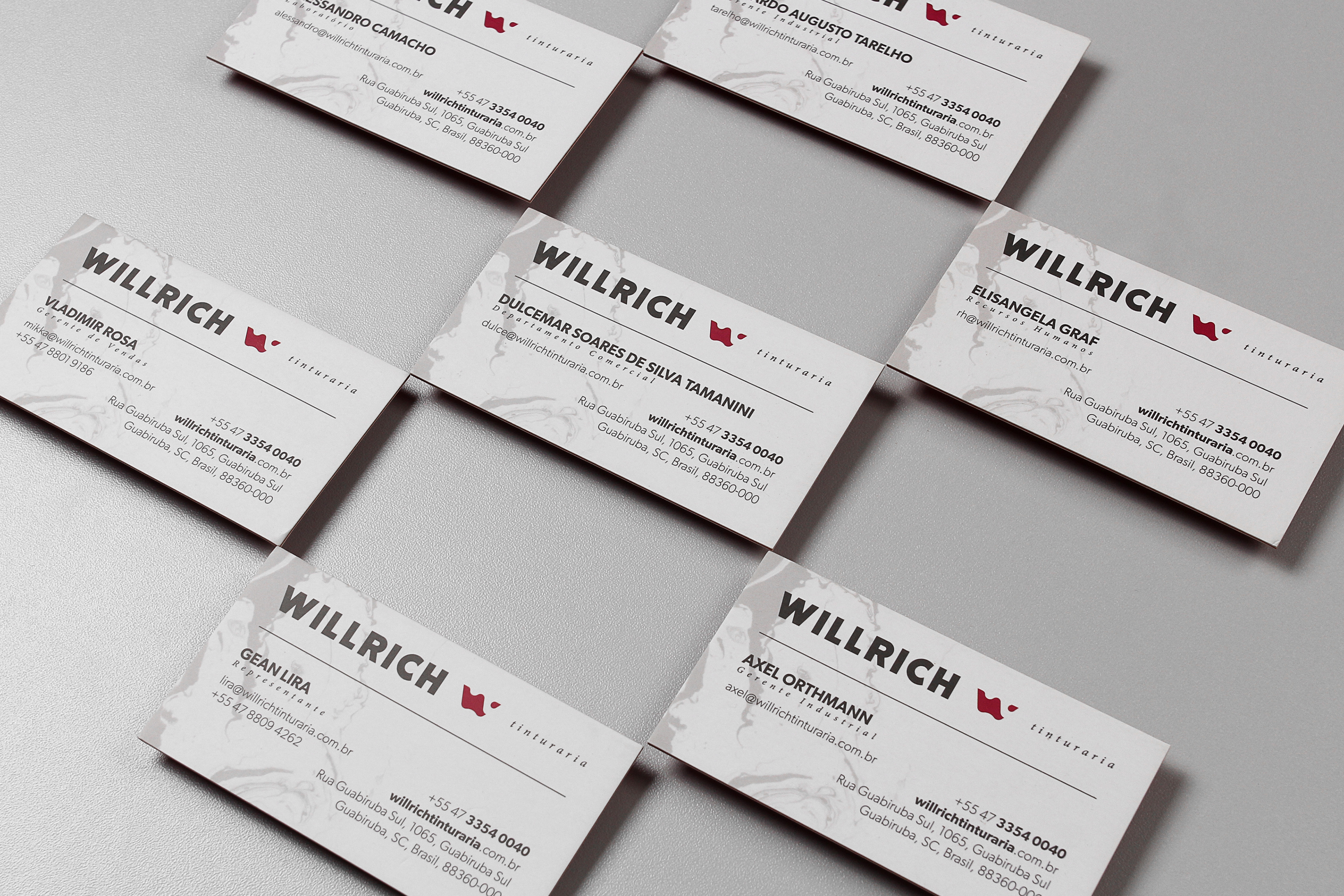
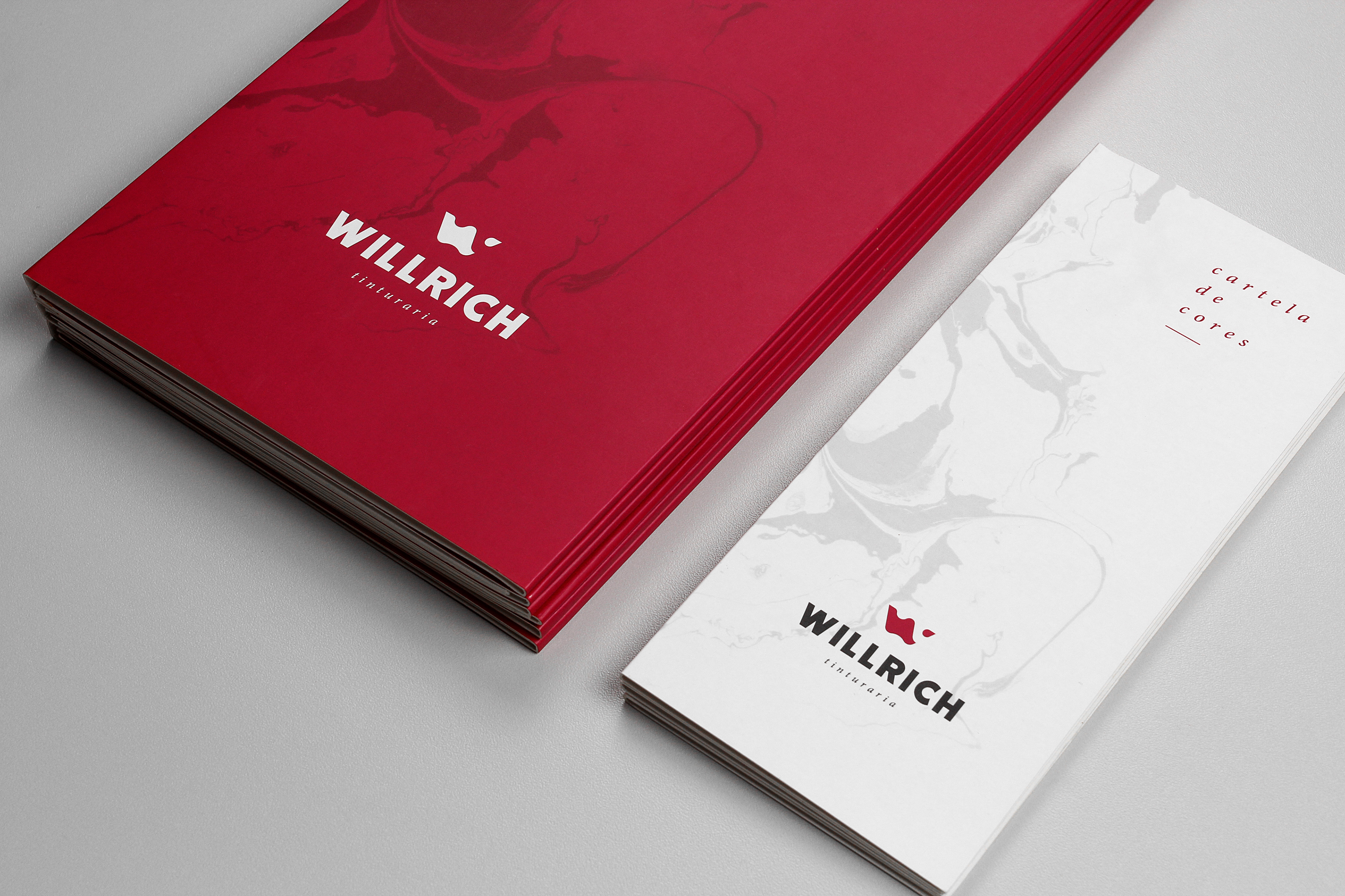
Nowadays every material used by Willrich Tinturaria further reflects
the greatness of a brand that carries a legacy of 30 years.
the greatness of a brand that carries a legacy of 30 years.


If you like this, check our instagram for more.
COMMITTAL
_Redesign
_Symbol
_Visual identity
CREDITS
Customer service: Alex Reuter
Graphic designers: Alex Reuter, Guilherme Rosa e Juliano Jover.
Print: MarauGraf.
Photo (texture): Guilherme Stadzisz.
Video: Michelangelo Bernardoni.
Copy: Vitória Vargas.
Translator: Milton Andrade Jr.
_Redesign
_Symbol
_Visual identity
CREDITS
Customer service: Alex Reuter
Graphic designers: Alex Reuter, Guilherme Rosa e Juliano Jover.
Print: MarauGraf.
Photo (texture): Guilherme Stadzisz.
Video: Michelangelo Bernardoni.
Copy: Vitória Vargas.
Translator: Milton Andrade Jr.