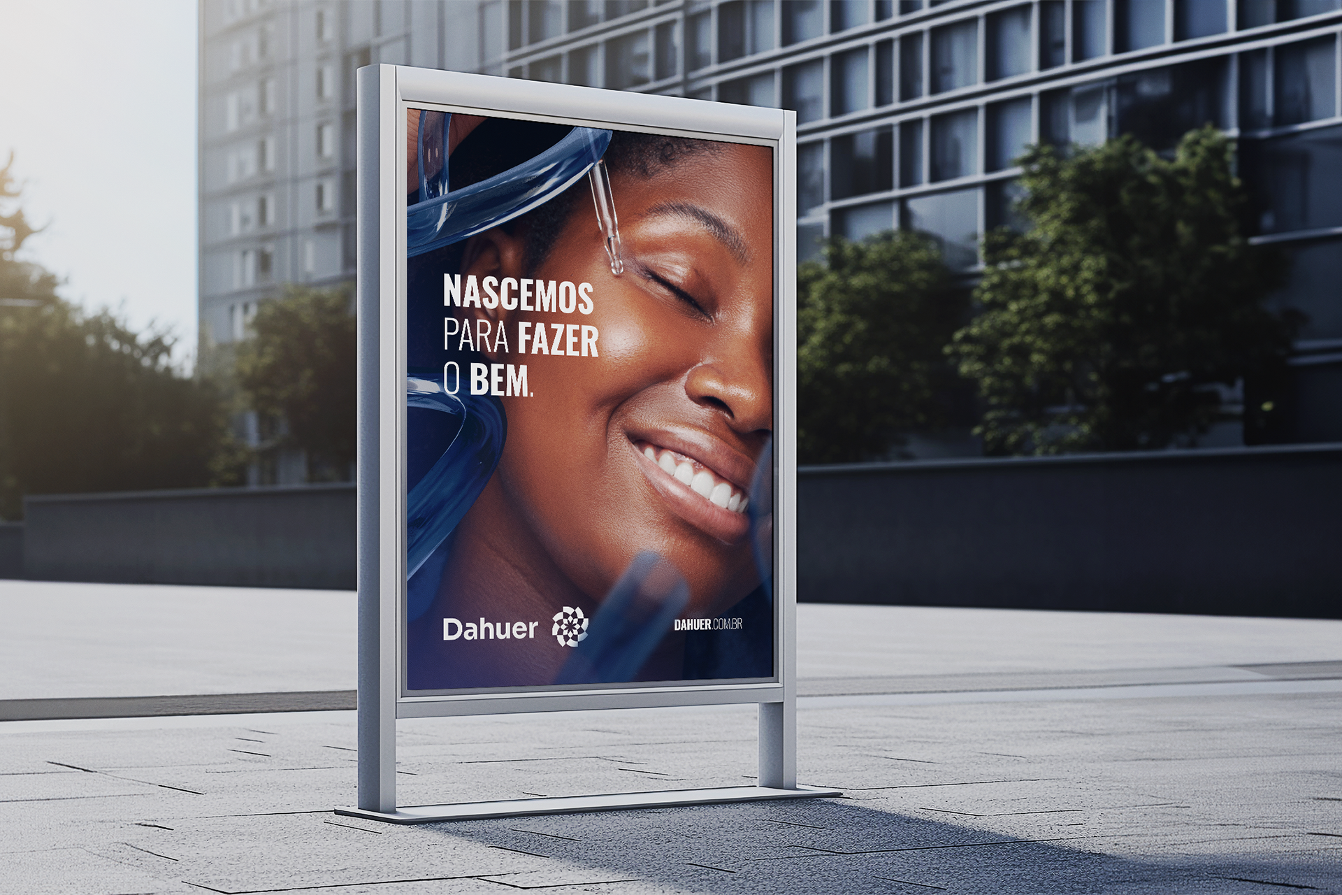
we were born to do good
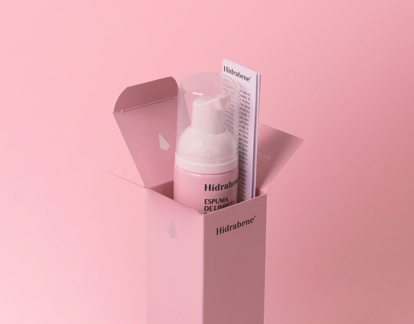
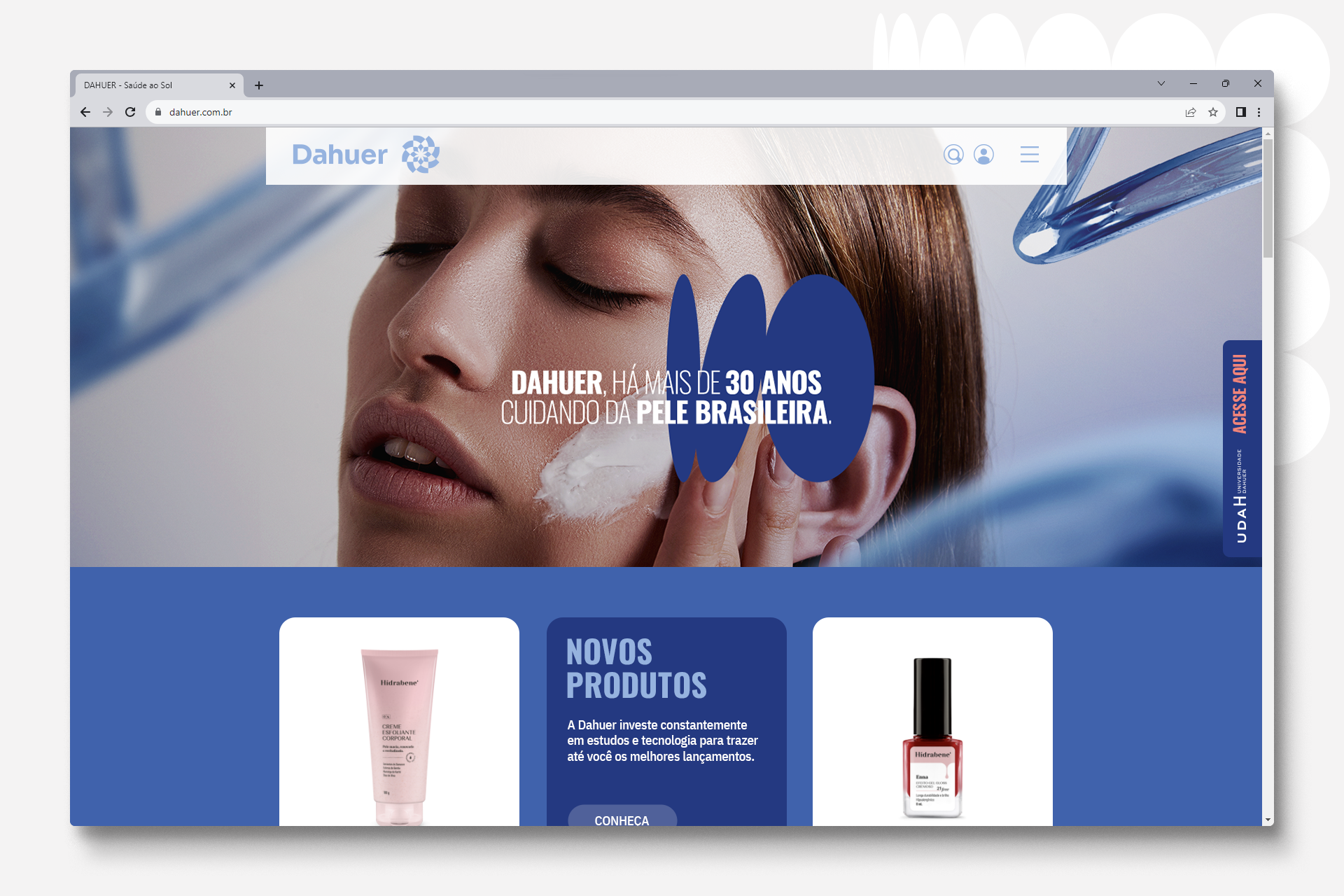
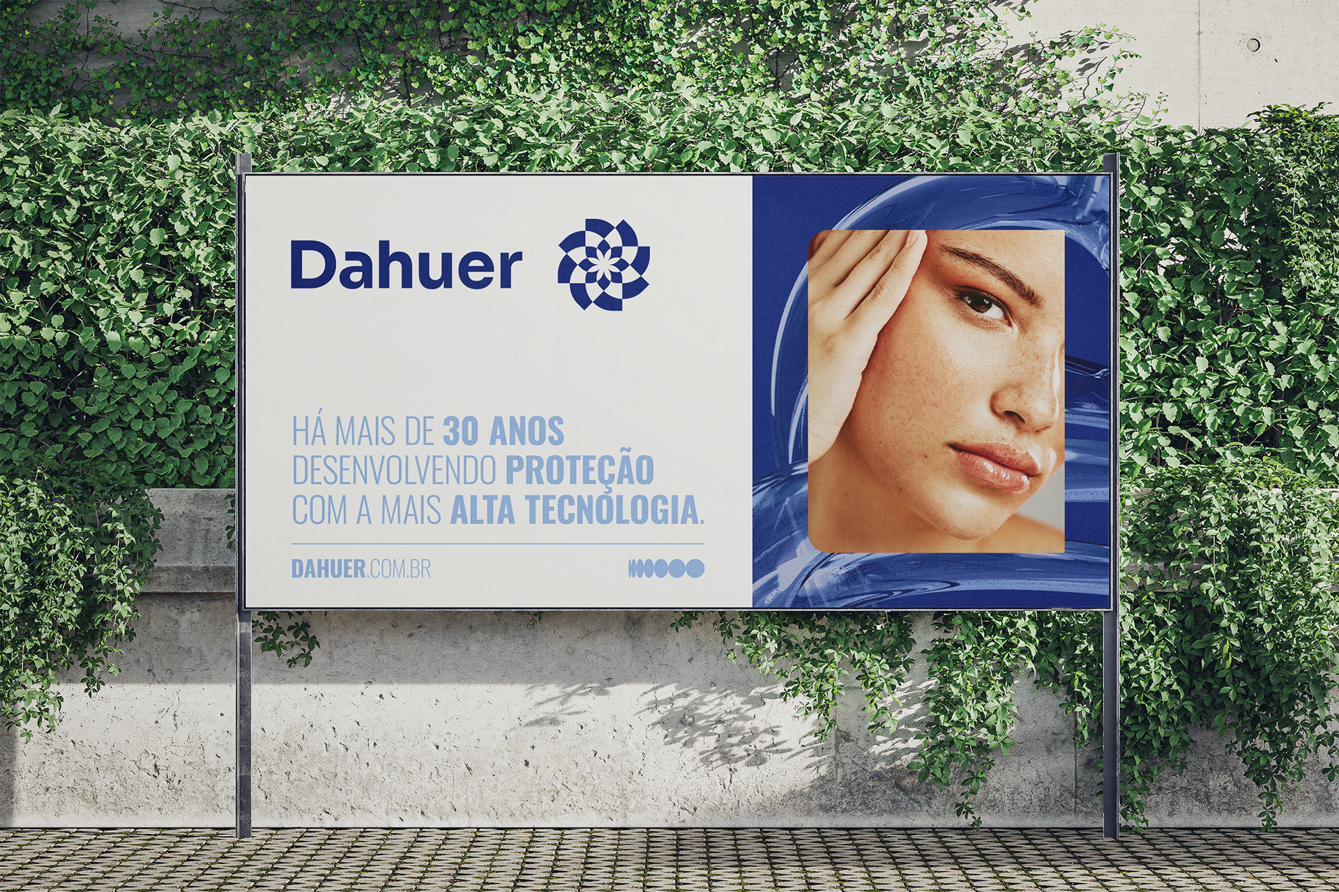
Dahuer is a company focused on caring for Brazilian skin that offers sunscreens, tanning products, after-sun products and dermocosmetics. With more than 35 years of experience, exponential growth and the construction of a new manufacturing park, the perfect time has arisen to build a new visual language aligned with the company's values and the new positioning defined by its internal time.


redesign
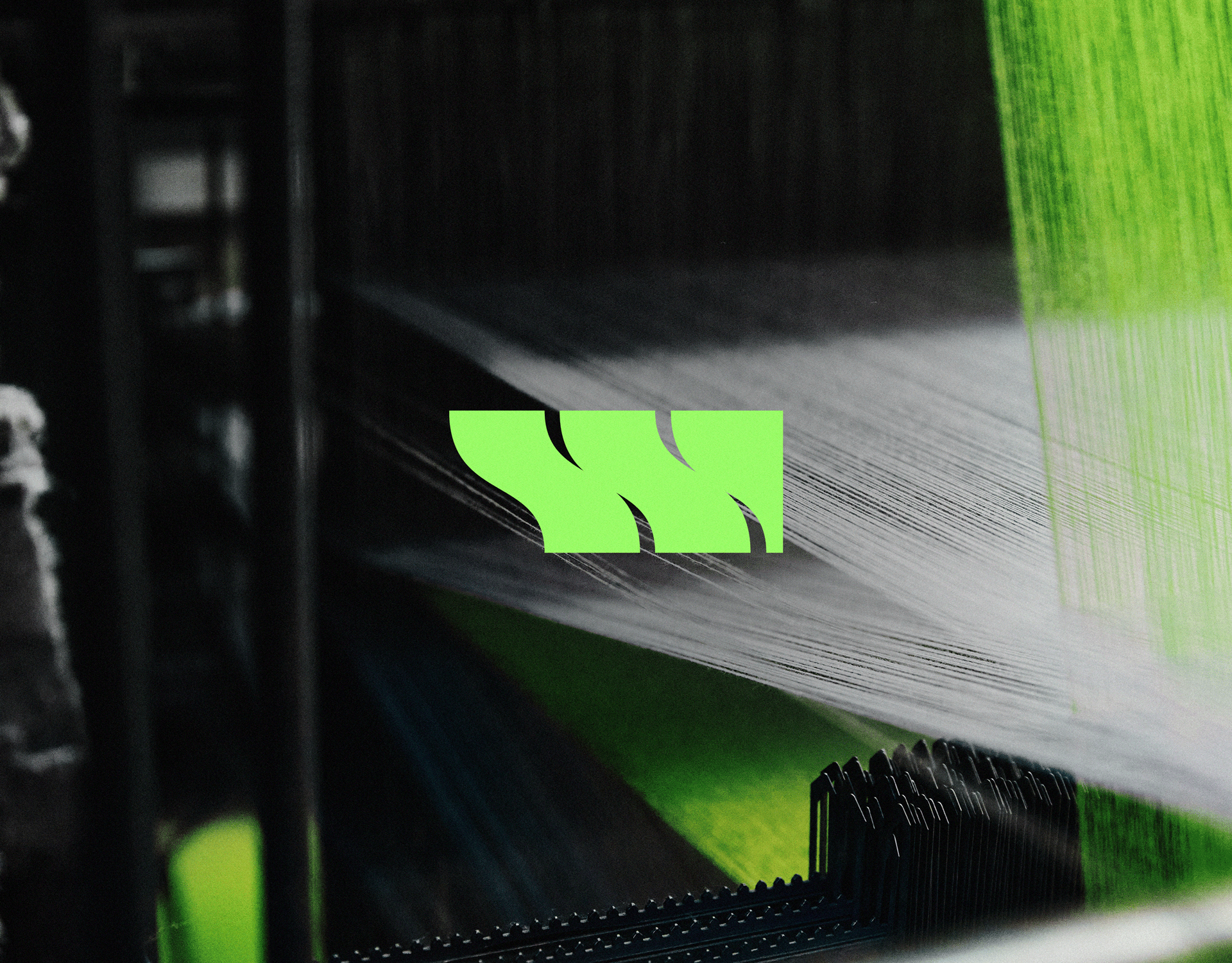
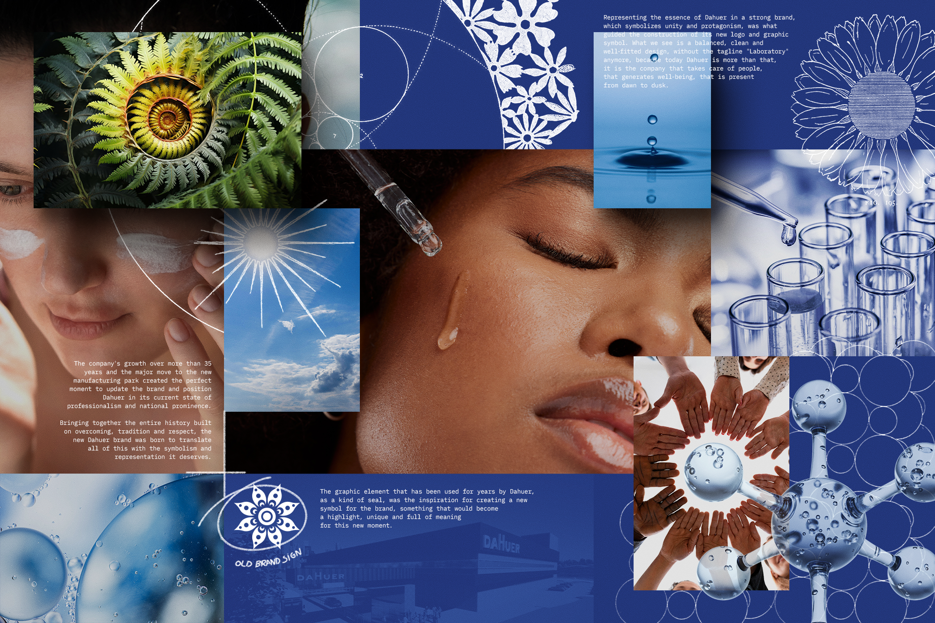
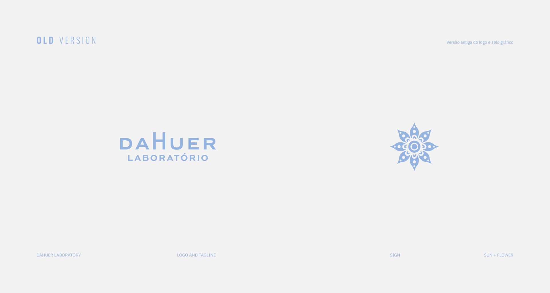
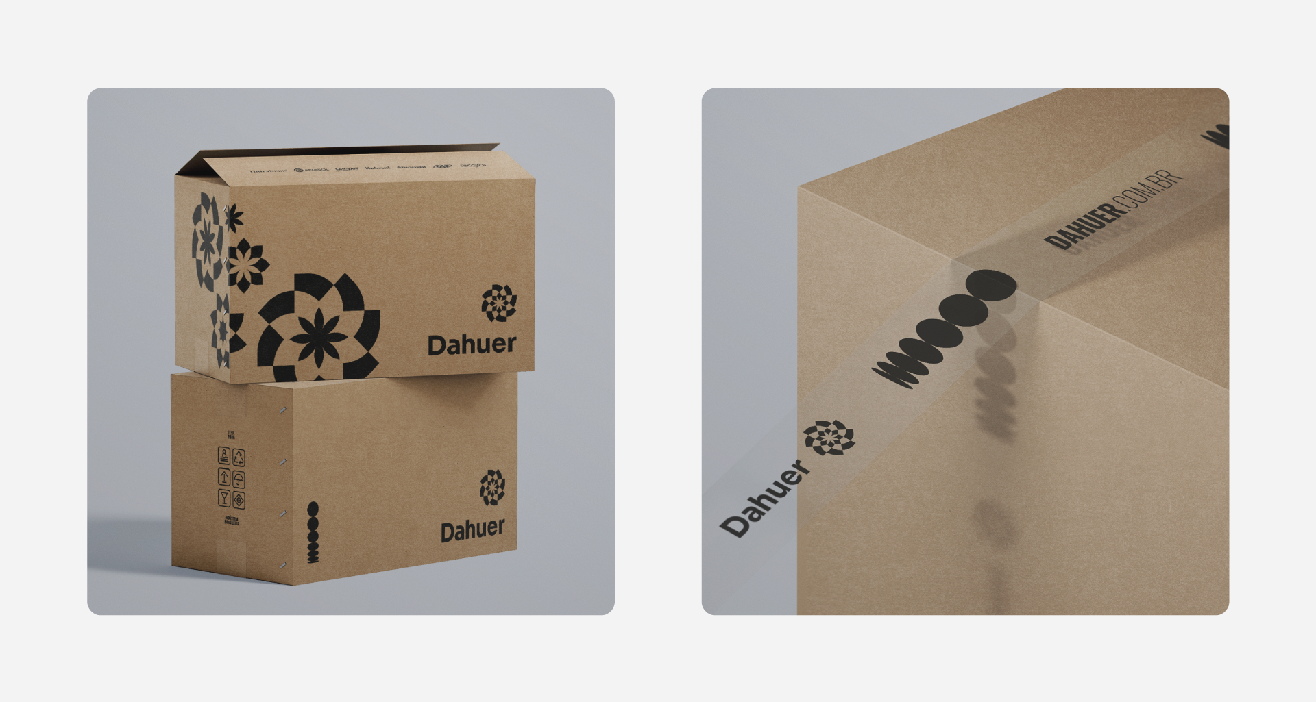
The sun/flower graphic element, which had been used for years as a complementary element, became inspiration for the creation of a new symbol that from now on becomes the protagonist. Solid, unique and full of meanings, this symbol represents the connection between people, the sun and life in movement.


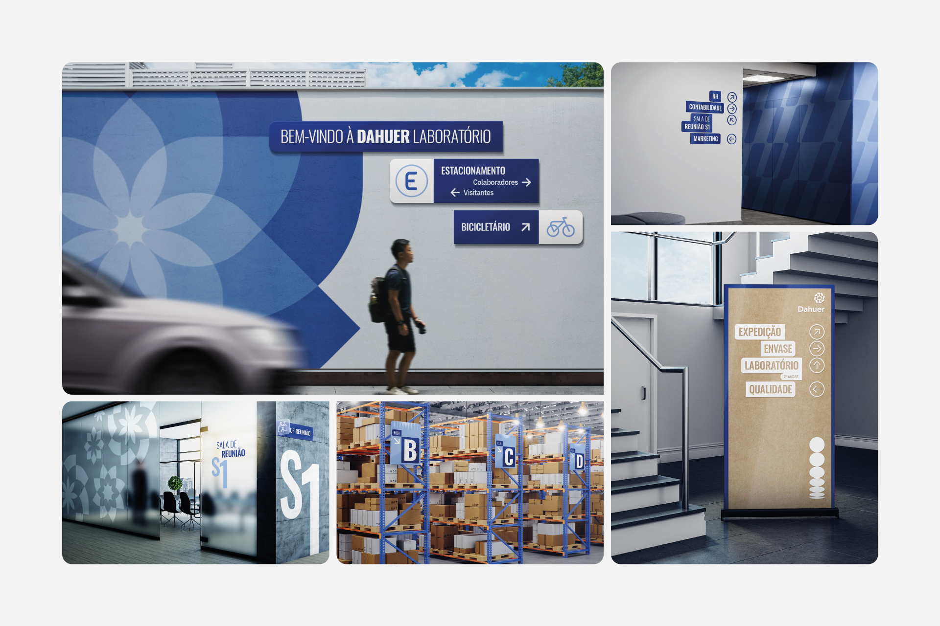
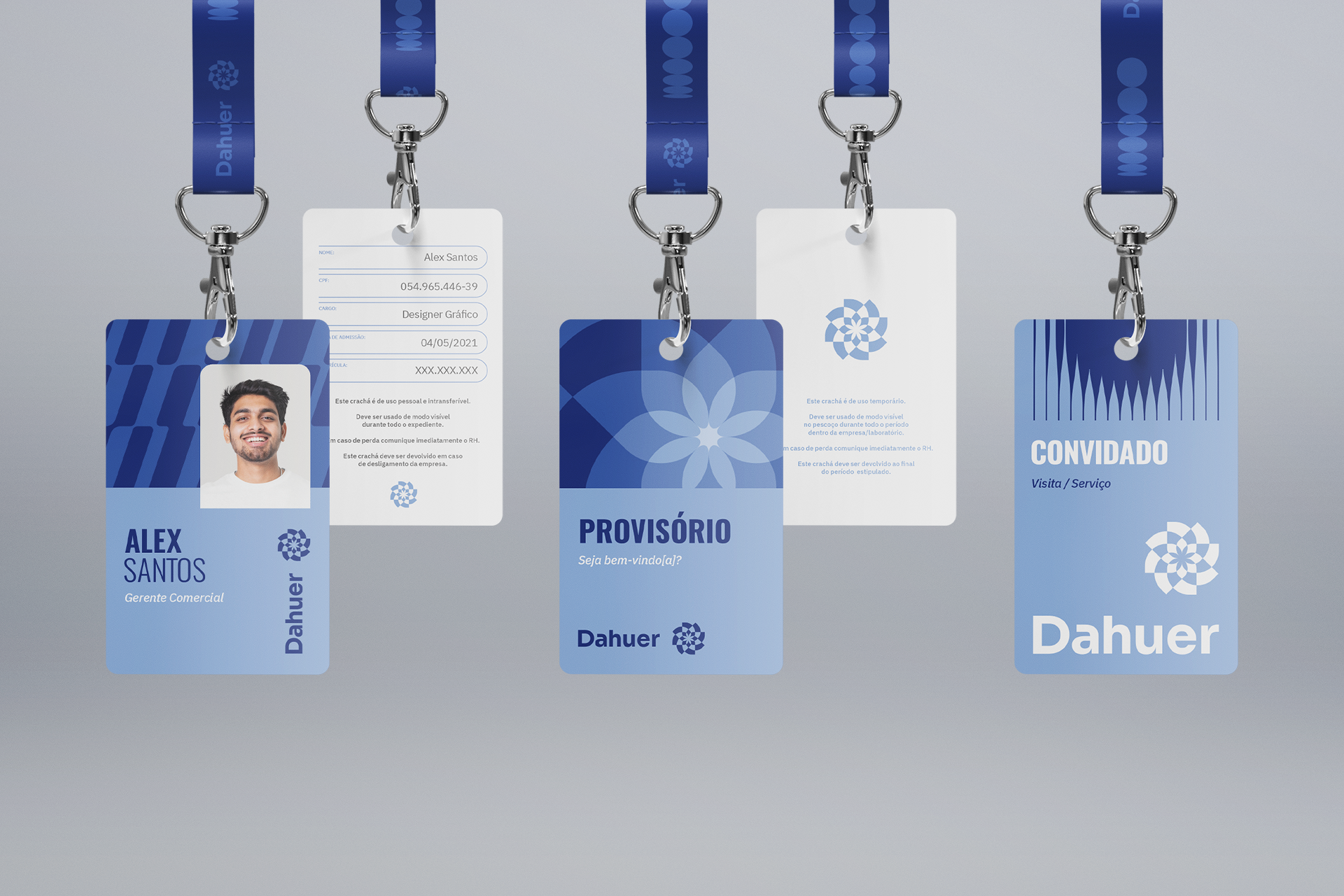
the new brand in practice
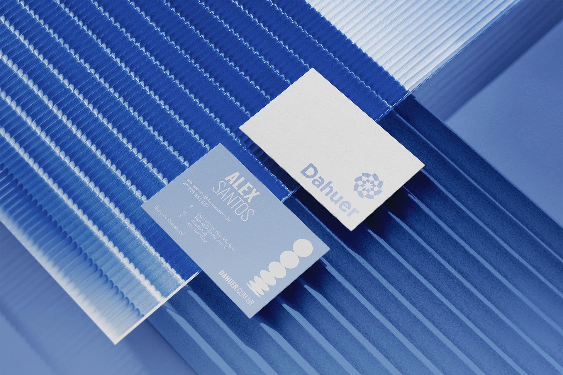
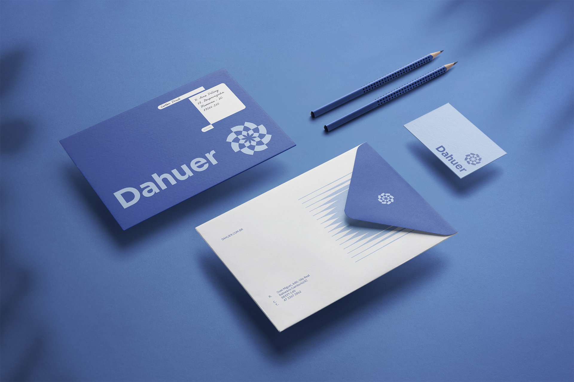
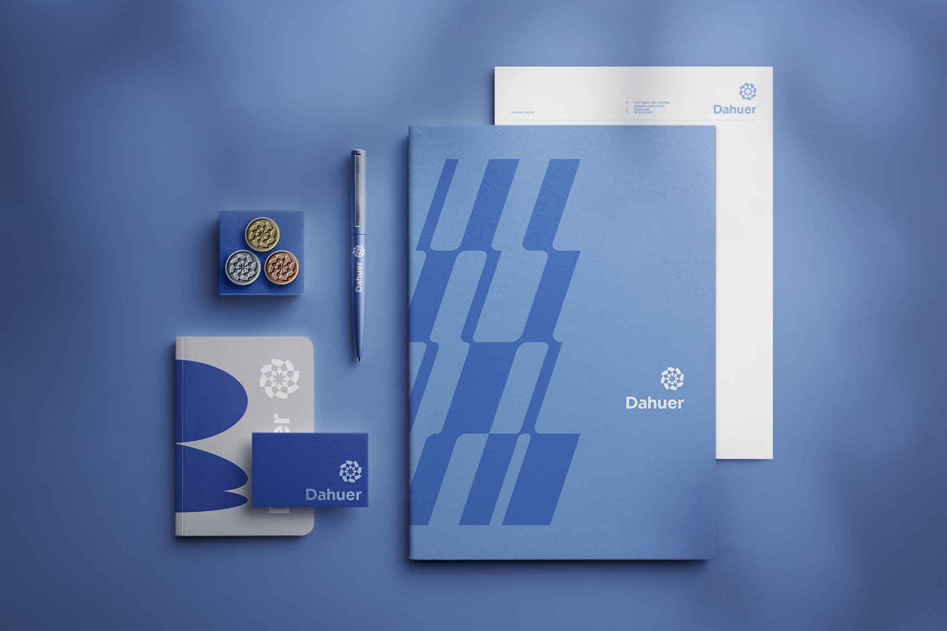
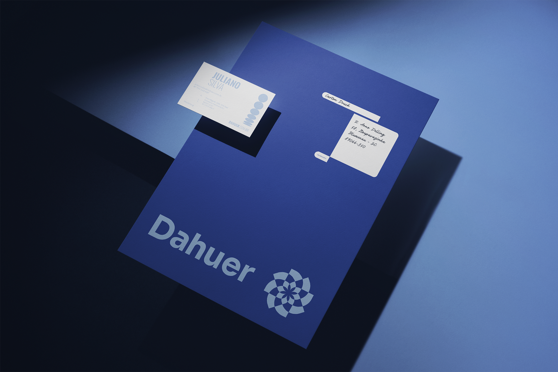
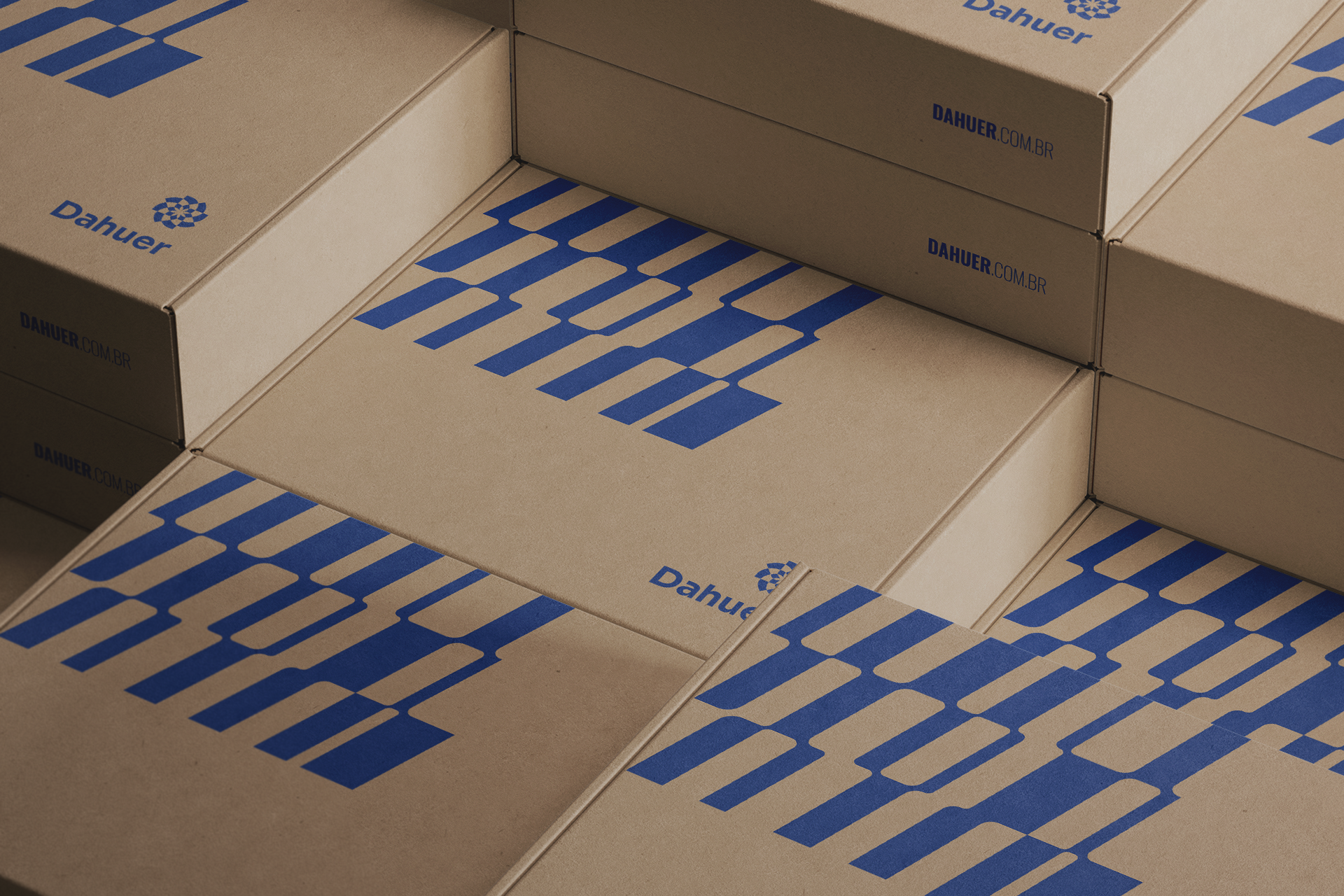
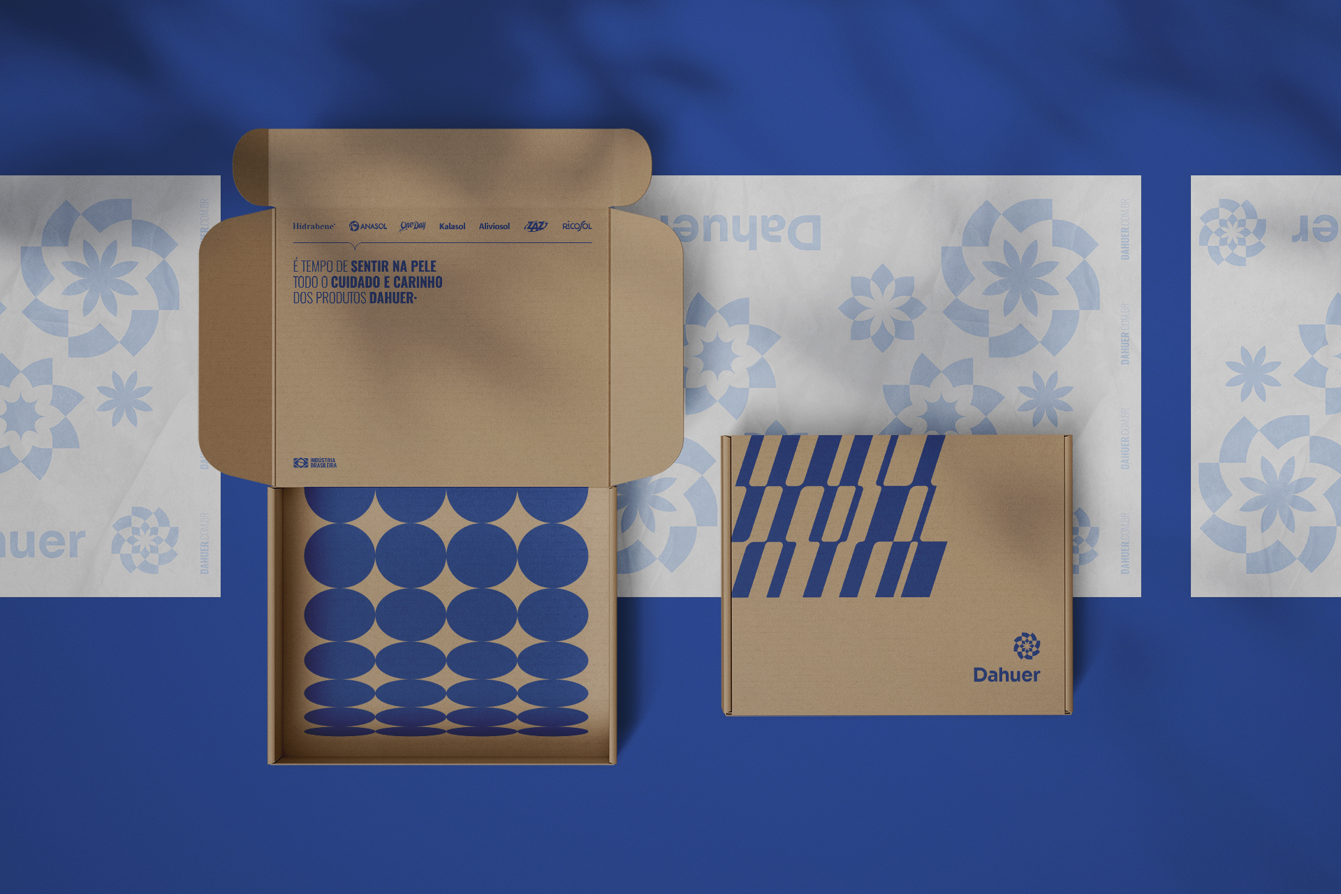
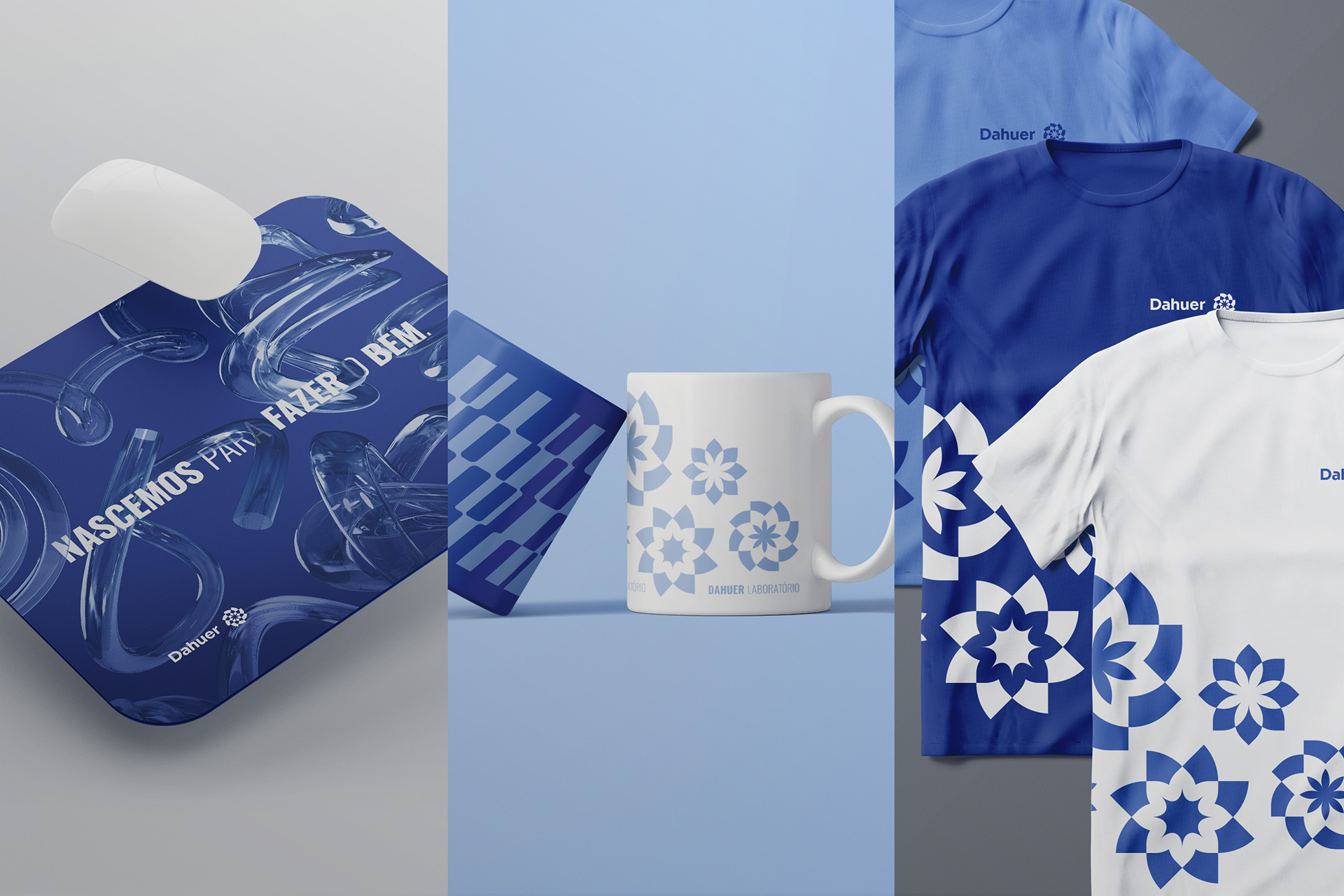
The textures and shapes created for the brand were inspired by the fusion of raw materials, chemical reactions, research and development equipment, the movement of machines and the subtleties of nature. The new visual language was developed to guarantee a uniform deployment, where the elements complement each other and allow for countless variations and combinations. From colors, fonts, textures, shapes and images, everything was designed for the best usability in the application on all possible platforms.


If you like this, check our Instagram for more.
ENTREGAS
Redesign / Redesenho
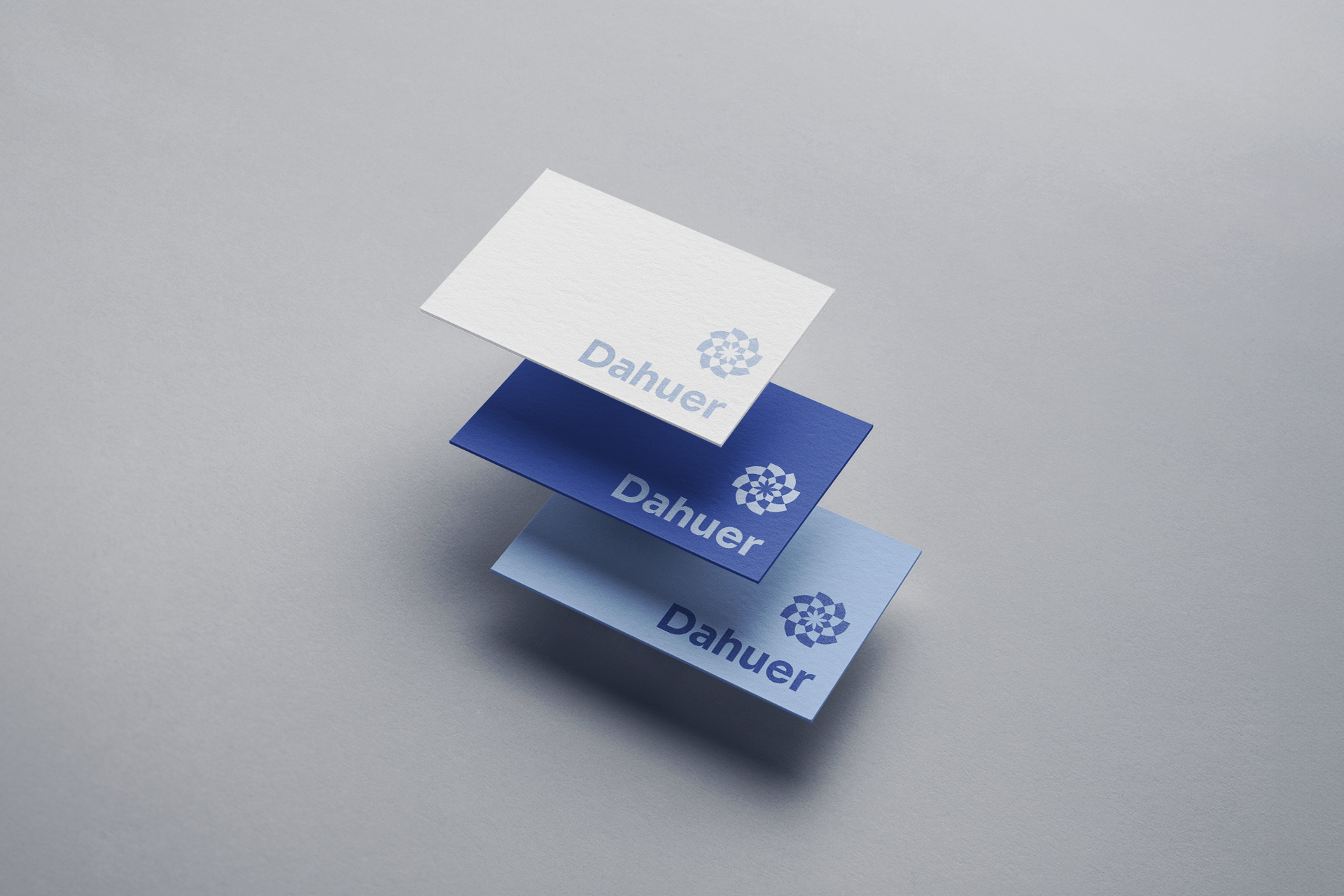
Símbolo / Symbol
Identidade visual / Visual Identity
Redesign / Redesenho
Símbolo / Symbol
Identidade visual / Visual Identity
CREDITS
Atendimento: Alex Reuter.
Designers: Alex Reuter e Juliano Jover.
Aprovação: Gregory Rizzoto, Liliani Rizzoto e João Vicente.
Vídeo manifesto (edição): Victoria Casagrande.
Locução: Karine Bono.
Manifesto: Karine Bono.
Motion: João Pedro Roncalio.