HIDRABENE
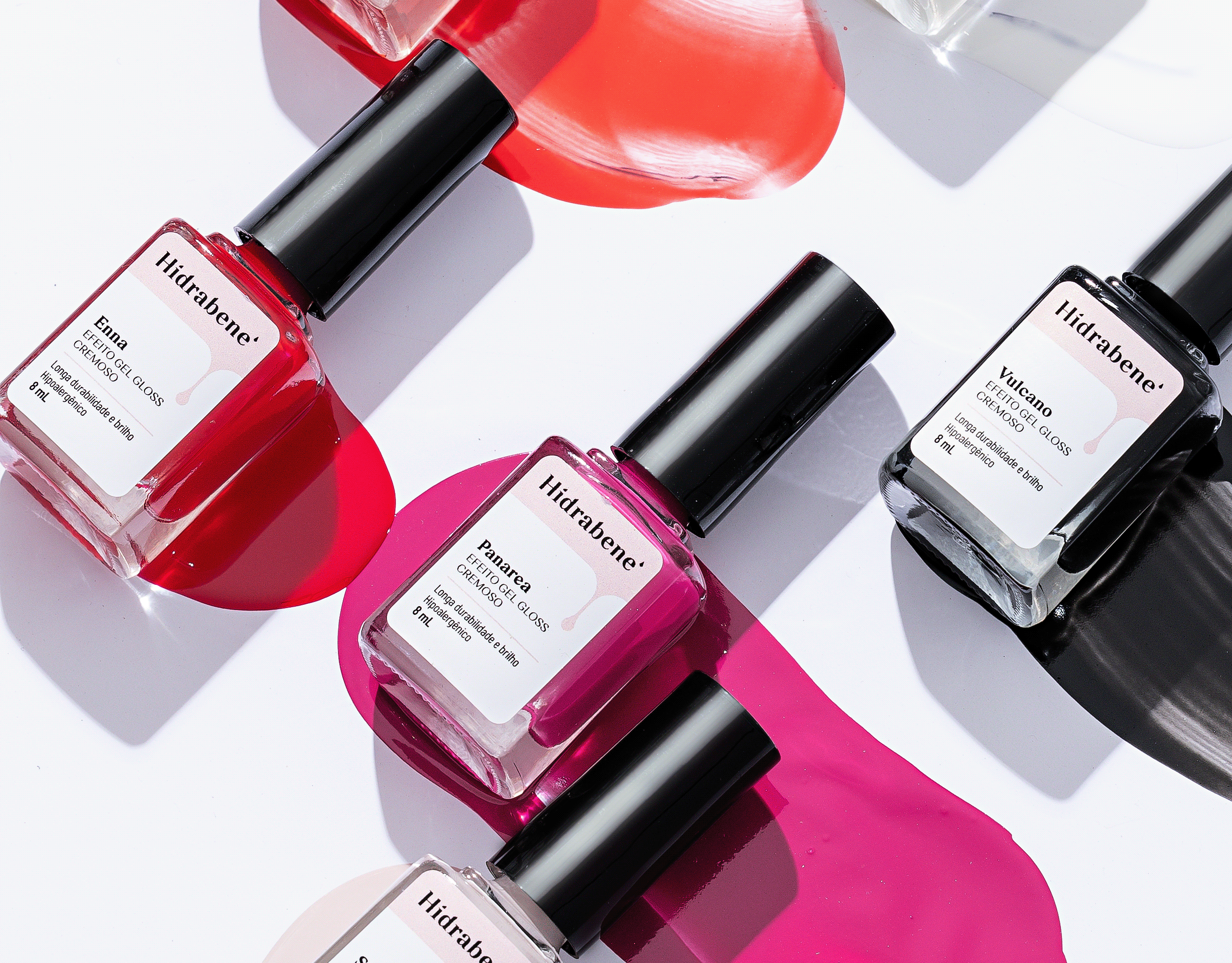
The Hidrabene product line is composed of body and facial dermocosmetics, made with raw materials recognized in the cosmetic sector, combined with advanced technology for localized treatment and intensive skin care.
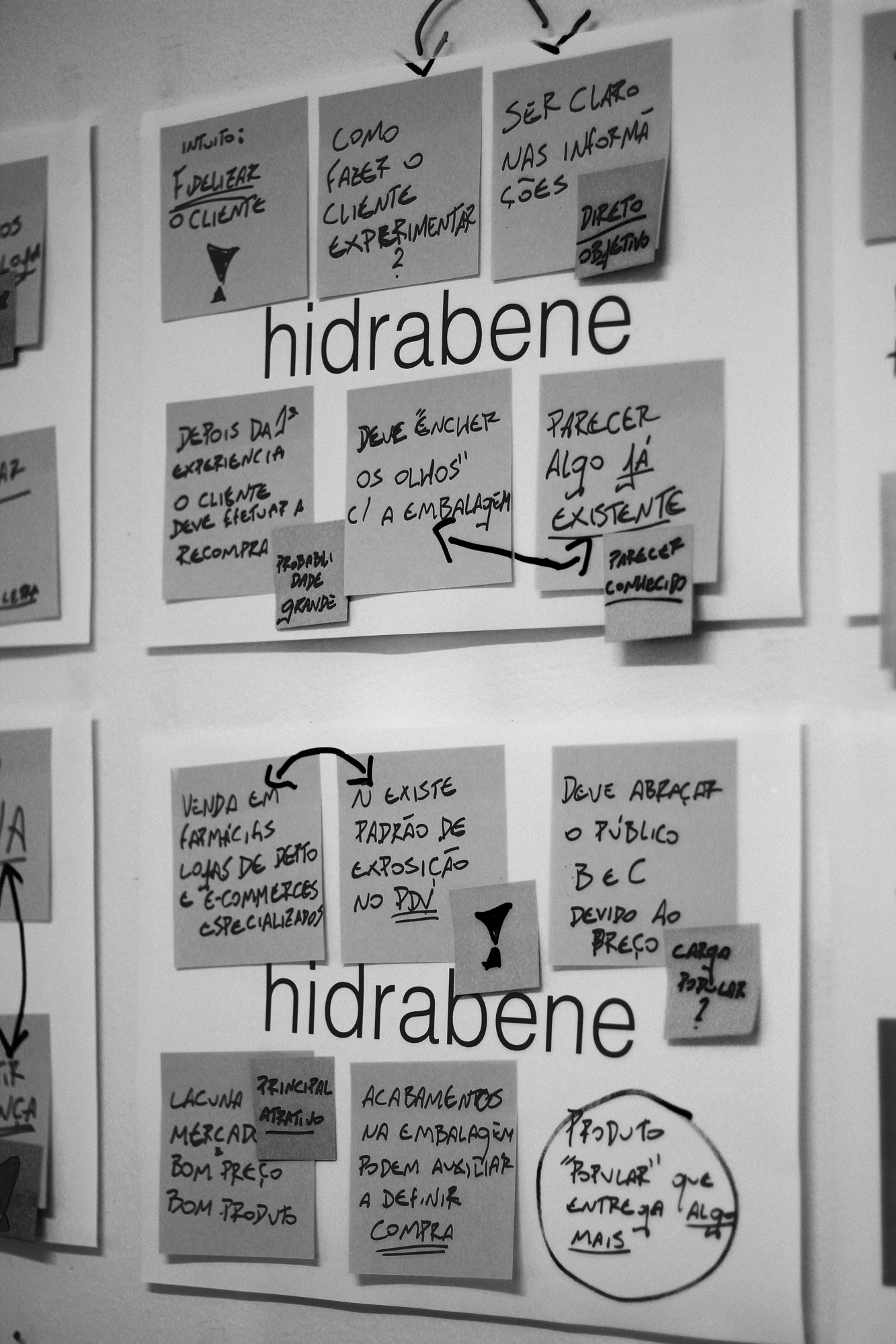
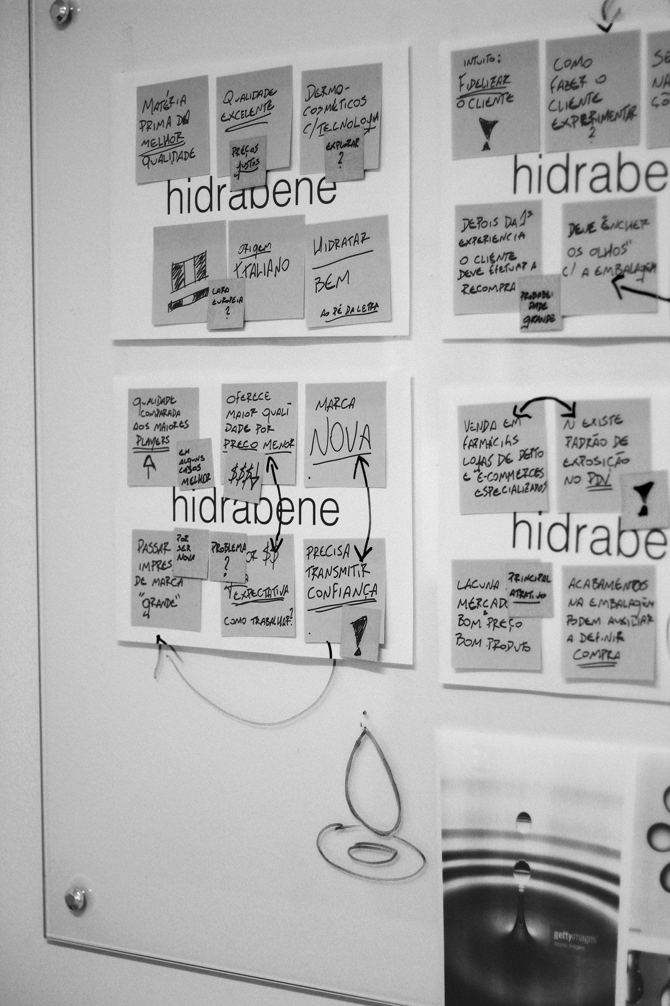
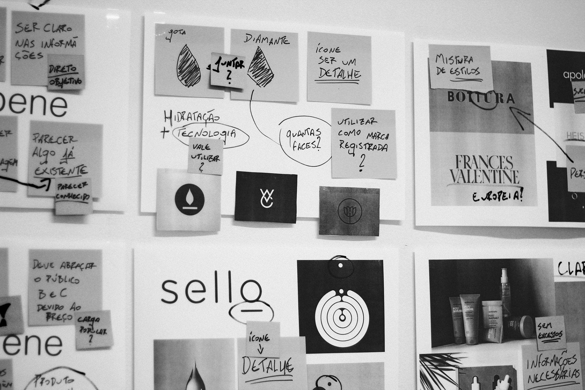
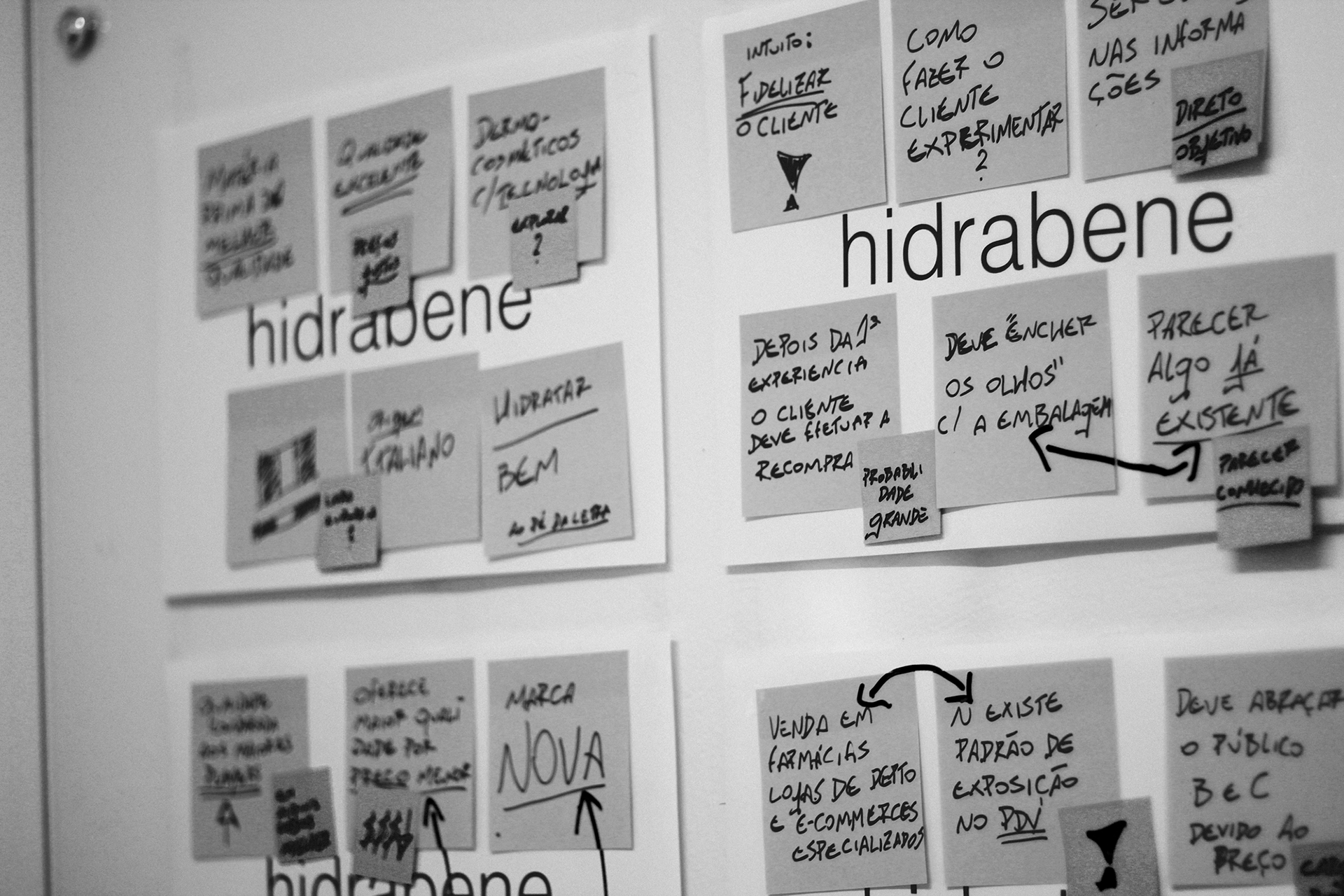
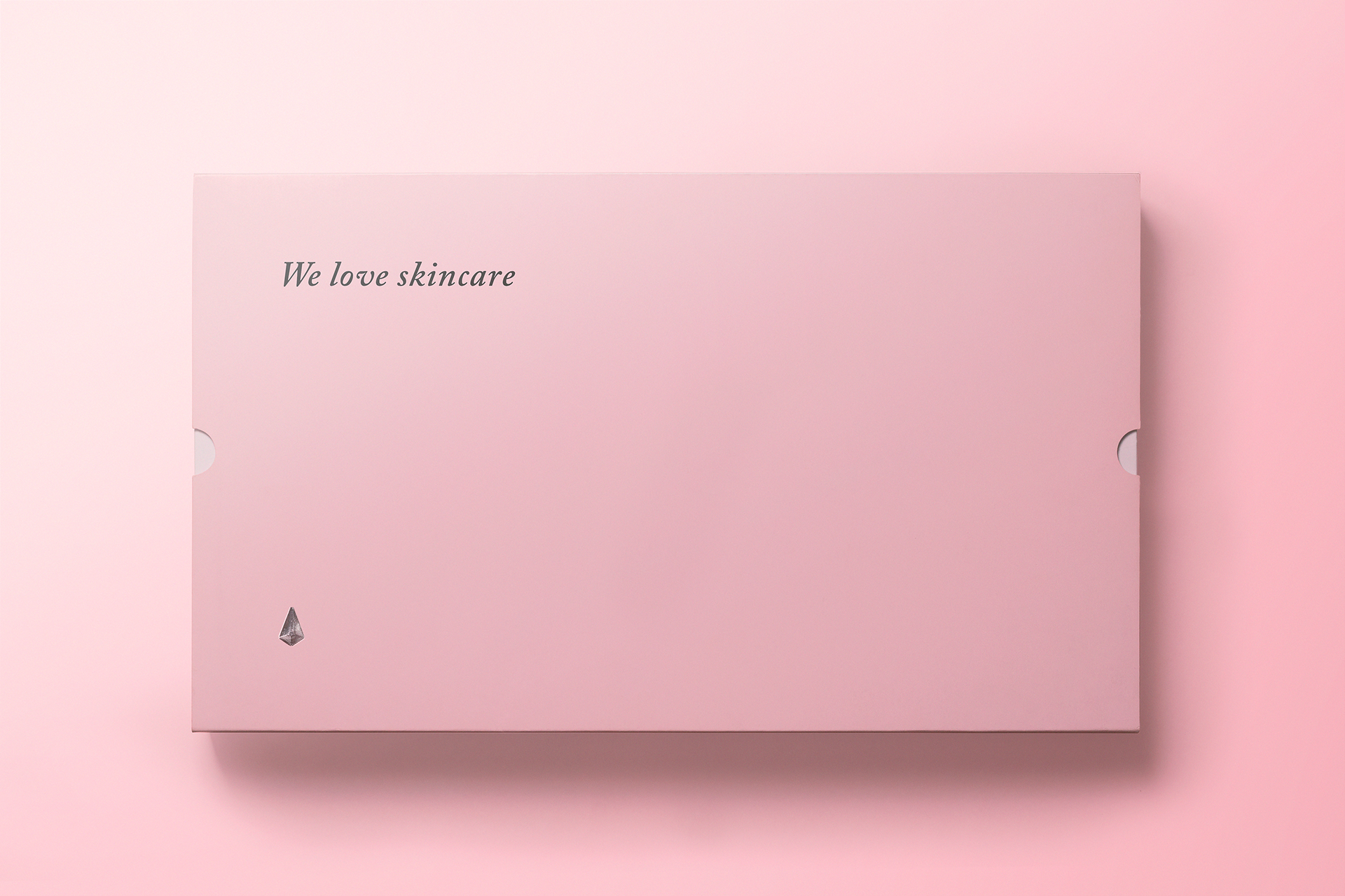
Our biggest challenge was developing material that inspired trust in a public that is, generally, very faithful to the products they currently utilize. Especially on the skin care segment. Thus, we searched for objectivity and precision when developing the brand – which is typographic and displays some graphic interference that provides it some more personality-, moving on to an icon that may be applied subtly or become the main component when new materials come to life. The icon itself is no more than the merger of a drop (that refers us to hydration) with a diamond (referring to lapidating, skin care). Following this line of thought, where clarity and objectivity guide the project development, the chosen colors refer to the delicacy of the skin and have enough contrast to ease the reading of information by the final consumer. Another concern was transmitting the correct information to the user.
We analyzed the best and most objective way to present relevant information first, facilitating the understanding and highlighting a desire for purchase of the products. The Hidrabene line can be found nationwide, in pharmacies and specialized stores and has been a great success in sales with little over a year in the market.
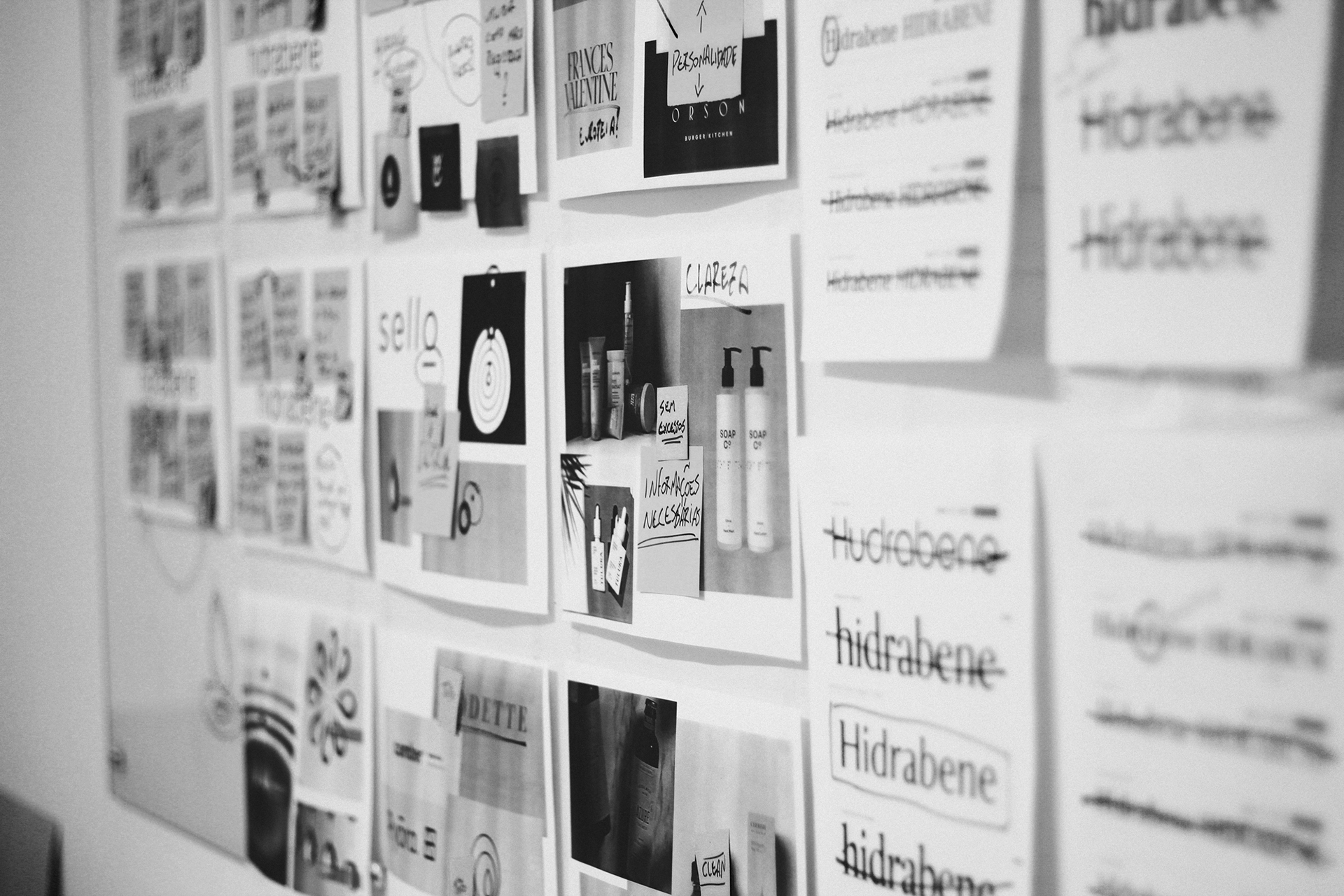
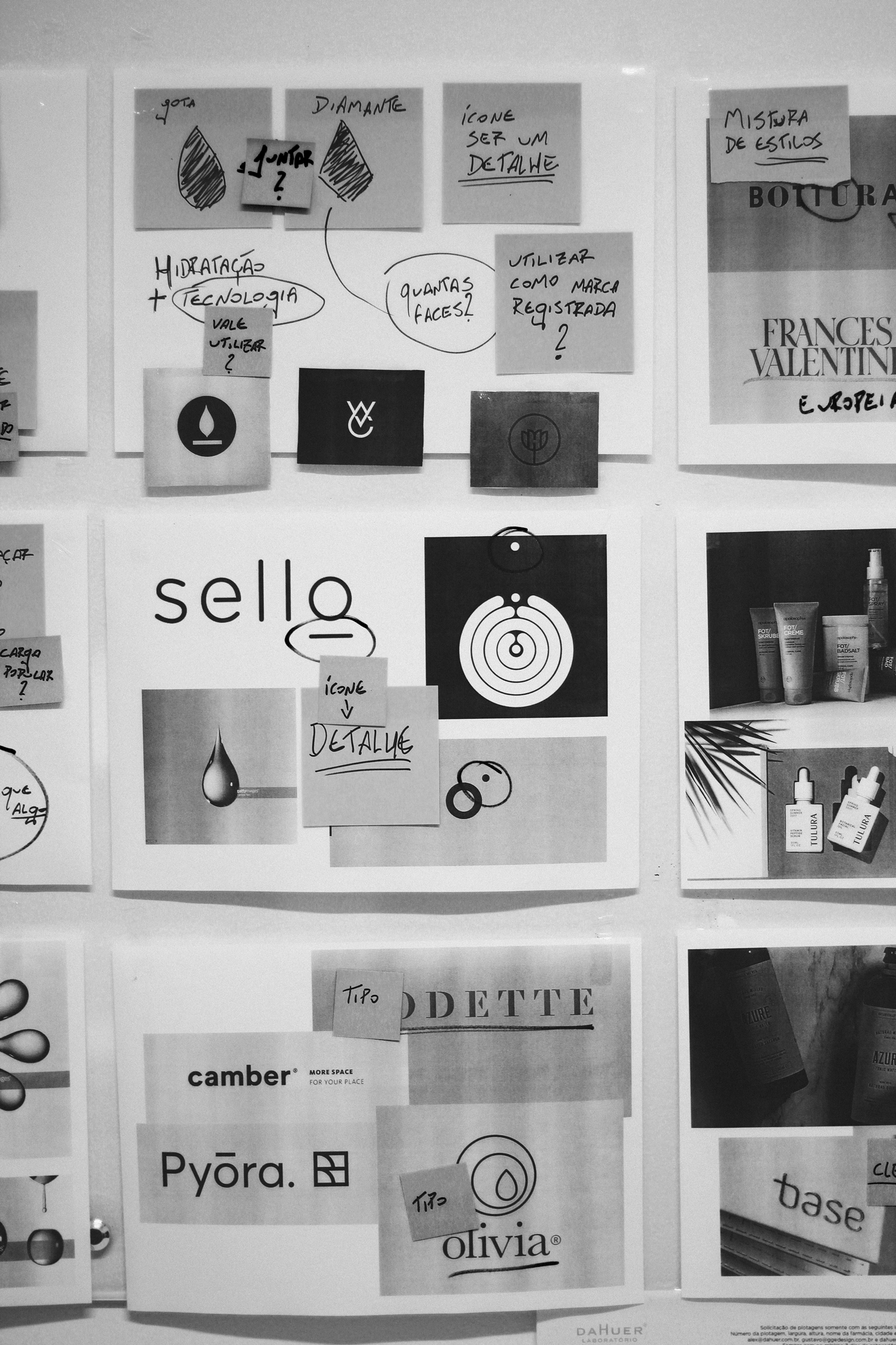
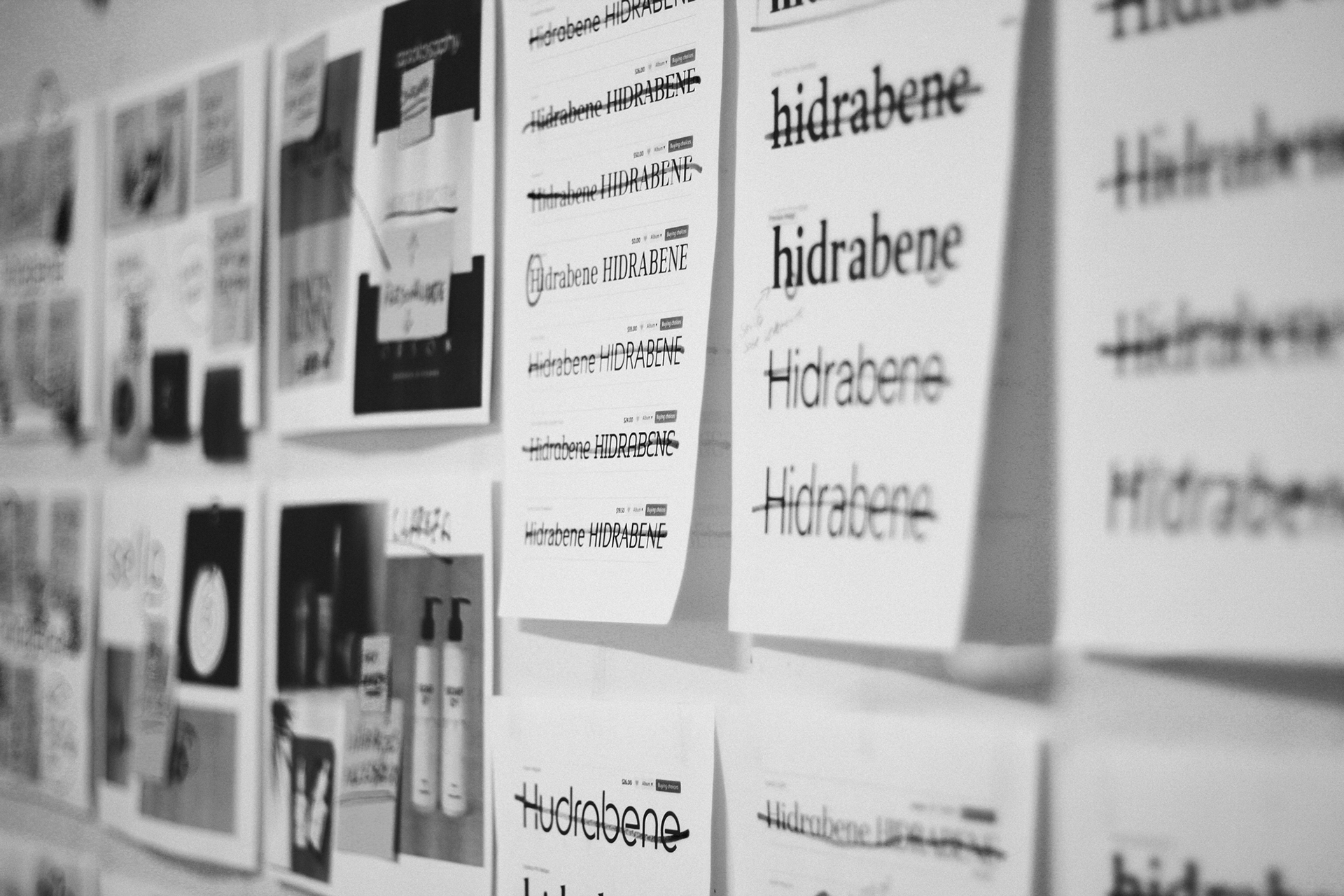
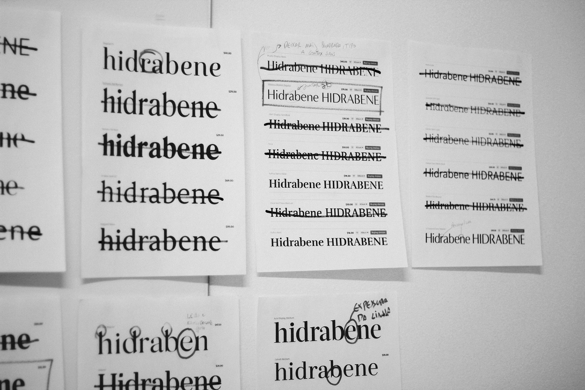
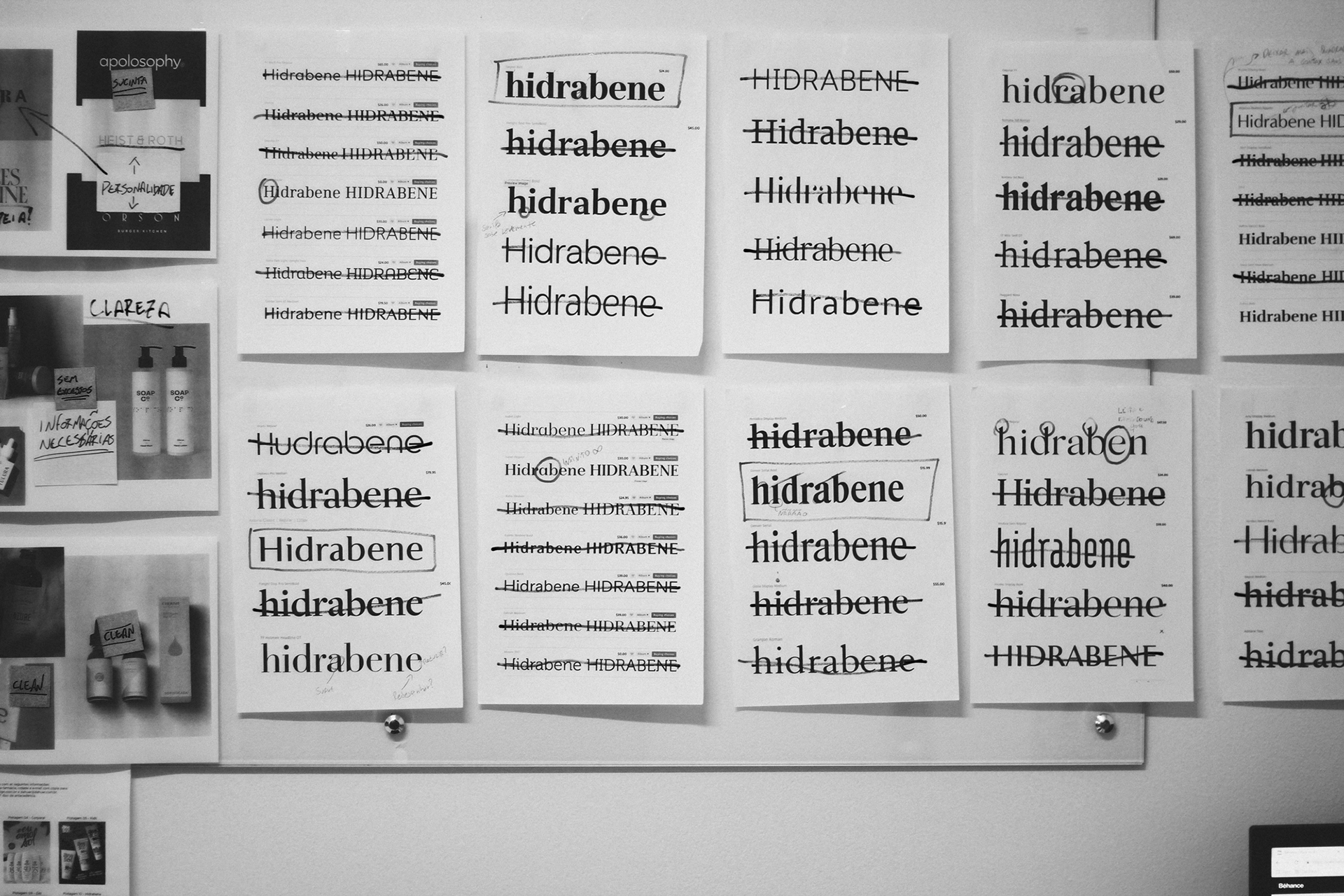
To communicate coherently and harmonically in all of the product’s contact points, we needed to define a typographic group that transmitted the brand’s core values and also facilitated reading.
The chosen fonts were: Audrey, Adobe Caslon and Freight Sans.
Another important factor was studying product testing by the consumer at establishments where it was being sold, and analyzing the repurchasing cycle. All this information was taken into account to make for the best possible consumer experience. It was then decided that the products would be offered in different sized bottles, creating a more dynamic and eye-pleasing skin care line.
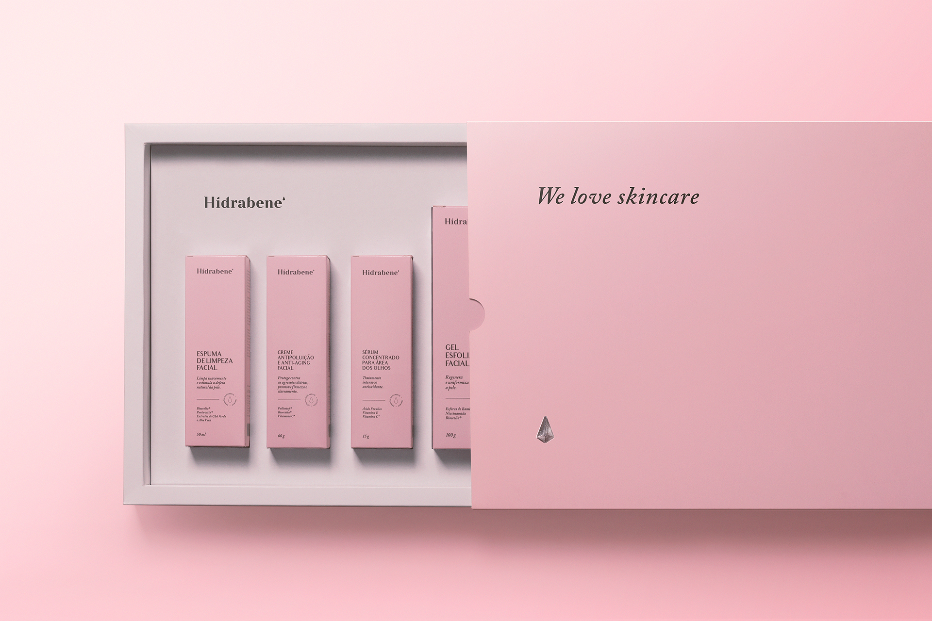
In a market as competitive as dermocosmetics, it is necessary to analyze how the competitions presents itself to the final consumer. In a market where packaging is becoming increasingly smaller, more polluted and crowded by technical terms, we chose clarity and objectivity, facilitating consumer understanding and choosing. In addition to the brand, we chose to place only essential information on the front part of the packaging, in a clear and concise way. With this in mind, we defined the following hierarchy:
- Brand
- What is the product?
- What is the product for?
- What are the main ingredients of the product?
- Volume
COMMITTAL
_Logo
_Visual identity
_Logo
_Visual identity
CREDITS
Customer service: Alex Reuter.
Graphic designer: Alex Reuter.
Photo: André Vandelo.
Translator: Dihego Kowalsky.
Customer service: Alex Reuter.
Graphic designer: Alex Reuter.
Photo: André Vandelo.
Translator: Dihego Kowalsky.


