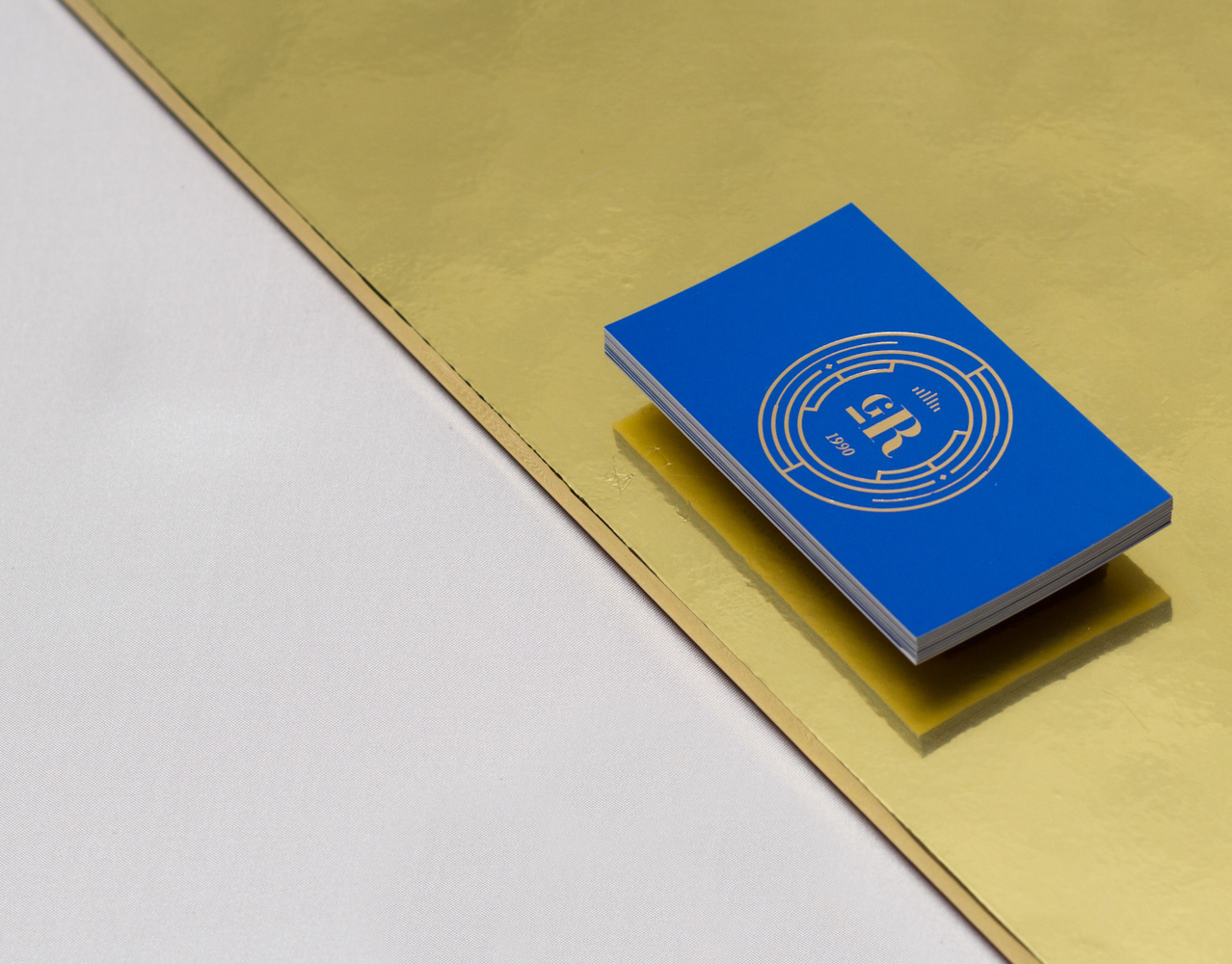
HOTEL VIEIRAS
With over 30 years of tradition and family management, Vieiras Hotel needed to adjust its alignment, brand and identity to current times.
Together with the hotel management, we developed a new positioning, aligned with the hotel´s vision and mission while respecting its values. All these elements were reconceived after a long journey into the history of the hotel, and also with the aid of internal and external research with new and old guests.
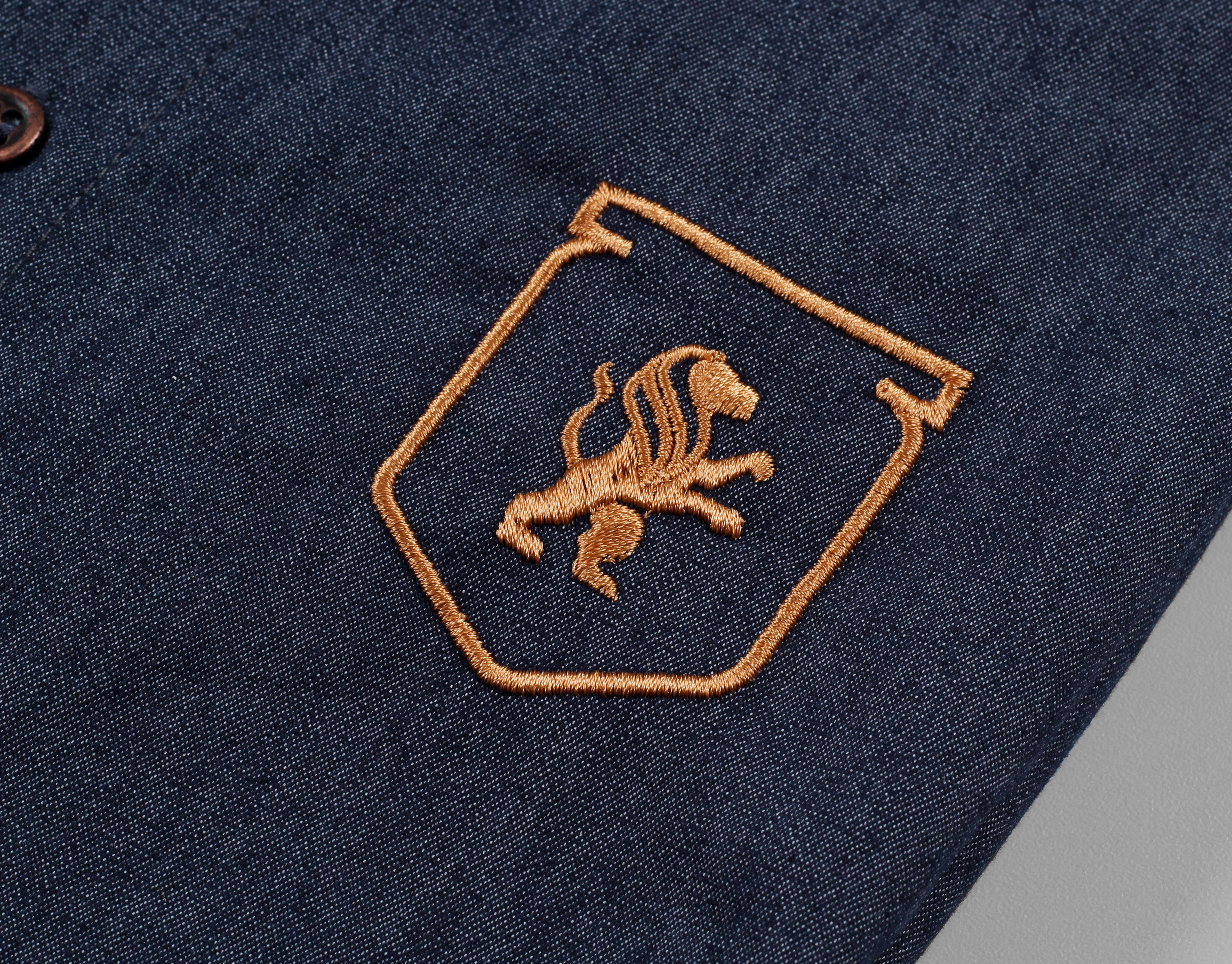
“Vieira” is Portuguese for “Scallop”, and it is also the last name of the family who owns this Hotel. Thus, it was requested that we kept this element of the old brand when redesigning, and so the scallop is still part of the design, although in a more understated manner. Inside the scallop is the letter “V”, for the family’s last name.
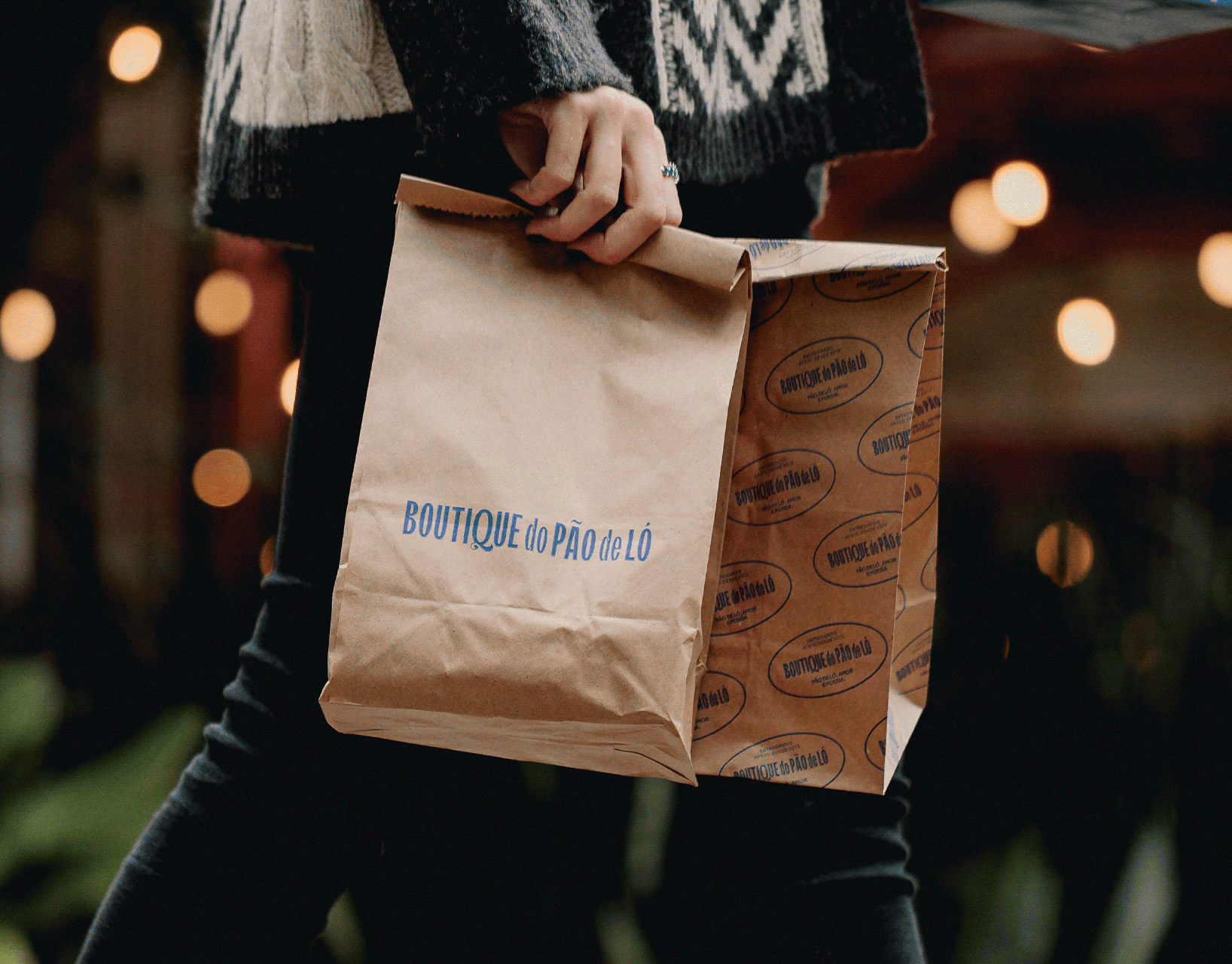
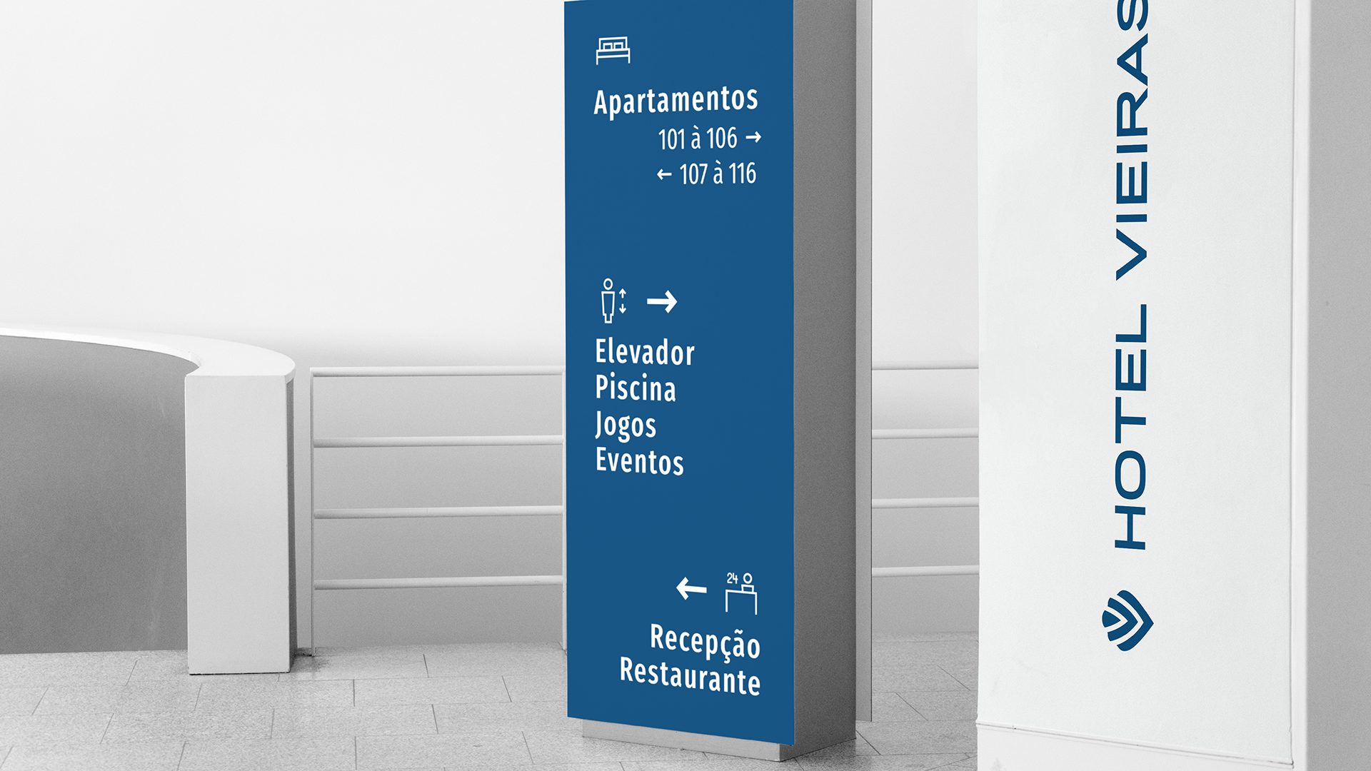
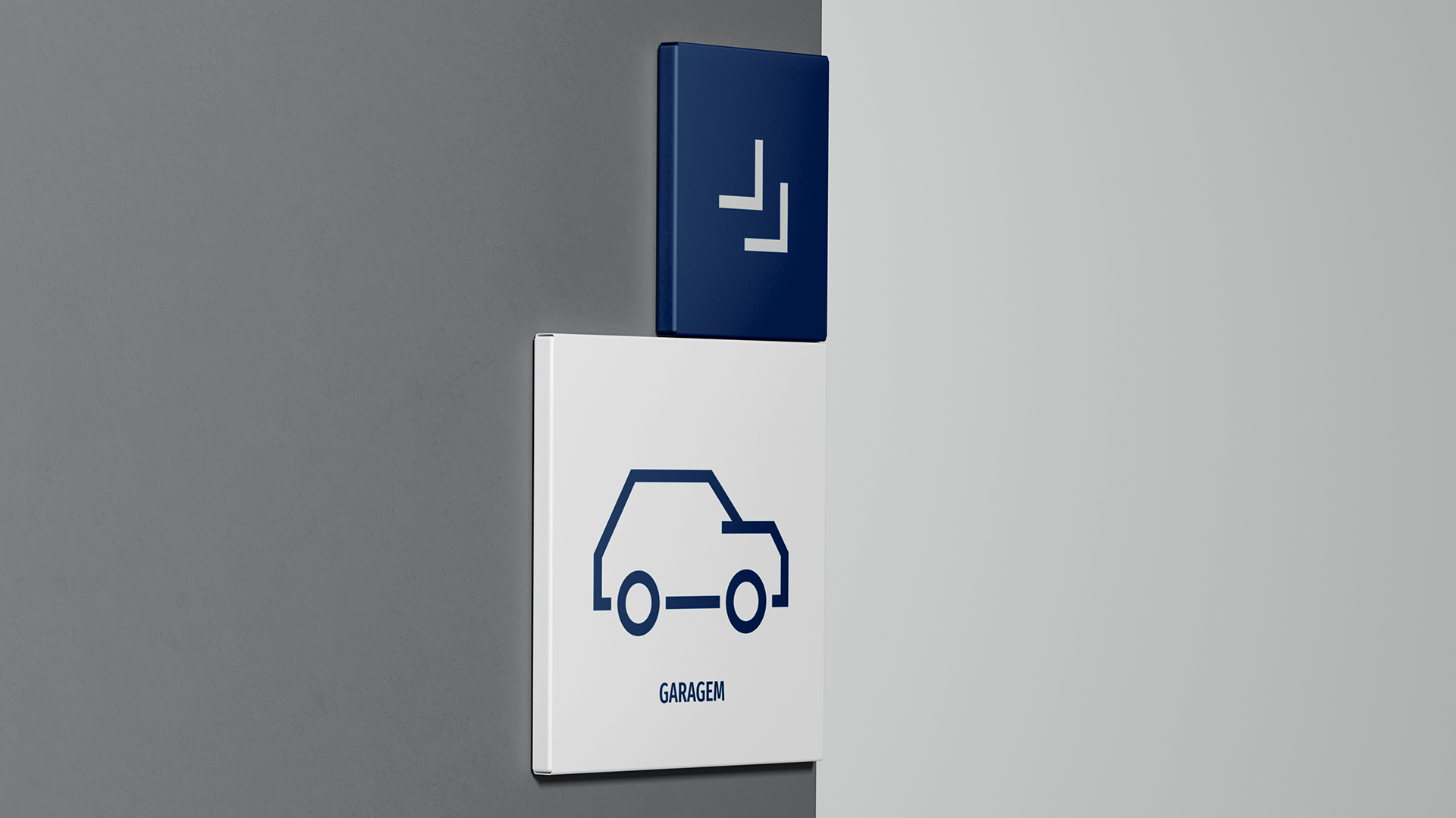
Vieiras Hotel is traditional and popular hotel. They receive different kinds of public throughout the year. Through stamps and textures, with elements inspired by the beaches and other distinctive spots in the city, and small animations and colors, that were named with these spots in mind, we were able to communicate with all necessary audiences and still maintain an aesthetic pattern that was needed for communication.
The development of this project resulted in a more coherent communication, that is more aligned with the essence and values of the hotel´s management, focusing on its very diverse target audience, and easy to be set up inside the hotel structure.
If you like this, check our instagram for more.
COMMITTAL
_Logo
_Visual identity
CREDITS
Customer service: Alex Reuter.
Graphic designers: Alex Reuter, Guilherme Rosa e Juliano Jover.
Translator: Dihego Kowalski.
_Logo
_Visual identity
CREDITS
Customer service: Alex Reuter.
Graphic designers: Alex Reuter, Guilherme Rosa e Juliano Jover.
Translator: Dihego Kowalski.


