Anasol Kids:
packaging redesign
with purpose and impact.
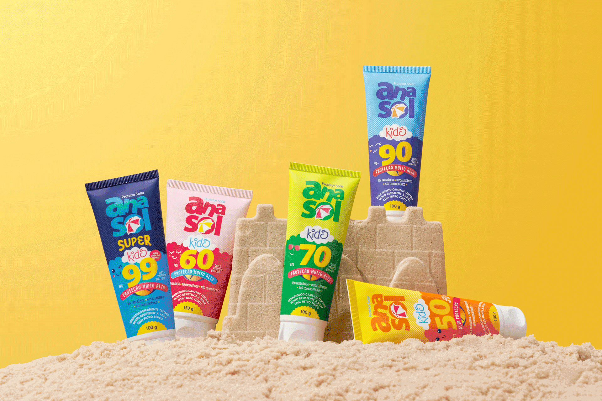
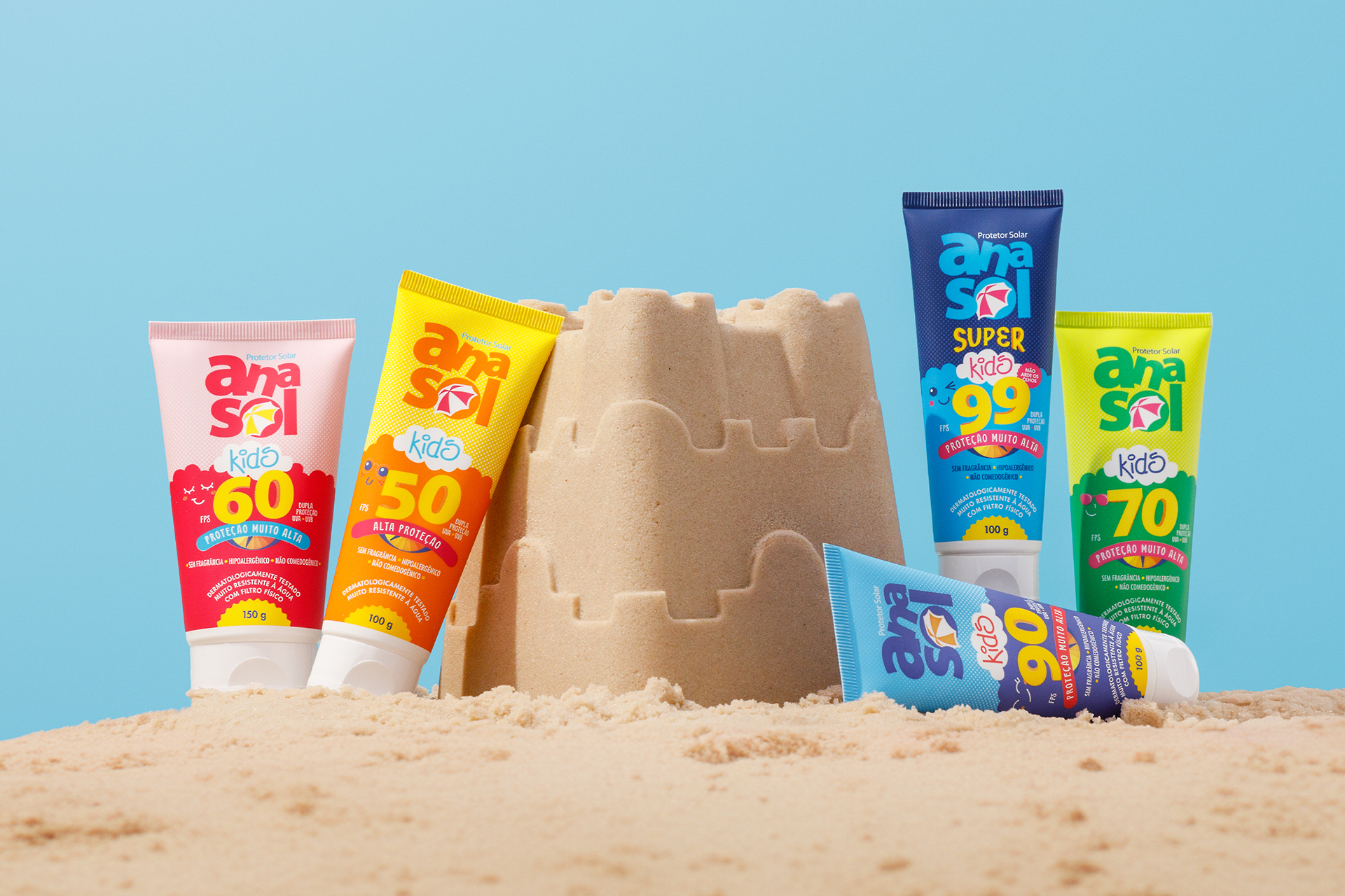
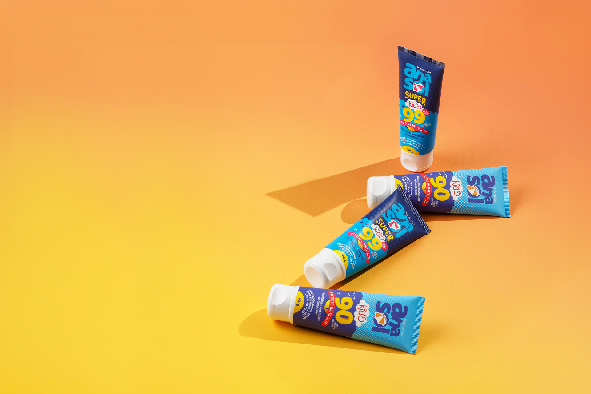
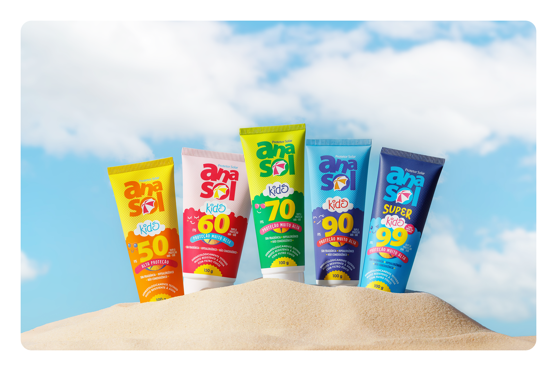
The Anasol Kids line redesign project arose from the need to visually reposition the brand's sunscreens at the point of sale, in line with its growth and market relevance. Comprising five SKUs in tubes, the line underwent a complete overhaul, encompassing everything from its visual appearance to technical and strategic aspects.
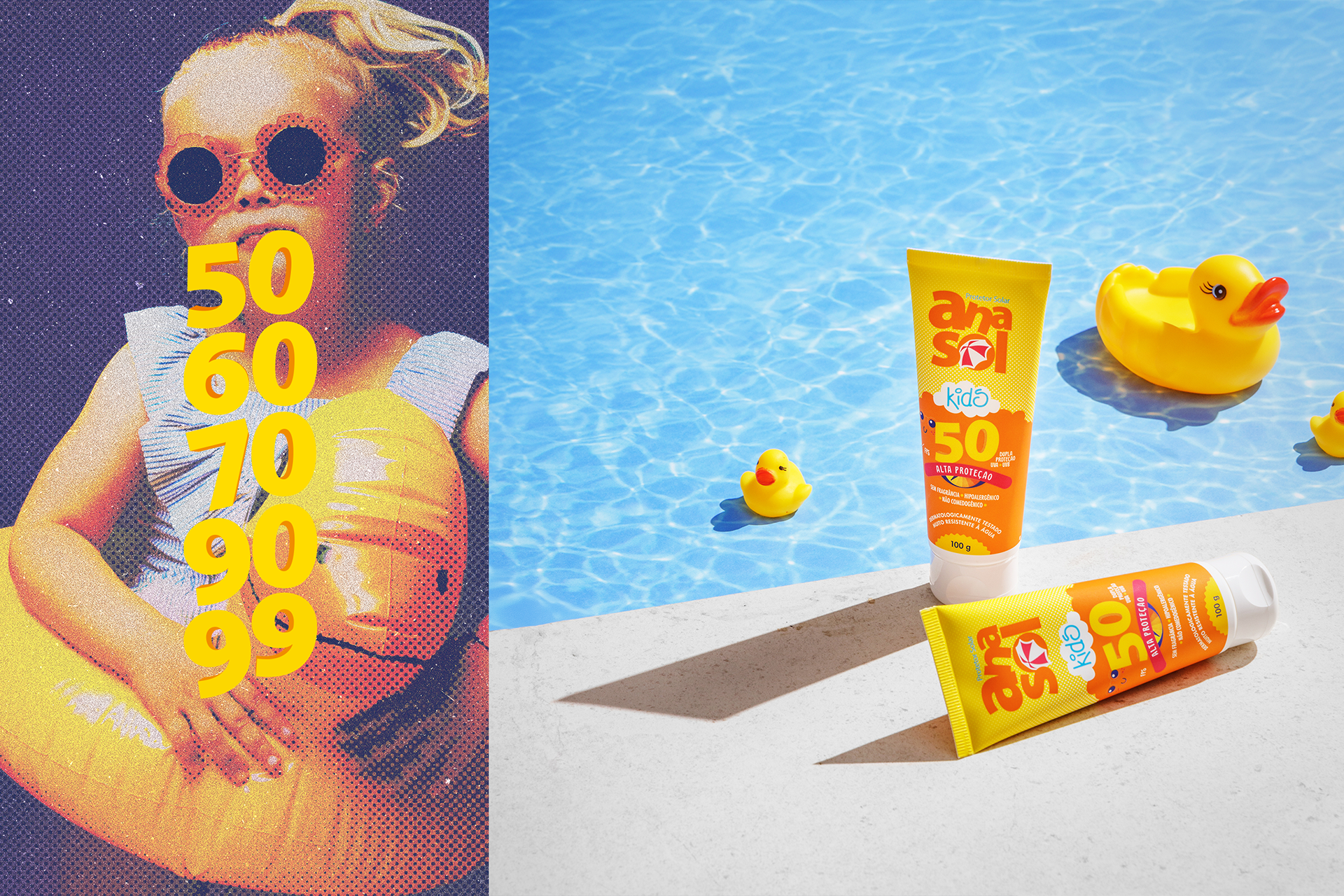
The goal was clear: modernize the packaging, create a more contemporary appeal, and strengthen the brand's presence among an increasingly demanding audience, particularly parents who are safety-conscious and children who are highly influenced by visuals.
The work began with a market immersion, analyzing direct competitors and mapping target audience preferences. Based on these references, we developed visual concepts that combined playful language and functional design, creating communication that was both engaging for children and trustworthy for adults.
One of the biggest challenges was the need to reduce the number of colors used in the packaging.
One of the biggest challenges was the need to reduce the number of colors used in the packaging.
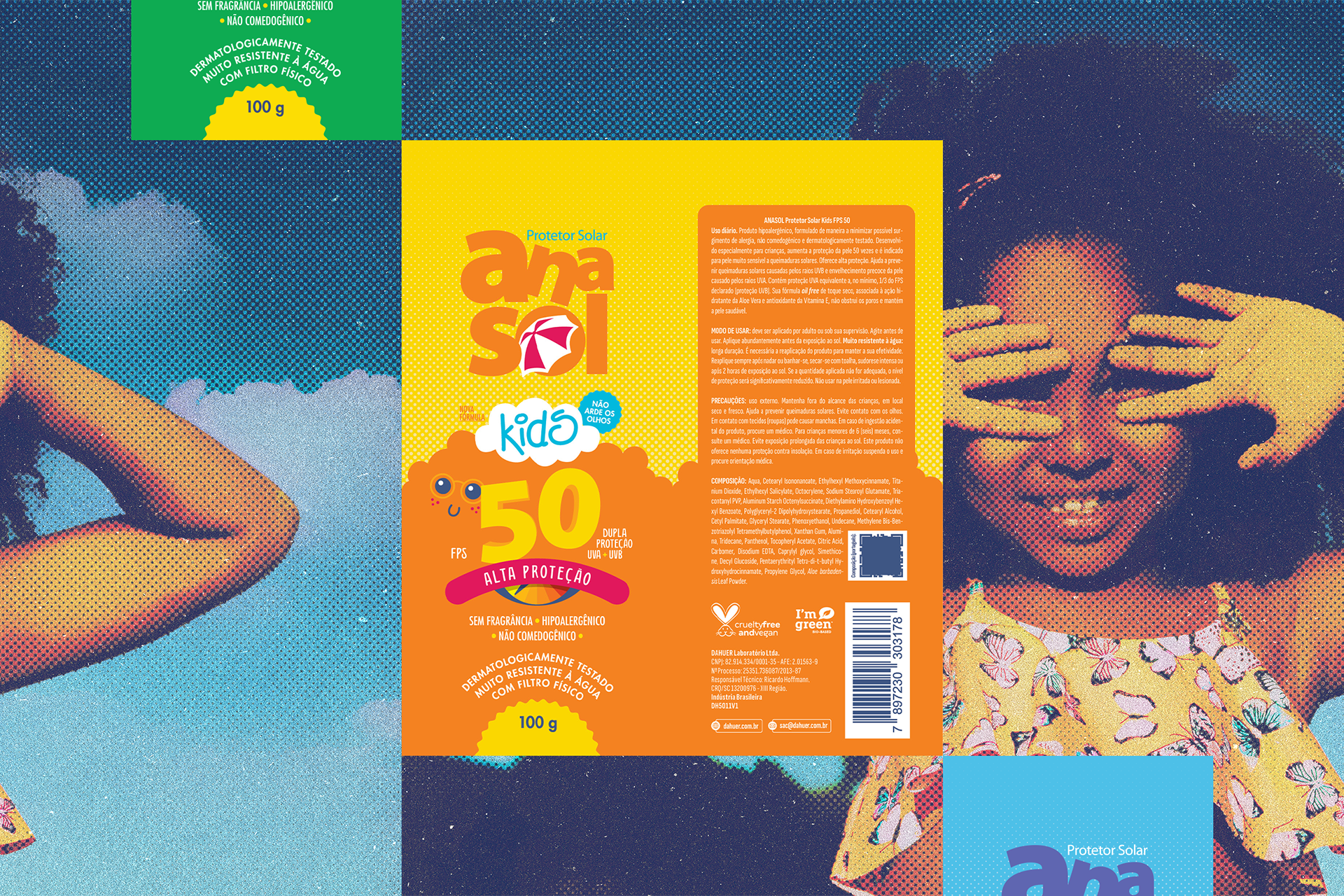
The previous line used chroma printing, which increased costs and hindered quality control. Therefore, we opted for a dry-offset printing process, which is more stable and cost-effective, requiring meticulous color selection and matching. This technical adjustment was made in conjunction with suppliers, undergoing print tests and physical proofs until we reached the best final solution.
Design: form, function, emotion.
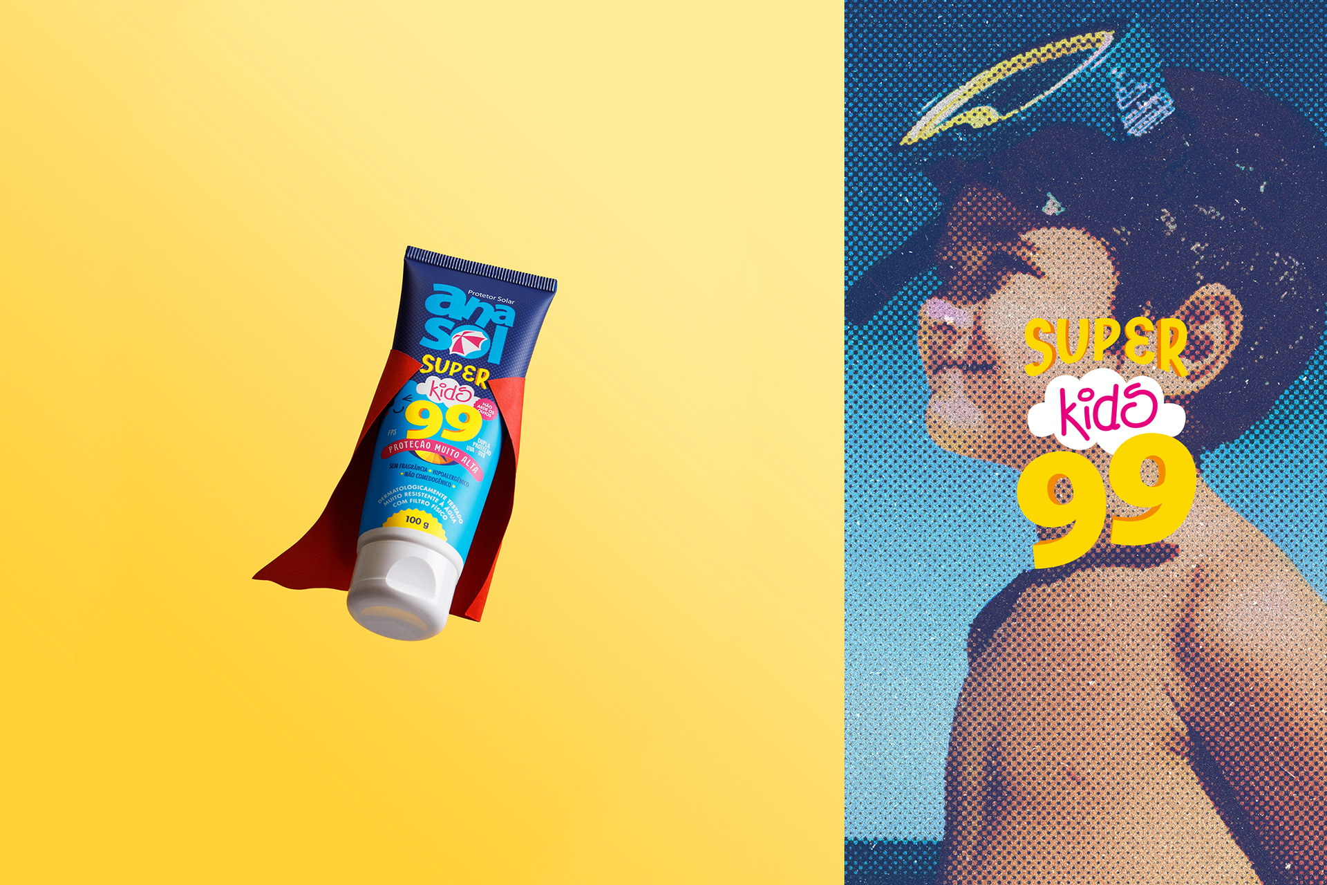
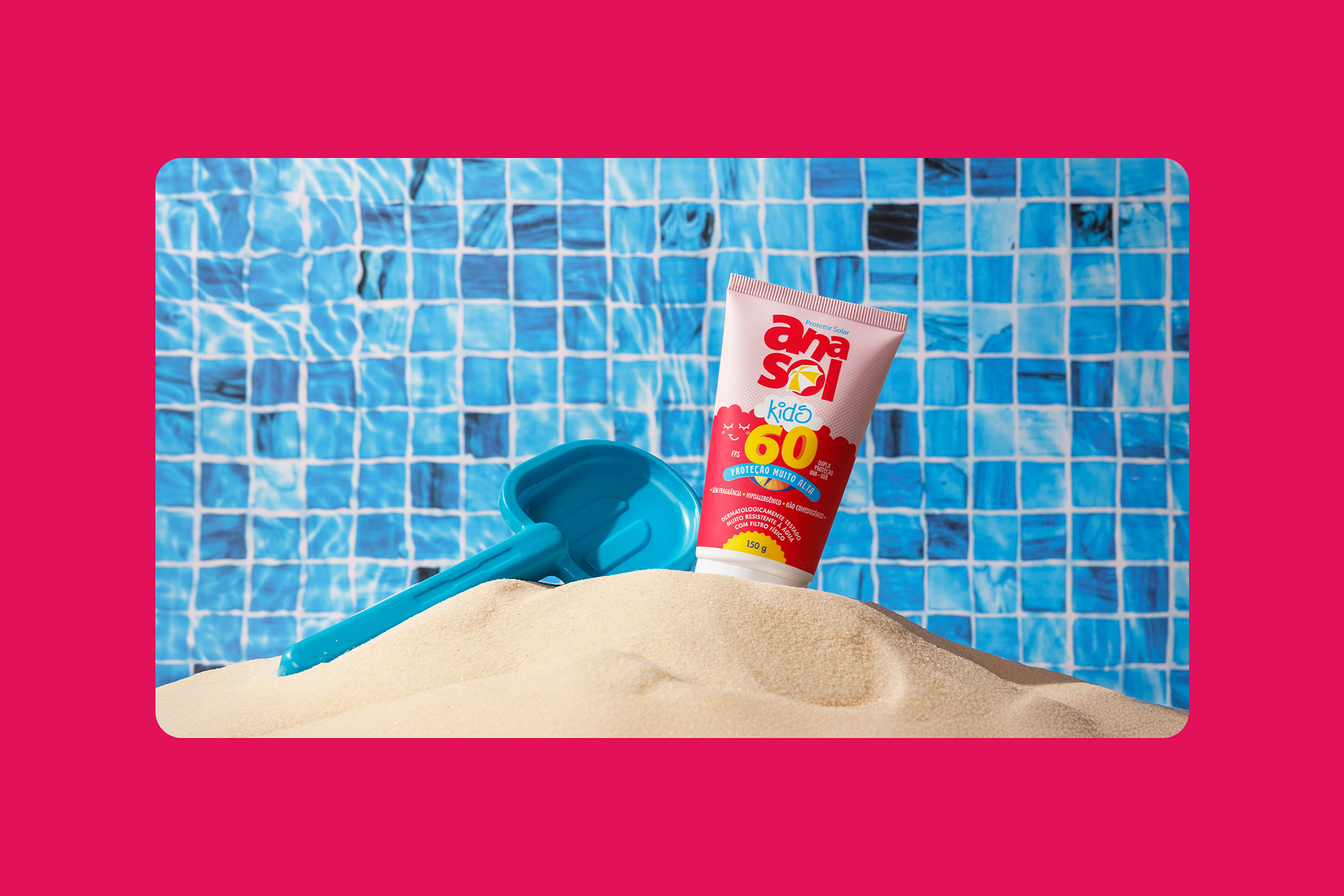
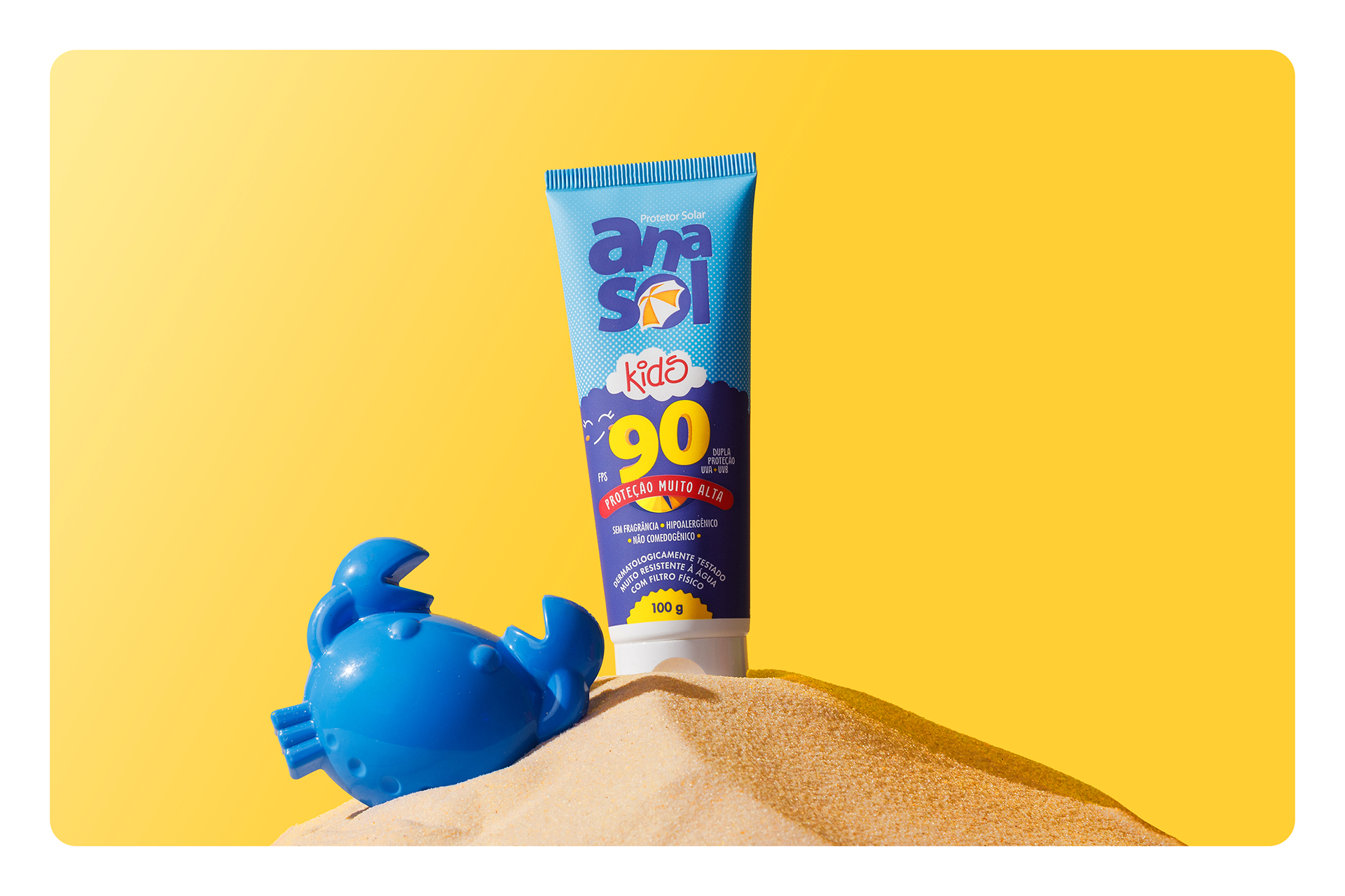
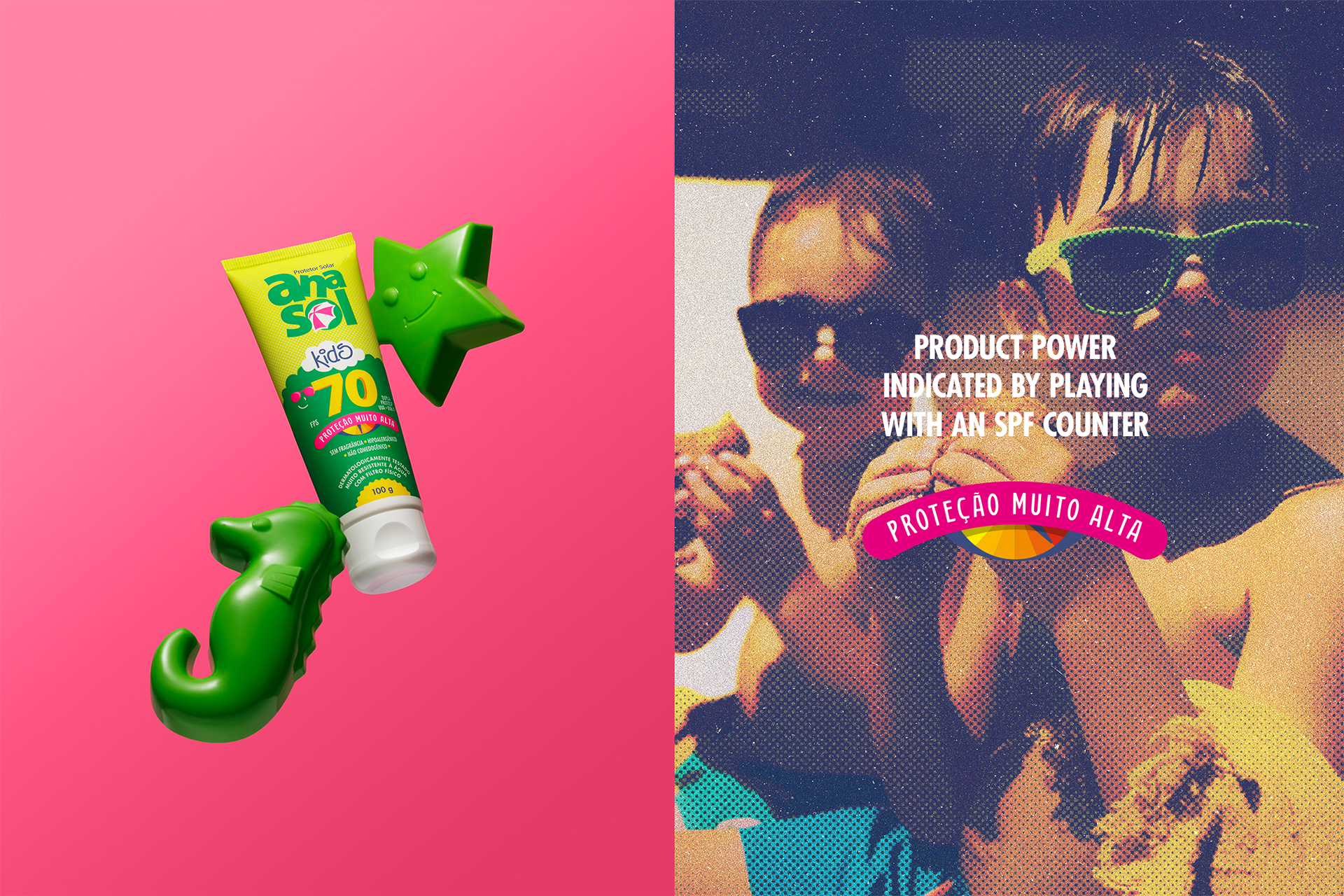
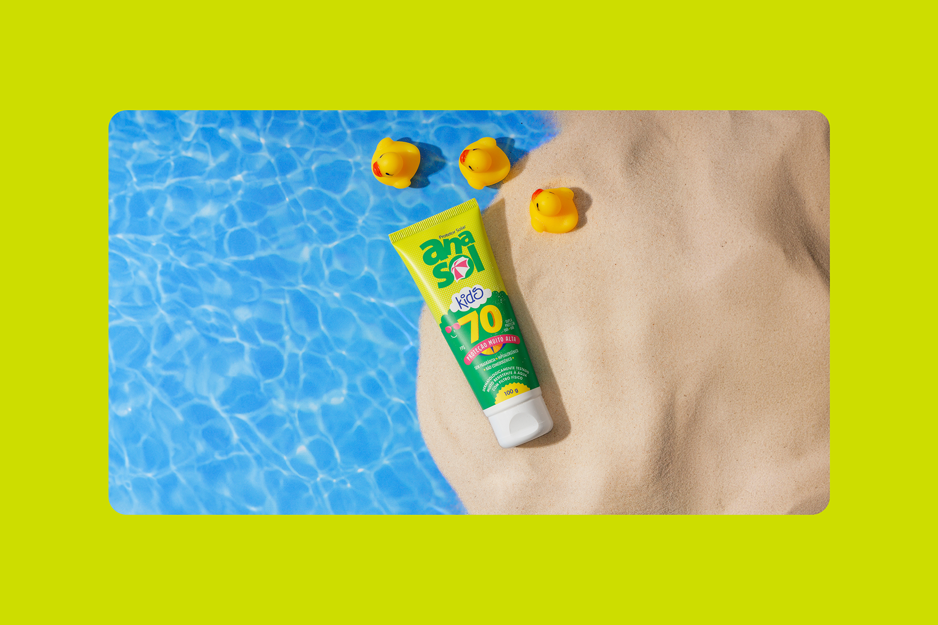
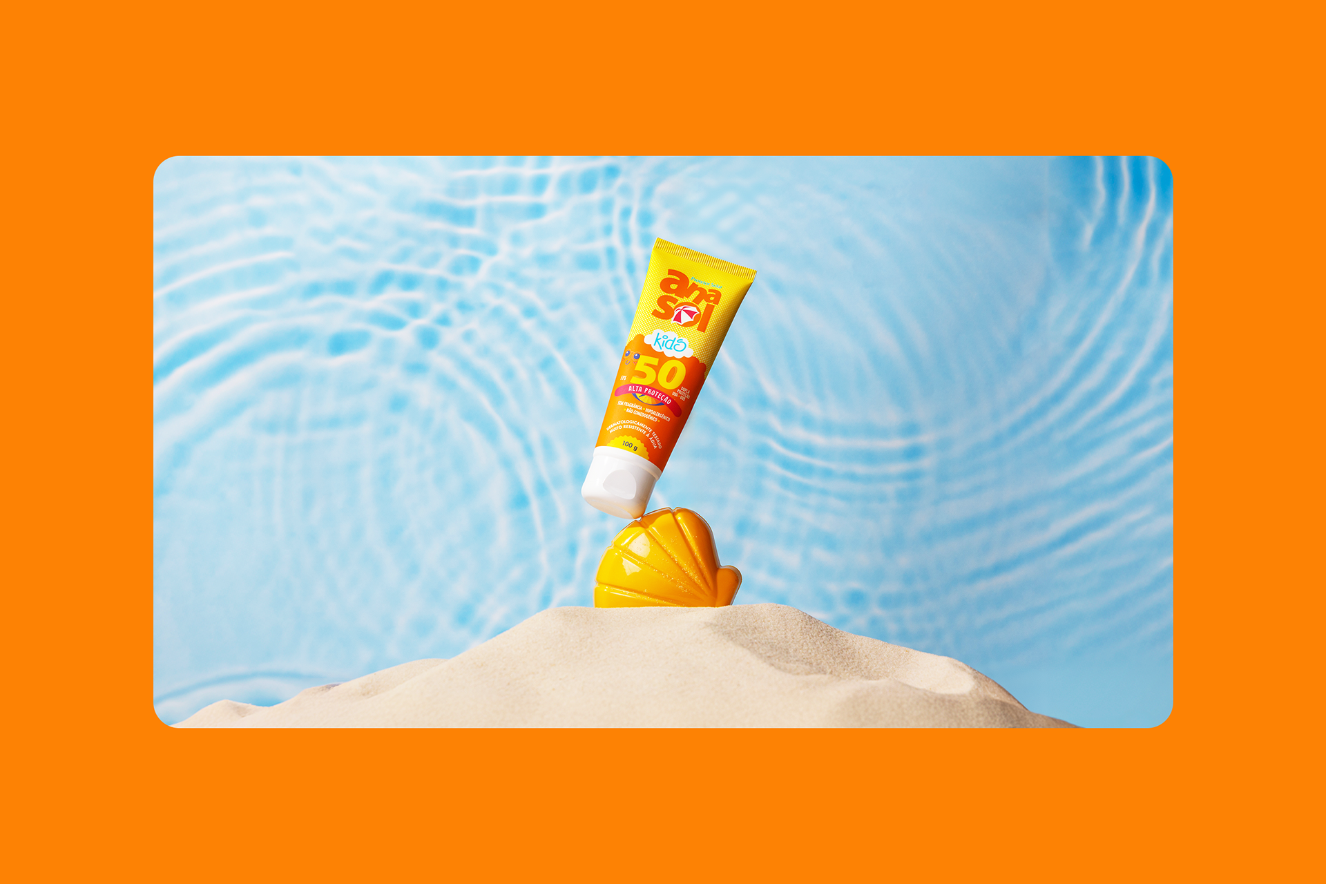
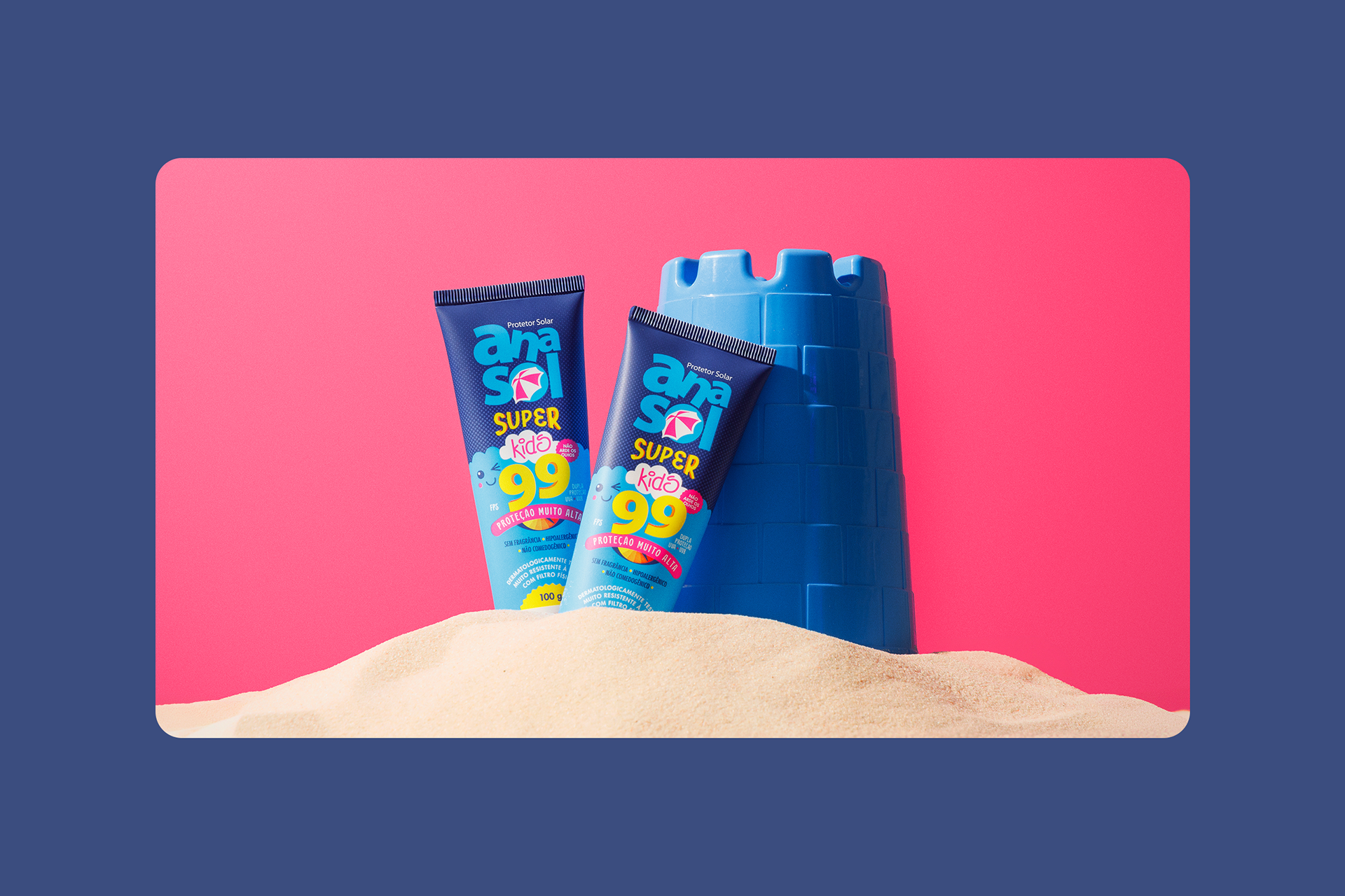
Visually, the design gained more energy and personality with the use of vibrant colors, which capture the attention of little ones and reinforce the feeling of joy and protection.
The graphic language was designed to establish an emotional connection with children, while the new hierarchy of information makes the product more practical and intuitive for parents. The application of matte varnish to the tubes increased the perception of product quality and added tactile value to the packaging, providing a richer handling experience. The result is packaging that balances form and function, with optimized visual impact, clear readability, and a refined finish.
In short, the redesign of the Anasol Kids line goes beyond an aesthetic overhaul: it represents a complete evolution in the way the brand communicates, positions itself, and delivers value. A project where design was used strategically to reduce costs, optimize processes, generate identification with the public, and strengthen the brand's purpose.
If you like this, check our Instagram for more.
DELIVERABLES
Identidade visual / Visual Identity
Embalagem / Packaging
Identidade visual / Visual Identity
Embalagem / Packaging
CREDITS
Customer service: Alex Reuter.
Customer: Dahuer / Anasol.
Approval: João Vicente e Gregory Rizotto.
Designers: Alex Reuter e Juliano Jover.
Photo: João Pedro Varela.
Plastic tube printing: C-Pack.
Customer service: Alex Reuter.
Customer: Dahuer / Anasol.
Approval: João Vicente e Gregory Rizotto.
Designers: Alex Reuter e Juliano Jover.
Photo: João Pedro Varela.
Plastic tube printing: C-Pack.