serene soul, hydrated body
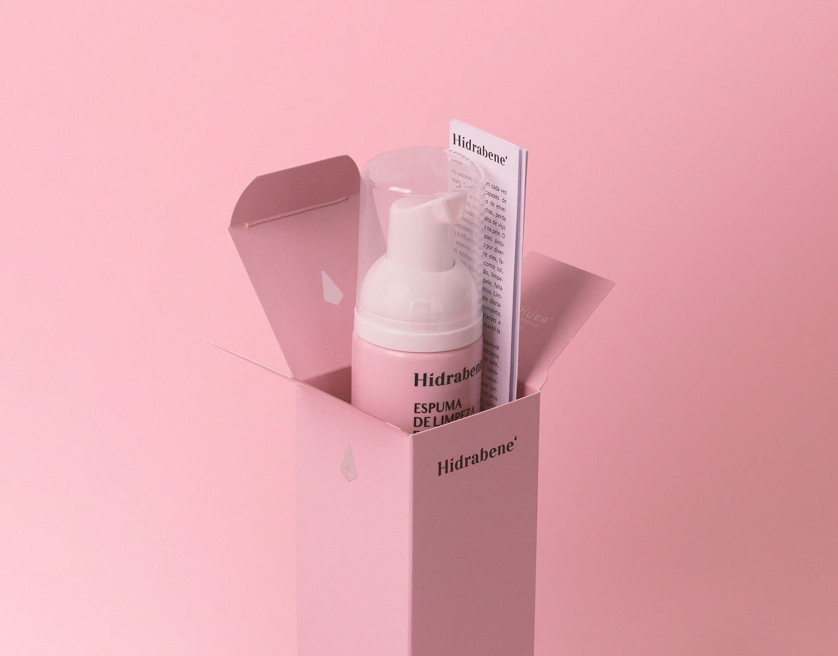
As part of the brand's universe, we were invited by Maitá Cosméticos to develop the new line of skincare products based on yerba mate, marking the company's debut in intensive treatments and which already has several SKUs launched.
To ensure visual cohesion with the brand's first launches, we maintained the typographic set of the previous products. However, we adopted a minimalist approach, with a technical, serious language and an innovative layout. The colors chosen reflect the essence of the main raw material, and the hierarchy of information was carefully structured to facilitate the consumer's understanding of the product. In this way, we created a light, fluid communication, aligned with the brand and that conveys the seriousness necessary for an intensive care line.
together since the beginning
We are immensely proud to contribute to this new chapter in the history of the brand, with which we have had such a special connection since the beginning. You can check out what we have developed together through the following link:
If you like this, check our instagram for more.
ENTREGAS
Identidade visual / Visual Identity
Embalagem / Packaging
Embalagem / Packaging
CREDITS
Atendimento: Alex Reuter.
Designers: Alex Reuter, Guilherme Rosa e Juliano Jover.
Aprovação: Leliano.
Fotografia: João Pedro Varela.
Designers: Alex Reuter, Guilherme Rosa e Juliano Jover.
Aprovação: Leliano.
Fotografia: João Pedro Varela.


