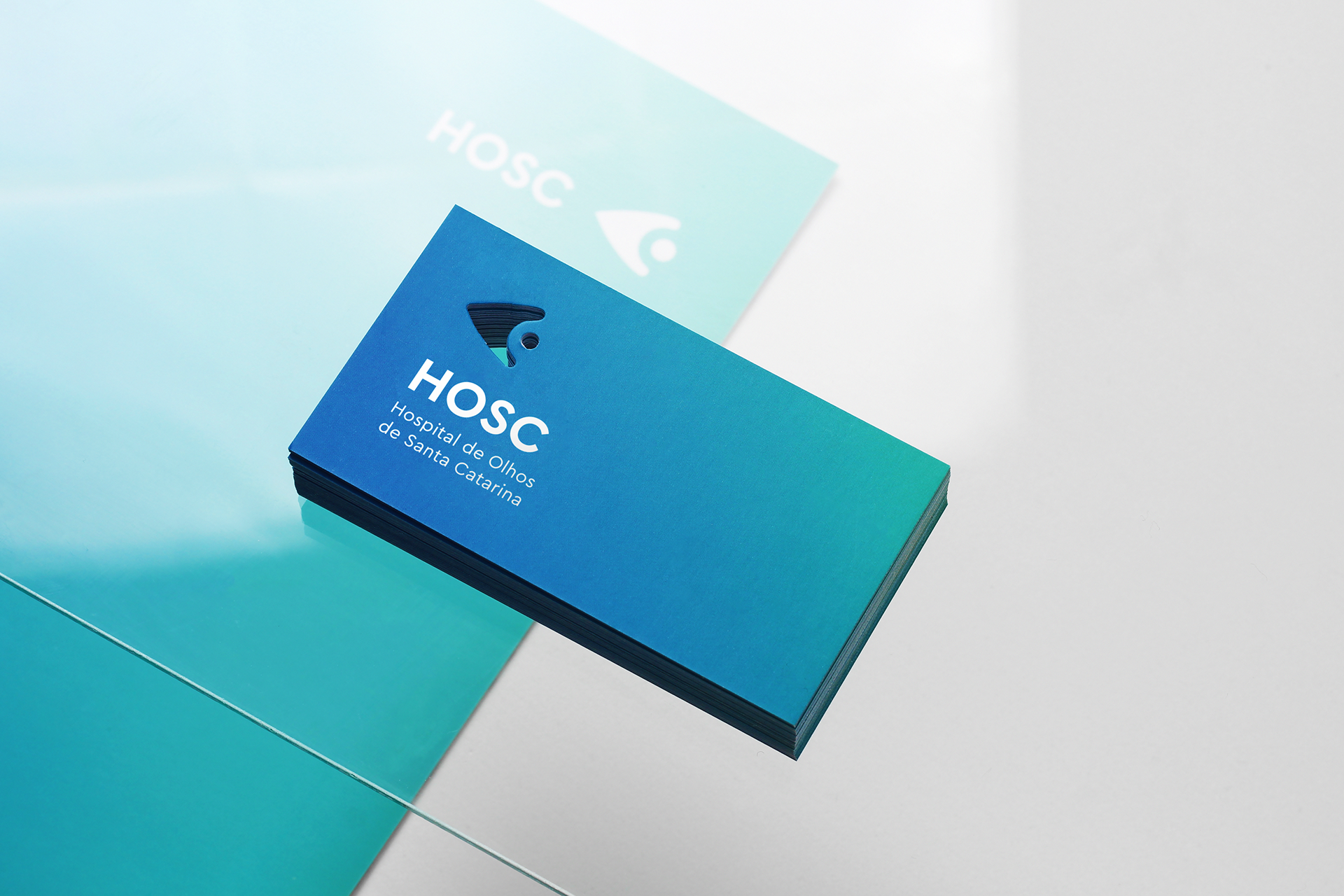
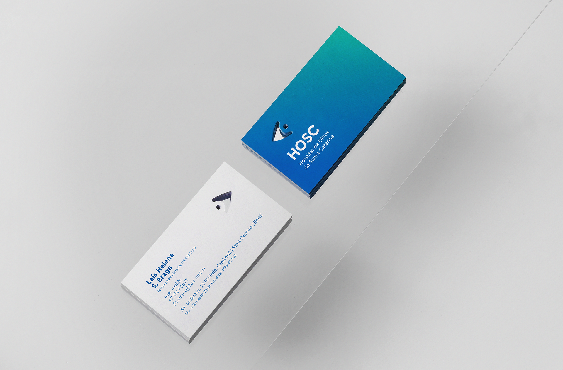
Hospital de Olhos de Santa Catarina
We were invited to redesign the brand and identity of the HOSC - Hospital de Olhos de Santa Catarina (Santa Catarina Eye Hospital). One of the most prestigious and recognized hospitals in the south region of Brazil. The new brand is part of the celebration of HOSC's 20 year anniversary and represents a stage of both internal and external changes that reaffirm their evolution.


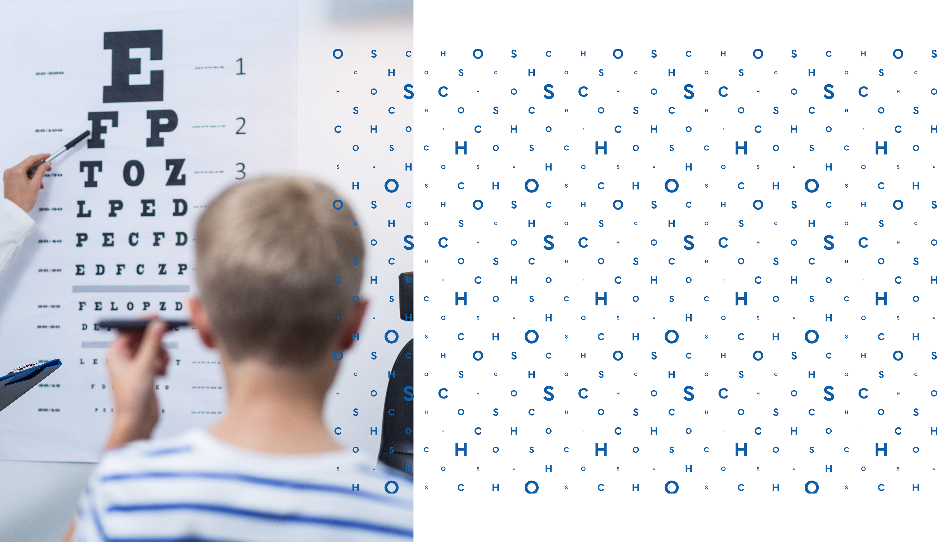
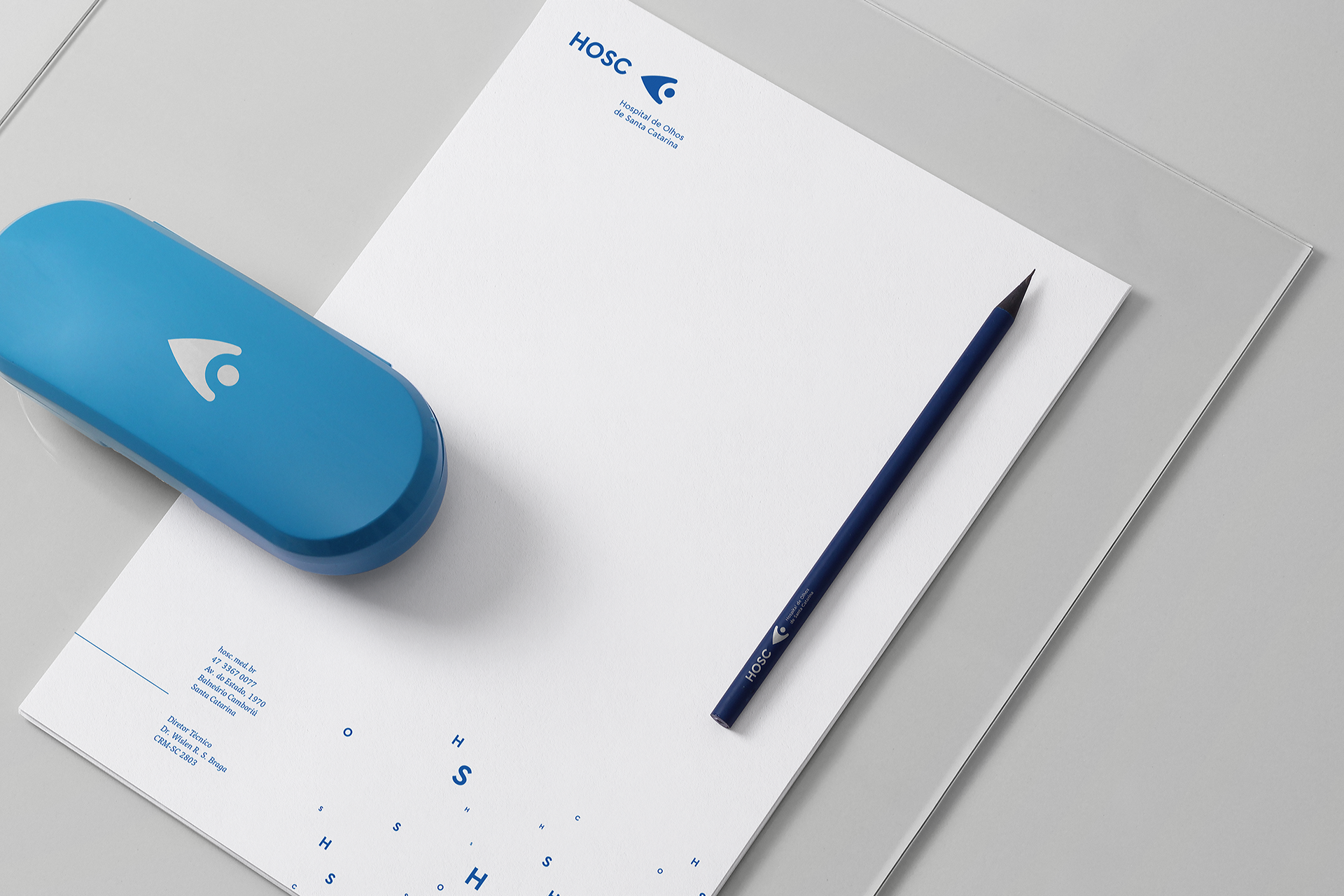
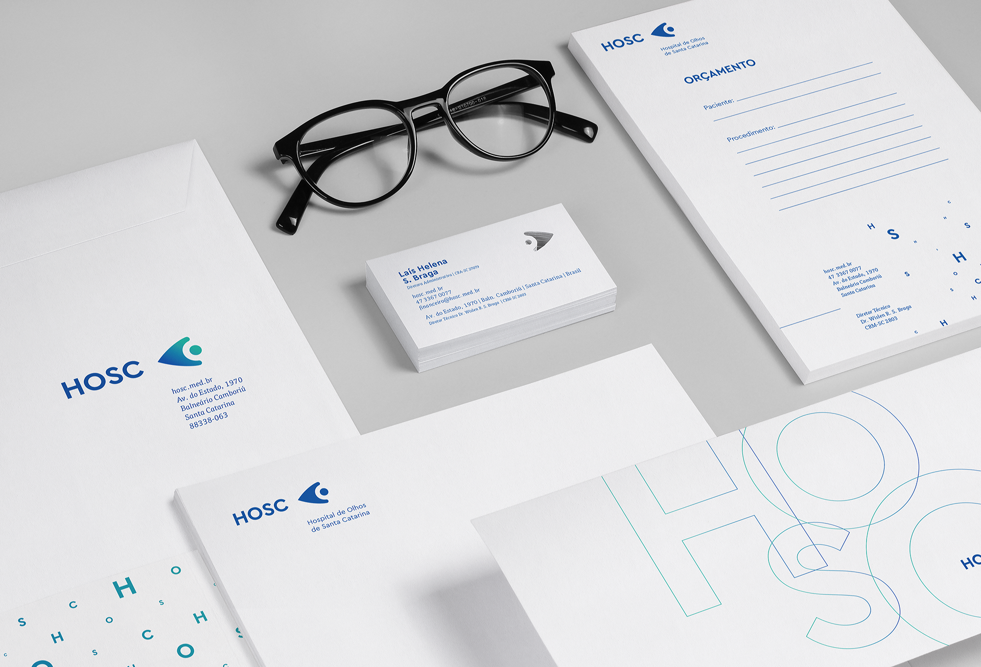
One of the objectives of the new brand design was making it friendlier, bringing HOSC closer to their public while transmitting the hospital's core values.

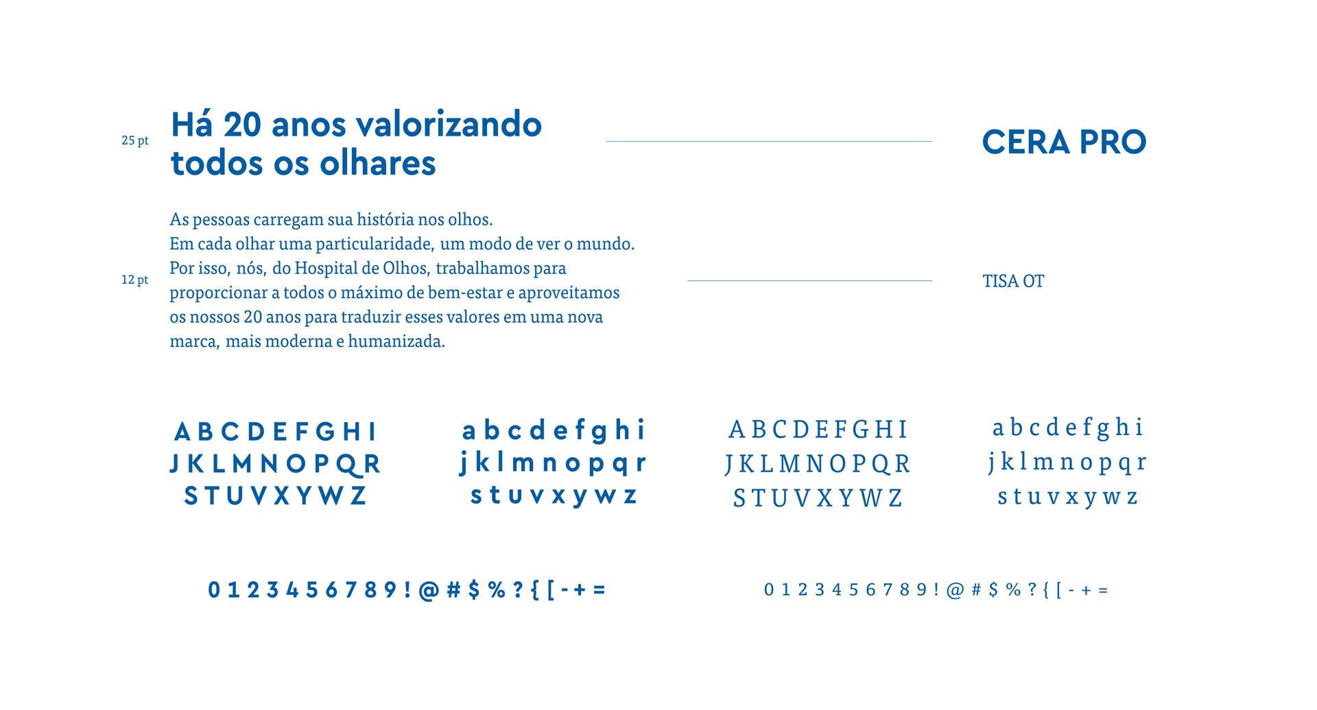
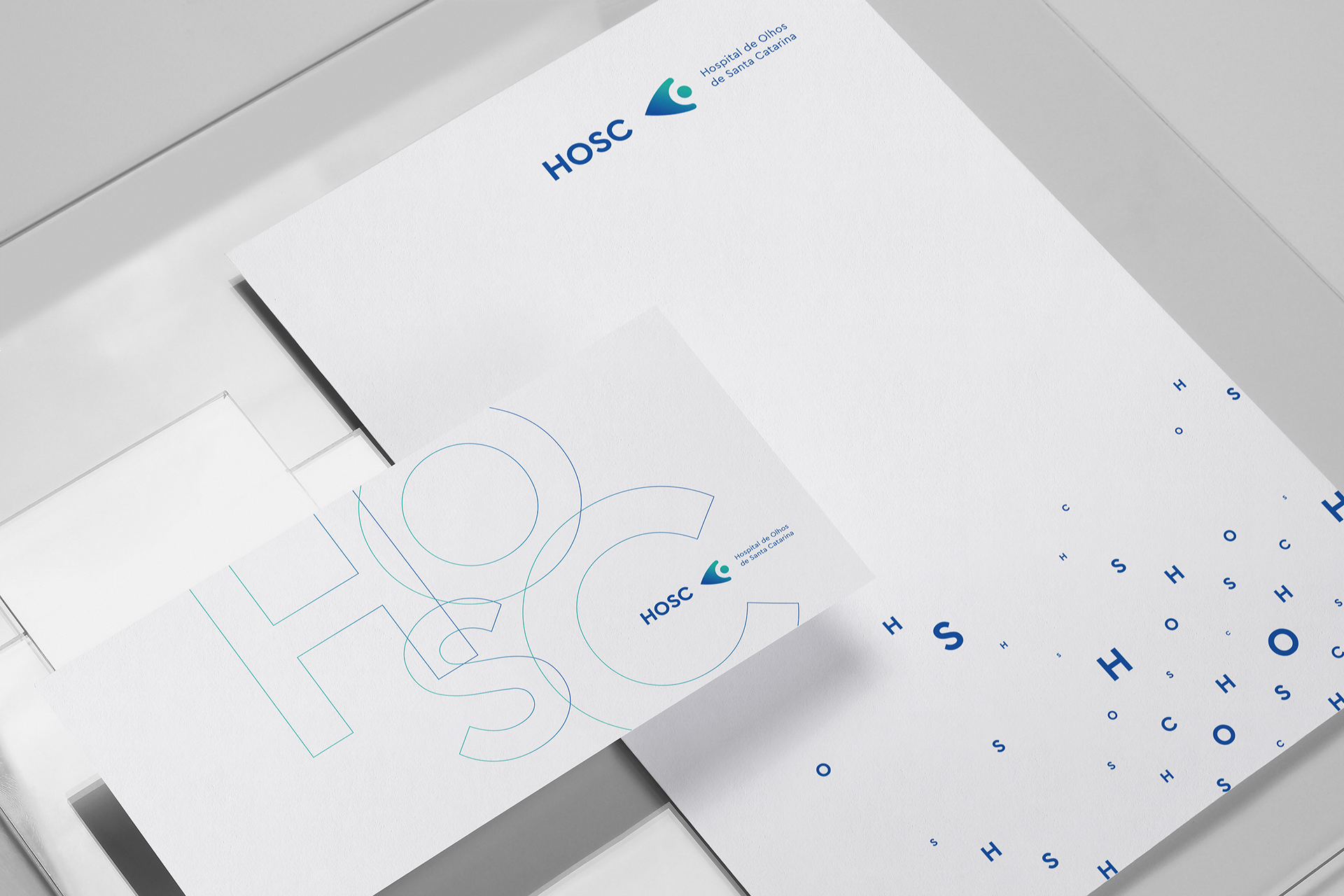
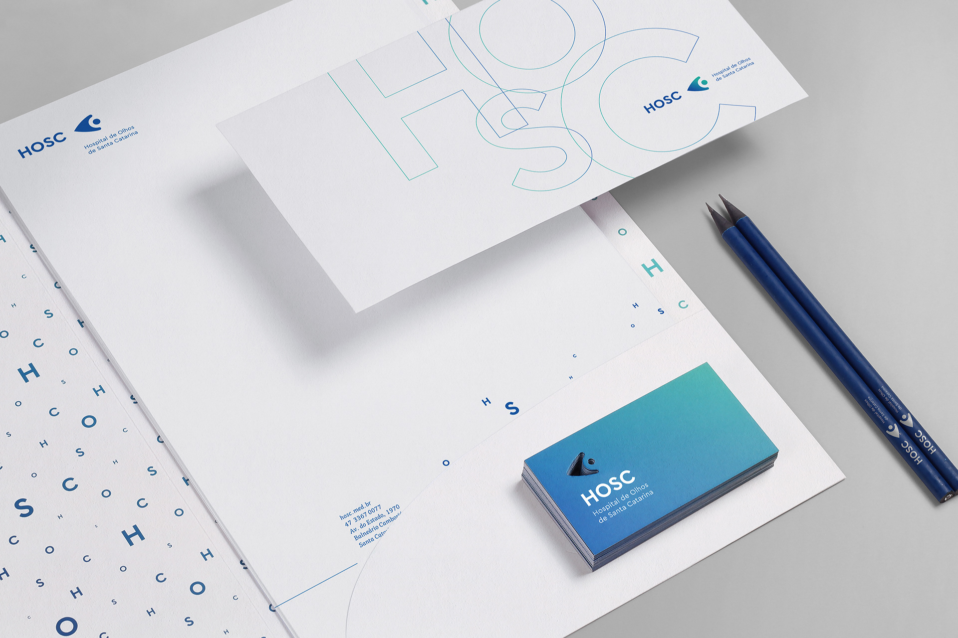
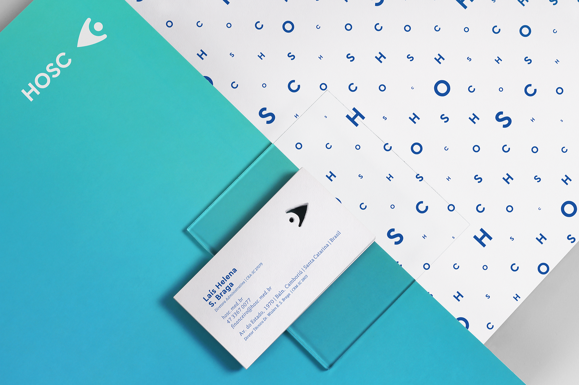
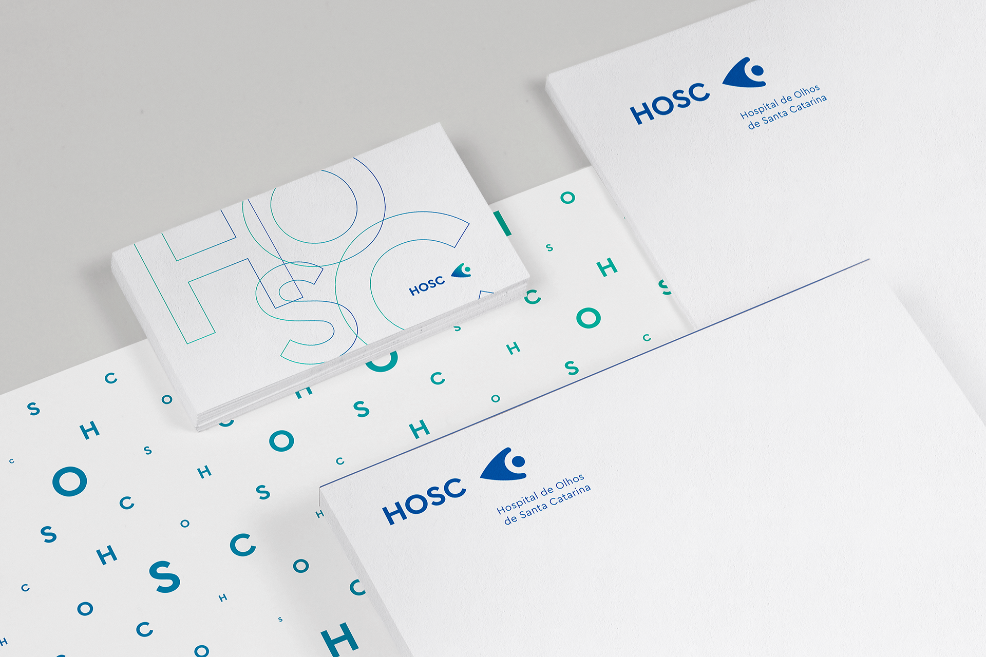
During the process of development of the new symbol we prioritized simpler lines, looking for clarity and easy comprehension while maintaining aspects of classic graphic representation.

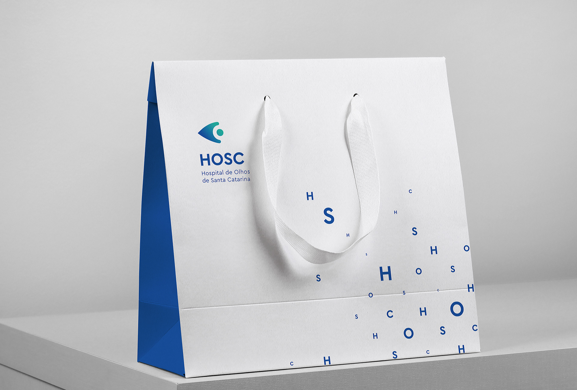
As a means of making the name shorter and easier to read and pronounce, we suggested an abbreviation made by their initials. (Hospital de Olhos de Santa Catarina - HOSC), thus creating a friendlier way for the public to relate to the hospital.

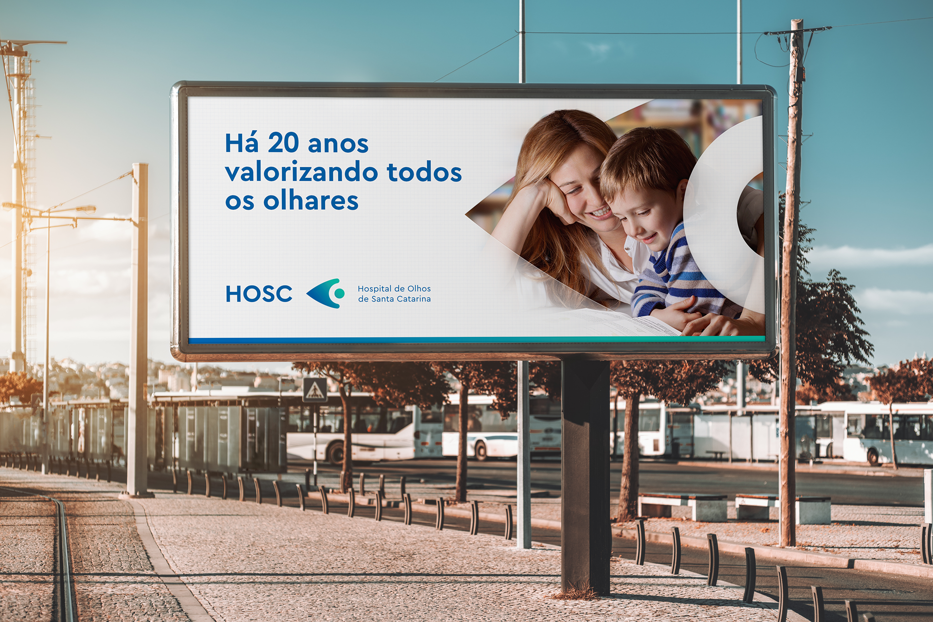
In addition to the brand, a multimedia campaign was launched, commemorative of the hospital’s 20 year anniversary and focused in one of HOSC's pillars, which is caring for all people, not just their patients. The video was produced by IVA films.


Older version:

If you like this, check our instagram for more.
COMMITTAL
_Redesign
_Logo
_Symbol
_Visual identity
_Campaign
_Redesign
_Logo
_Symbol
_Visual identity
_Campaign
CREDITS
Customer service: Alex Reuter.
Graphic designers: Alex Reuter, Guilherme Rosa e Juliano Jover.
Copy: Pamela Moreira Fonseca.
Print: MarauGraf.
Video: IVA Filmes.
Translator: Dihego Kowalski.