when care becomes identity
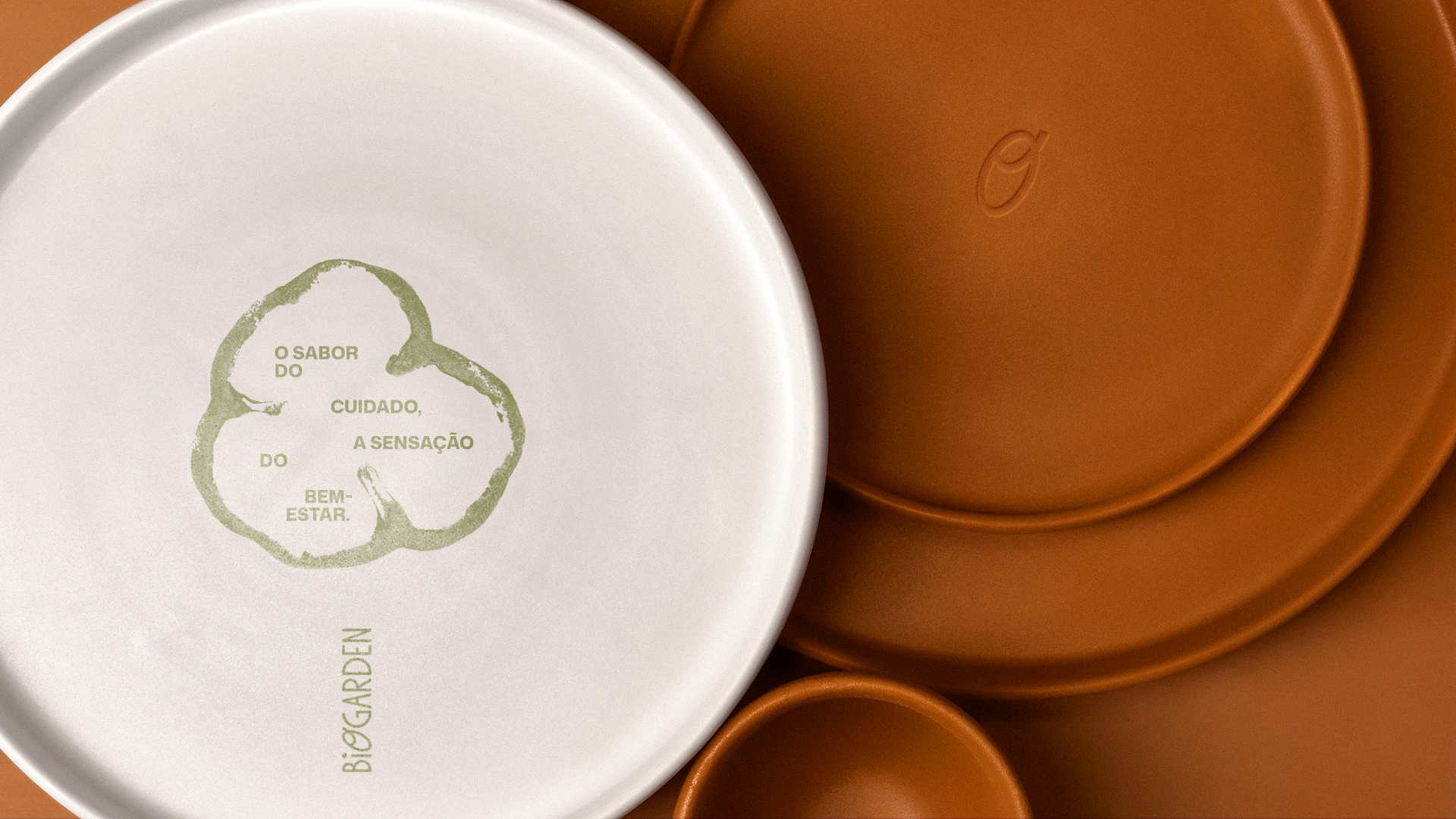
Biogarden was conceived as a brand that values the relationship between food,
well-being, and the simple experiences of everyday life. The visual identity project
was designed to translate this idea into a welcoming and contemporary graphic language, capable of reflecting the natural character of the kitchen and the brand’s closeness to its audience. From this direction, a visual system was developed to communicate authenticity, freshness, and a light atmosphere across all brand touchpoints.
where care becomes flavor
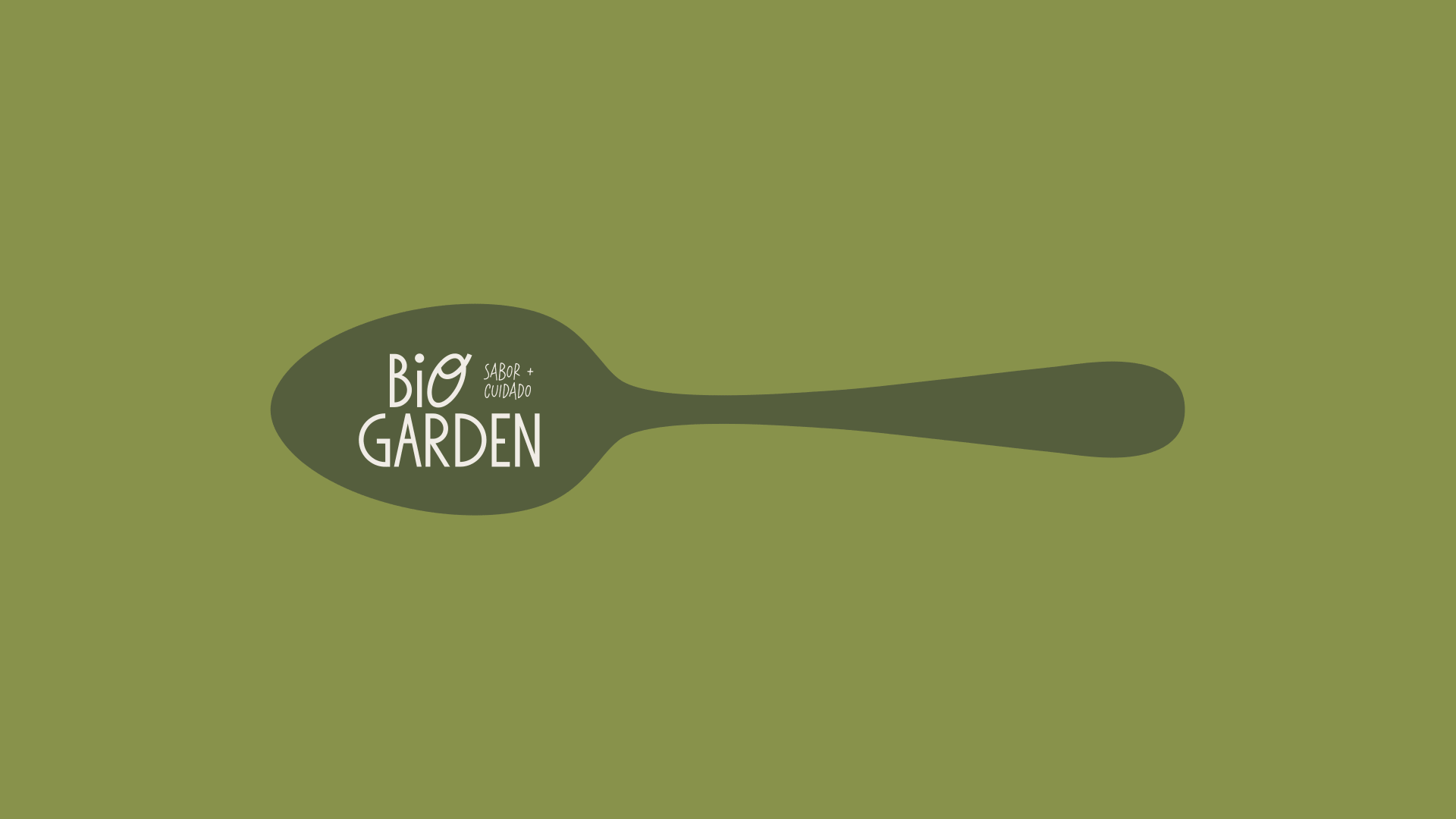
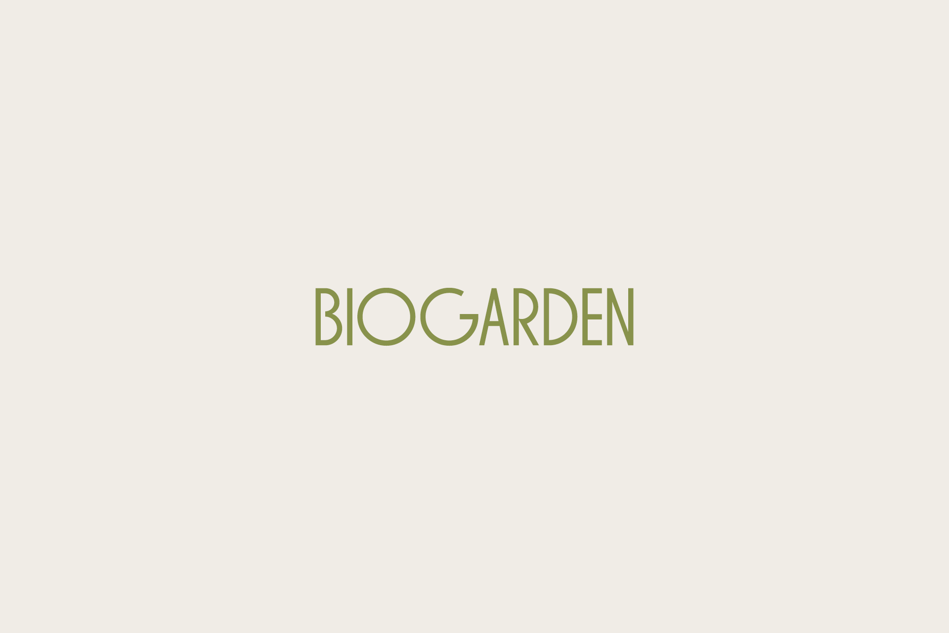
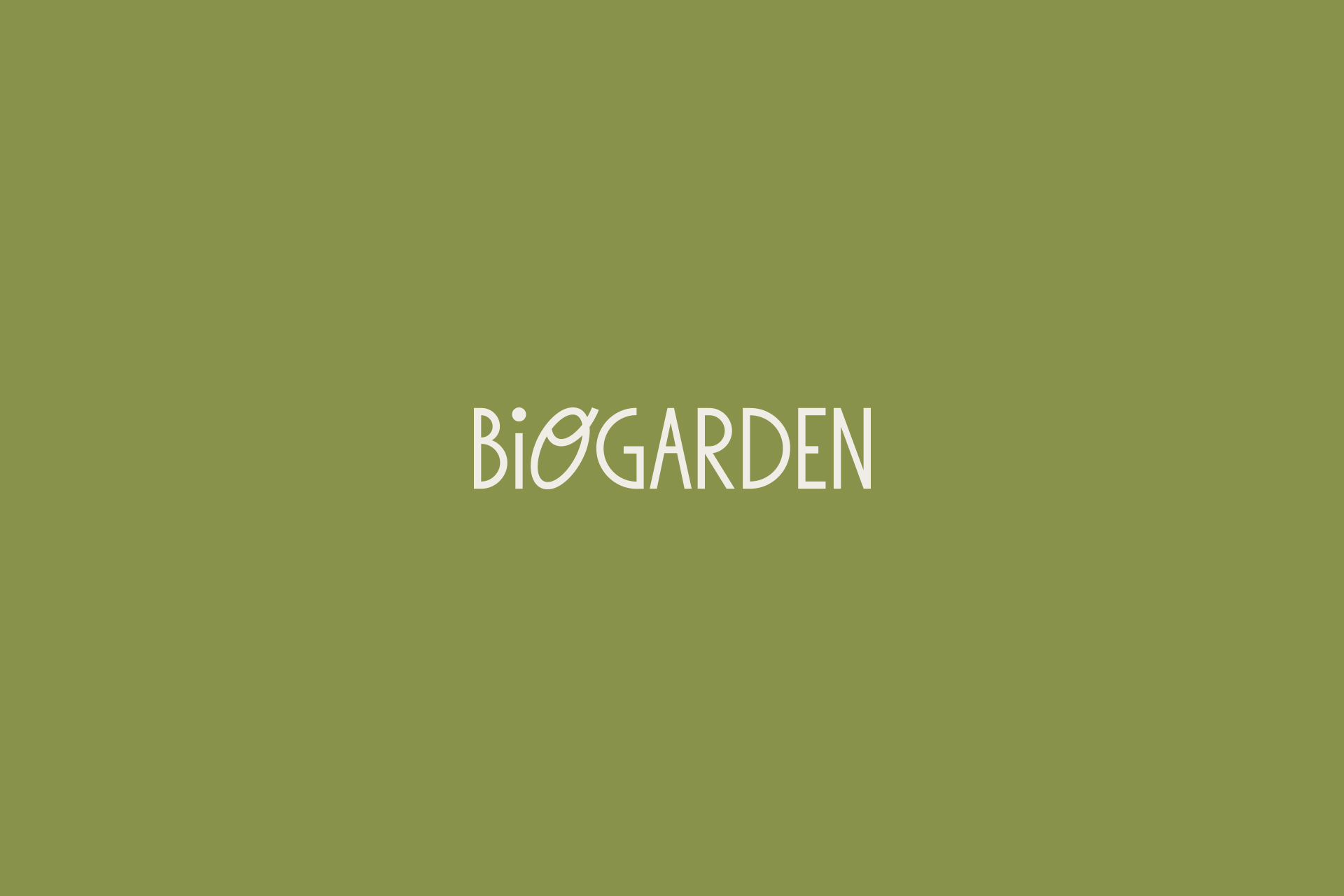
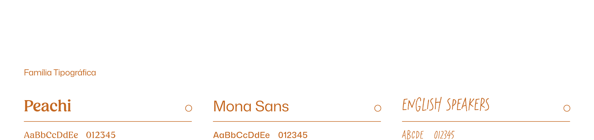
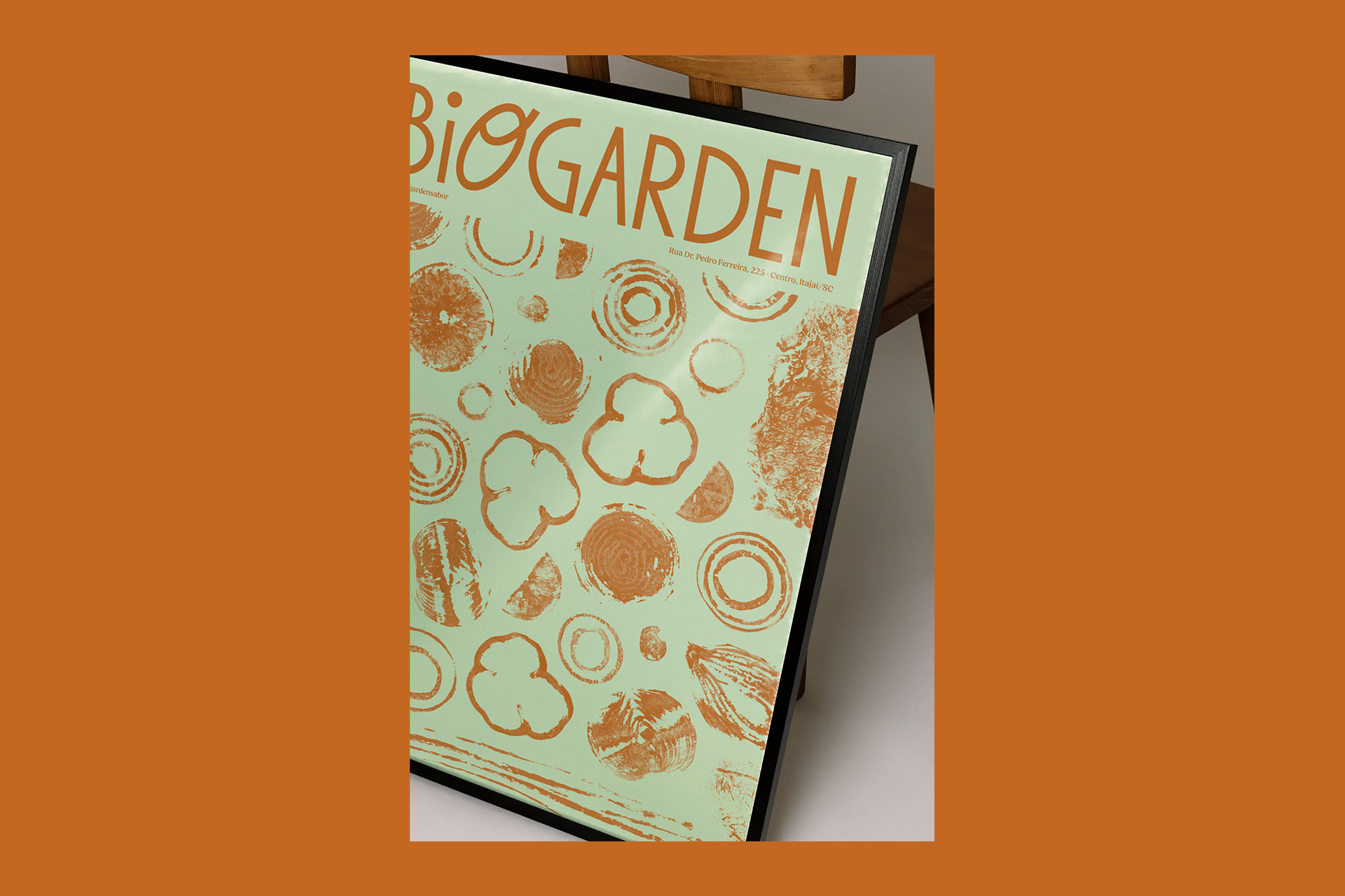
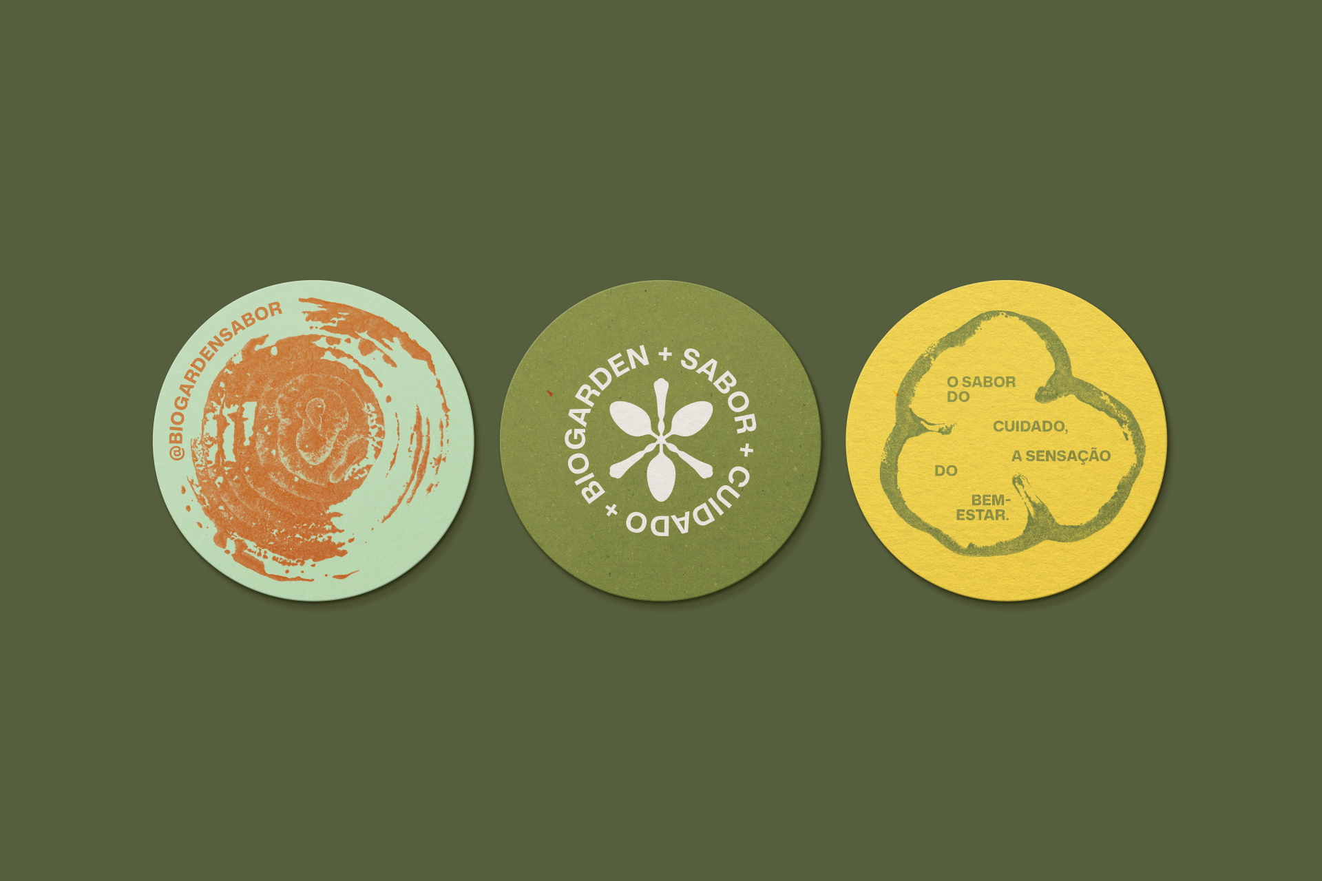
As a typographic logo, the proposal was to bring personality, lightness, and an organic touch through the design of the letterforms. Especially the letter “O,” which becomes
a point of expression within the brand. Soft and friendly strokes help build a visual identity that feels close, welcoming, and subtly playful, reflecting Biogarden’s tone
of voice.
a point of expression within the brand. Soft and friendly strokes help build a visual identity that feels close, welcoming, and subtly playful, reflecting Biogarden’s tone
of voice.
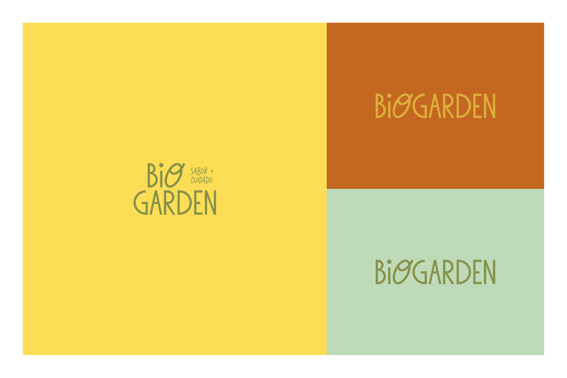
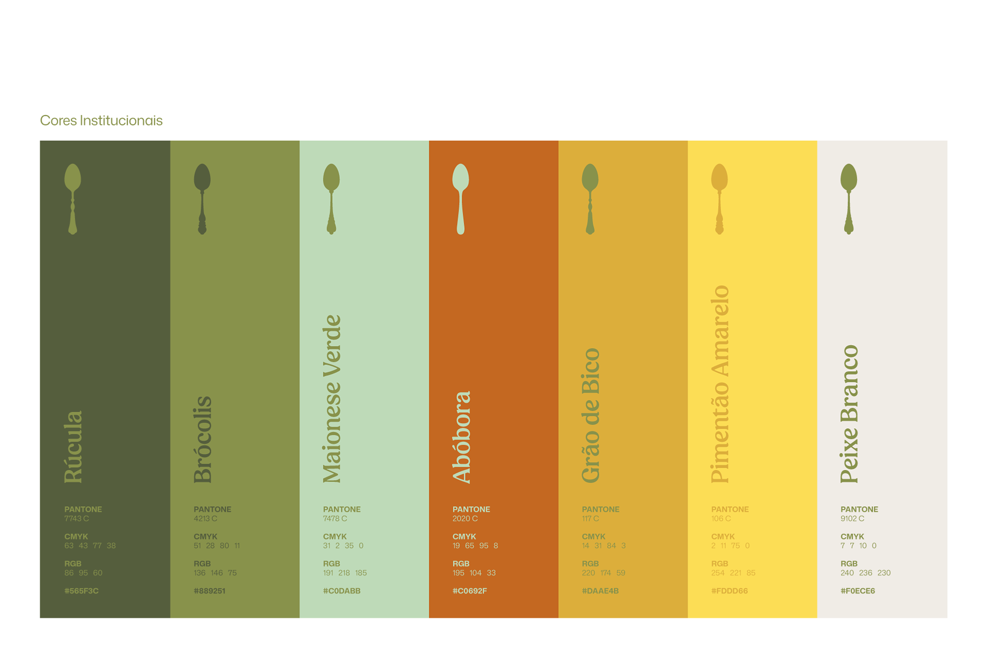
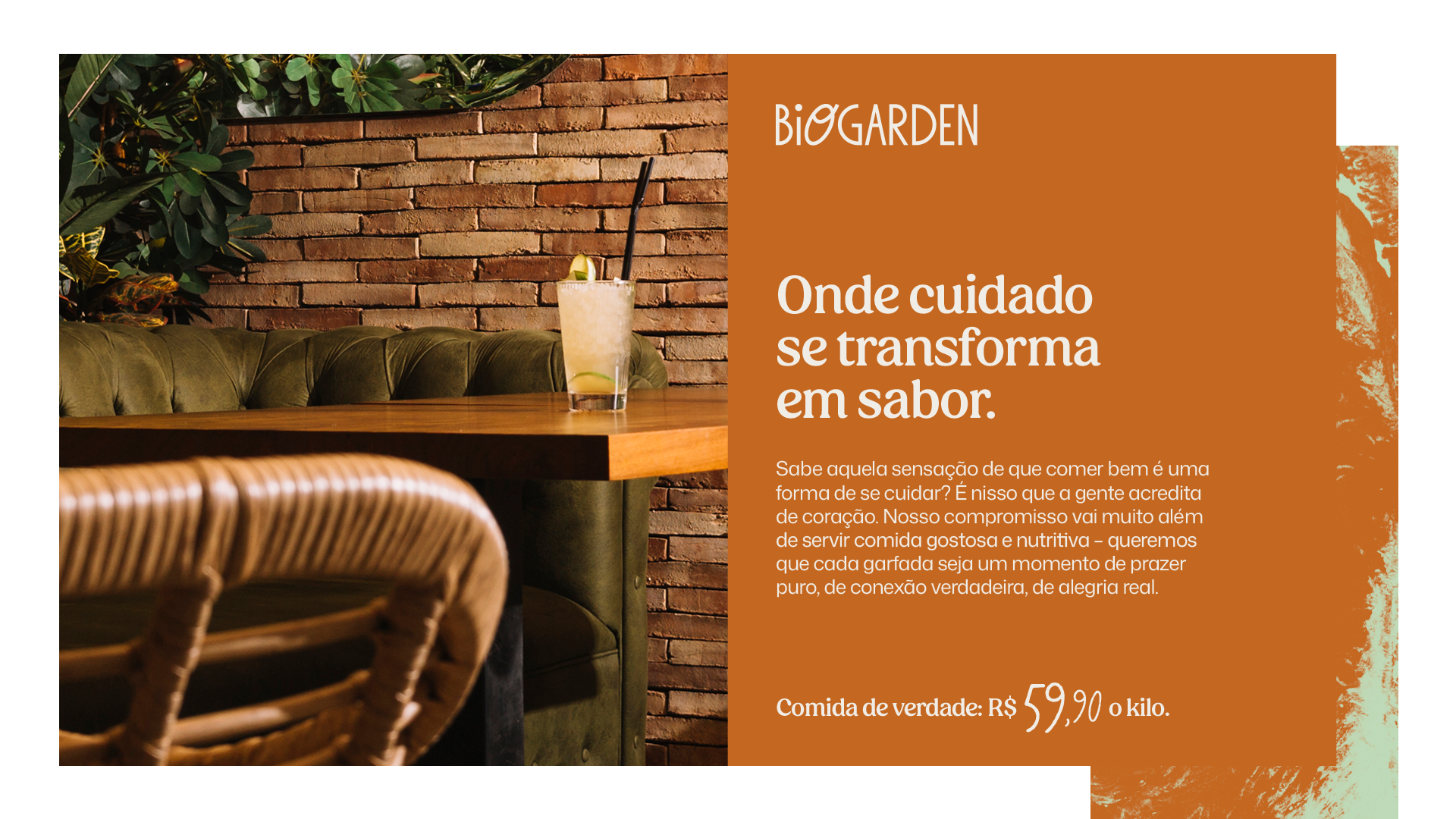
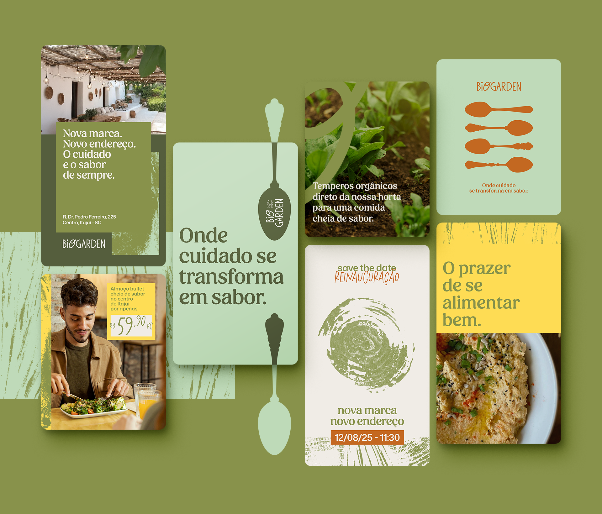
This typographic language is combined with a color palette inspired by the world of natural cooking. Shades that evoke fresh ingredients, vegetables, and nutritious foods help communicate freshness, naturalness, and vitality, reinforcing the idea of balanced and flavorful eating. From these elements, a flexible and coherent visual system was developed. One capable of adapting to different brand touchpoints without losing its personality. The combination of typography, colors, and graphic elements creates
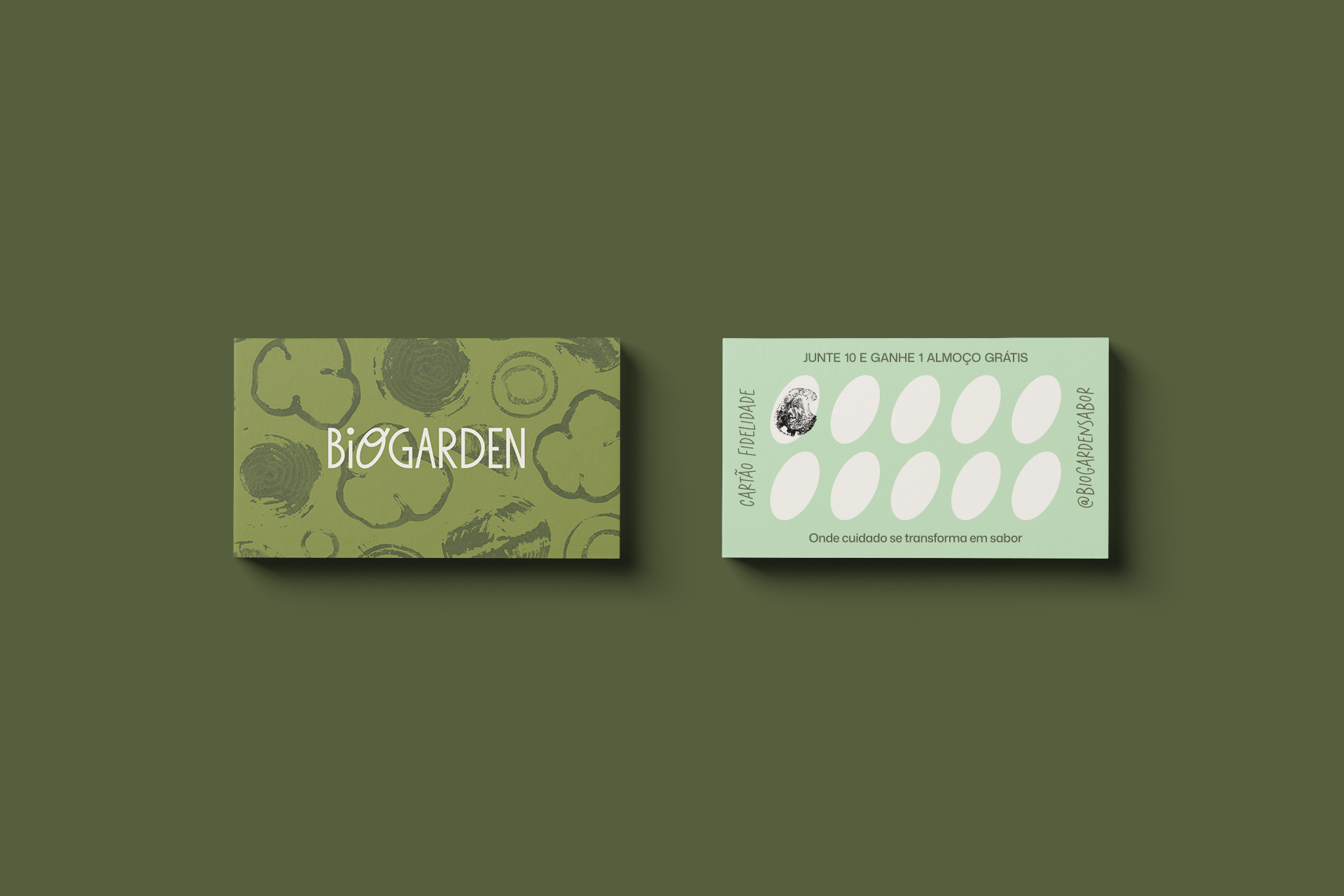
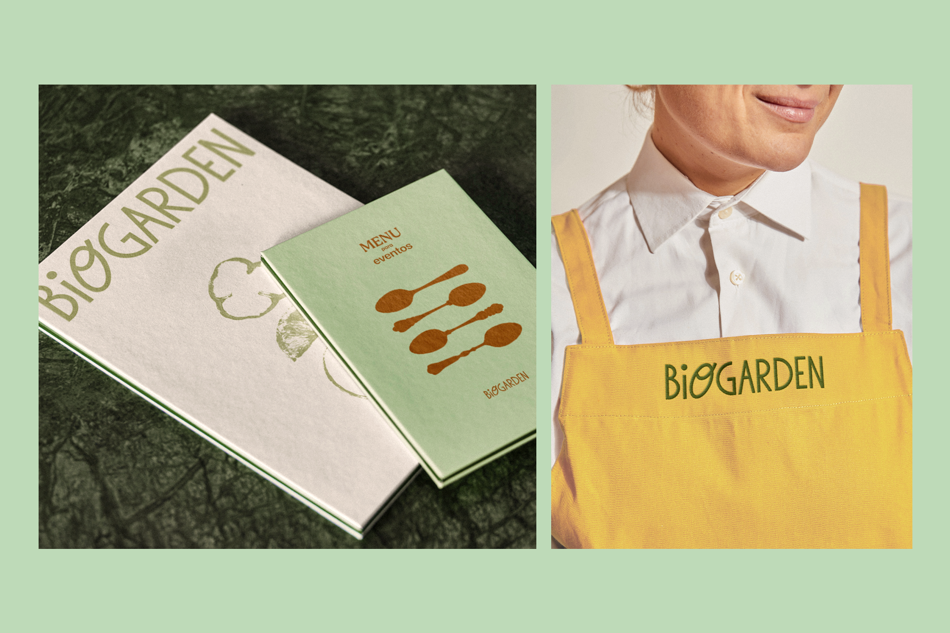
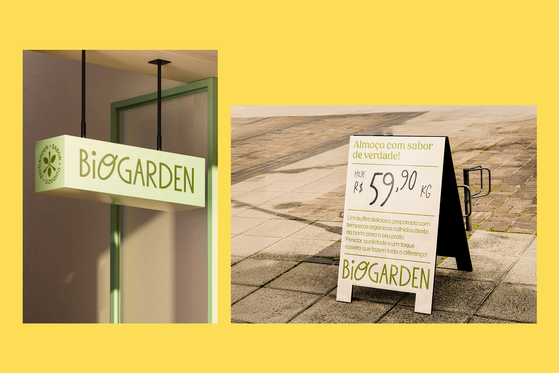
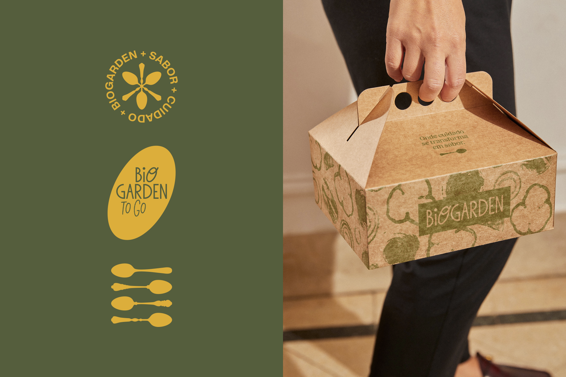
a contemporary, light, and easily recognizable identity. Applied across packaging, signage, communication materials, and environments, the identity builds a consistent visual system that balances simplicity, freshness, and personality.
a contemporary, light, and easily recognizable identity. Applied across packaging, signage, communication materials, and environments, the identity builds a consistent visual system that balances simplicity, freshness, and personality.
Each application reinforces the same idea: a place where quality ingredients,
care in preparation, and genuine flavor come together.
care in preparation, and genuine flavor come together.
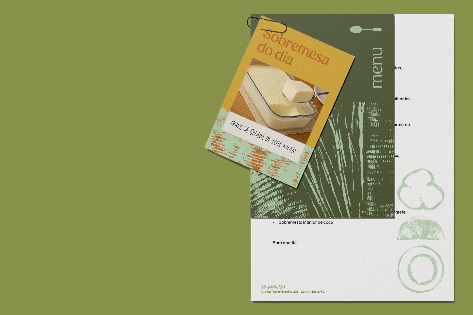
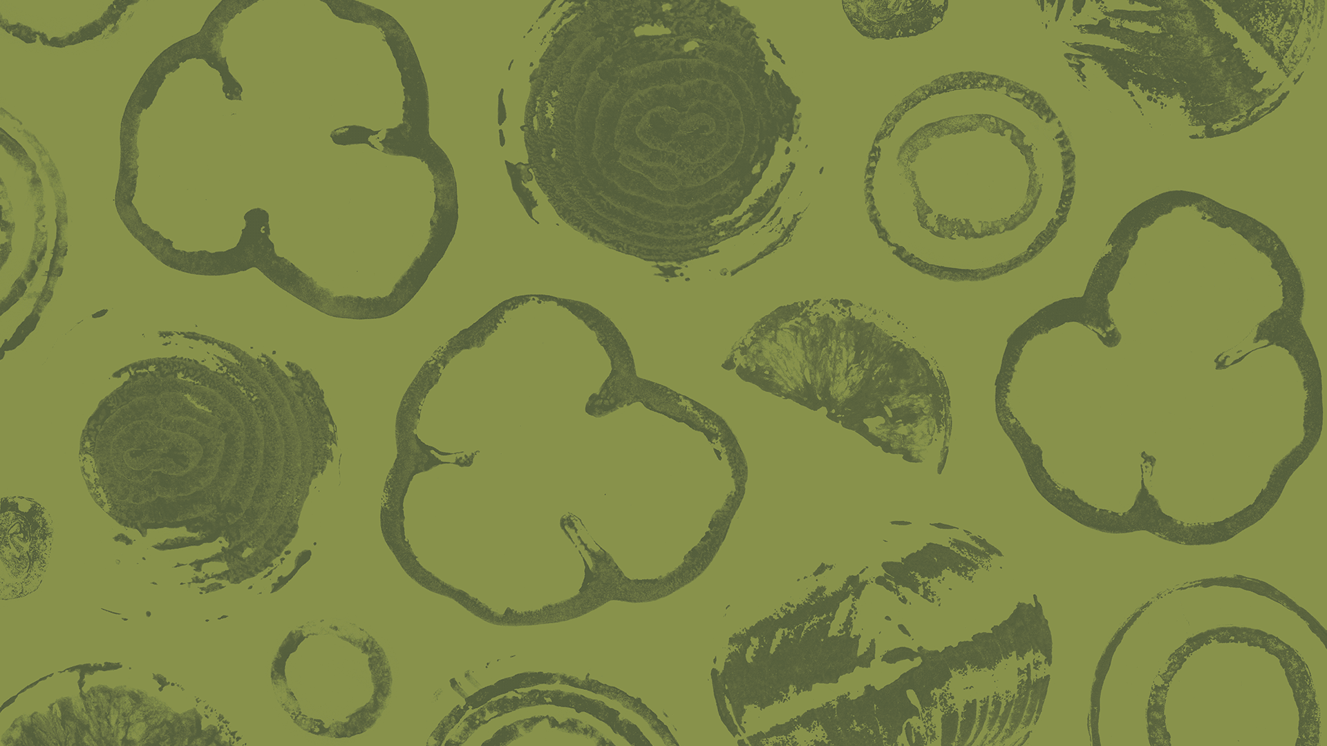
comida de verdade = texturas reais
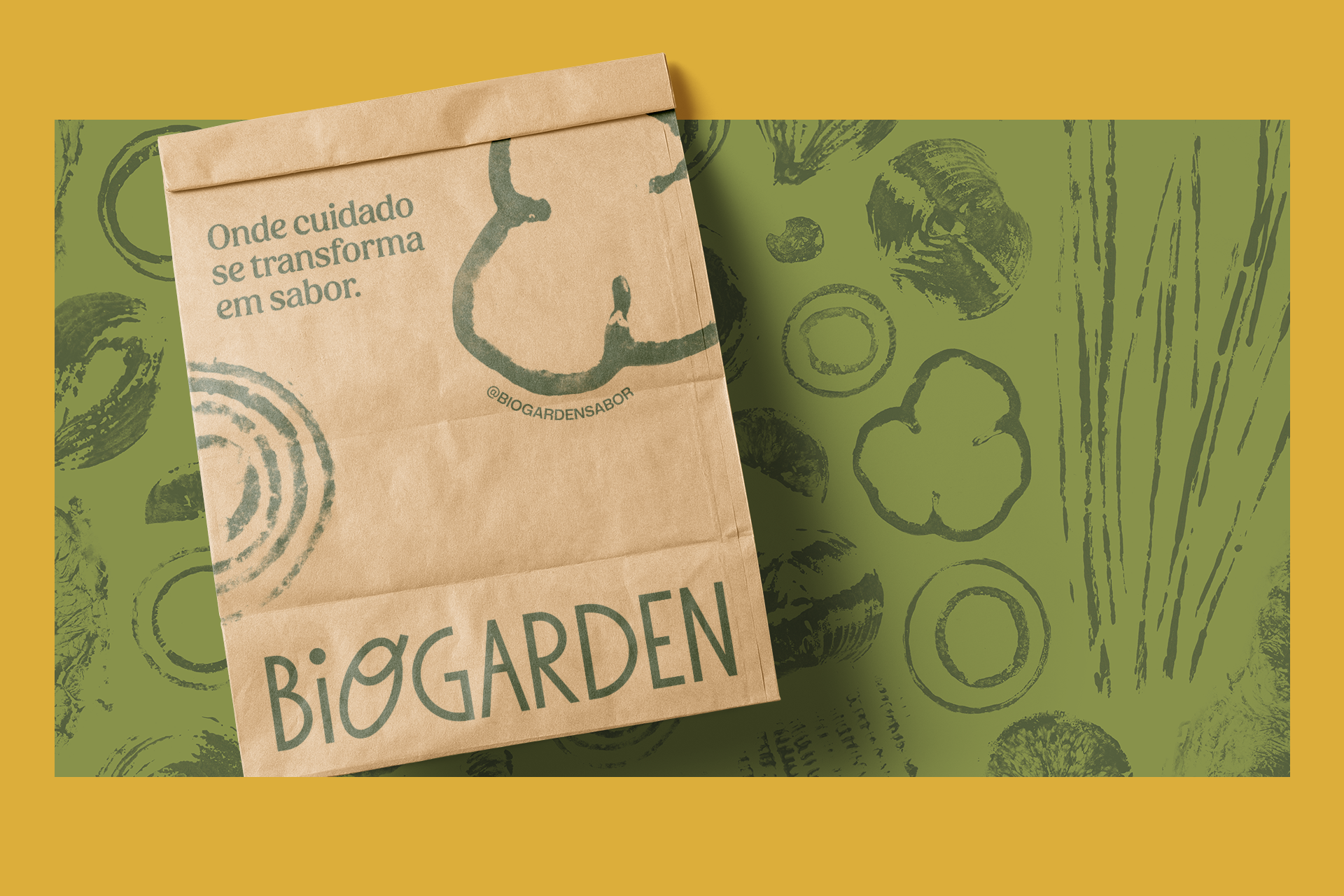
One of the central aspects of the project is the development of proprietary textures created from real kitchen elements. Vegetables and ingredients were used as natural stamps, producing organic and unpredictable marks. These impressions were later digitized and transformed into exclusive graphic patterns.
The result is a set of textures that carry gesture, materiality, and authenticity, creating a visual identity that moves away from generic graphics and brings the brand closer to the sensory universe of food.
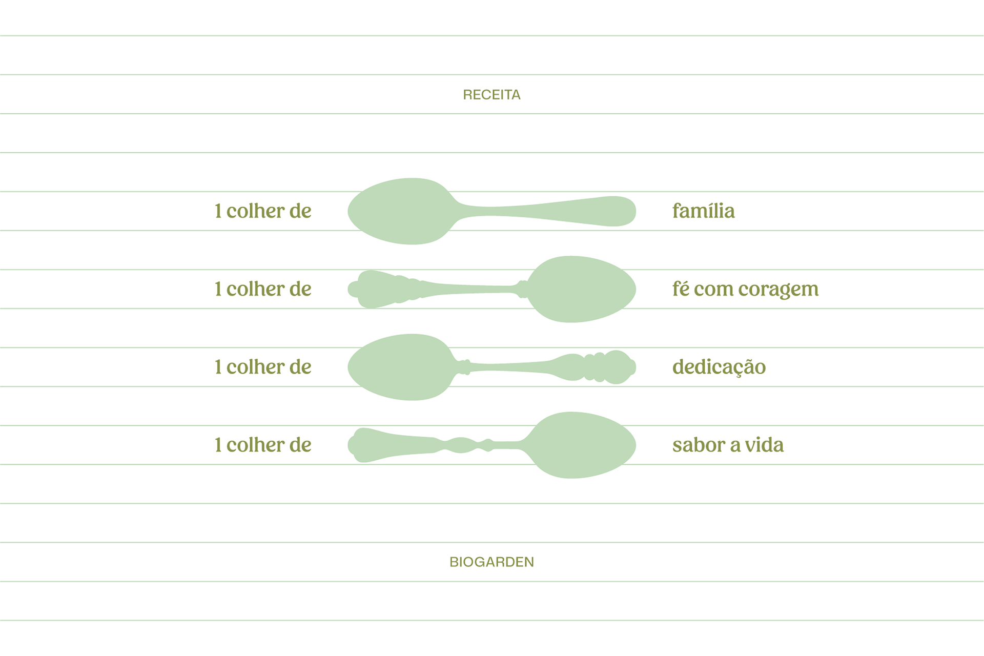
biogarden manifesto
You know that feeling that eating well is a way of taking care of yourself?
That’s what we truly believe in.
That’s what we truly believe in.
Our commitment goes far beyond serving delicious and nutritious food.
We want every bite to be a moment of pure pleasure, genuine connection,
and real joy.
We want every bite to be a moment of pure pleasure, genuine connection,
and real joy.
Hi! I’m Gabi. And I want you to know: here, you are not just another customer.
You are part of a special community that understands that, even in the rush of everyday life, taking care of yourself is one of the greatest gifts we can give ourselves.
You are part of a special community that understands that, even in the rush of everyday life, taking care of yourself is one of the greatest gifts we can give ourselves.
Every ingredient on our menu has a story. It was chosen with care and dedication, with the intention of offering the very best in every dish. We strive to be a place where you feel comfortable. A place where health blends with joy and simplicity.
We want that, when you sit at our table, you feel good from the inside out, a pleasant feeling that will stay with you for the rest of the day. For us, what truly matters is you. Your moment. Your story.
We are here with open arms, creating together a little space where
you will always feel at home.
We are here with open arms, creating together a little space where
you will always feel at home.
Biogarden.
Where care turns into flavor.
Where care turns into flavor.
DELIVERABLES
Identidade visual / Visual Identity
Redesign / Redesenho
Logo / Logo
Identidade visual / Visual Identity
Redesign / Redesenho
Logo / Logo
CREDITS
Atendimento: Alex Reuter.
Designers: Juliano Jover e Alex Reuter.
Aprovação: Gabriella Aragão.
Atendimento: Alex Reuter.
Designers: Juliano Jover e Alex Reuter.
Aprovação: Gabriella Aragão.