

![[:pt]MrCream_flag-2[:]](https://feitorialab.com/wp-content/uploads/2022/06/MrCream_flag-2.gif)
MR CREAM
Mr. Cream was created based on a childhood dream of its founder, Beto: to revive sweet memories and great childhood moments that he had while eating ice cream.
While living in Montevideo his family used to spend long afternoons sharing moments in the city’s ice cream parlors. These memories have always been present in his life and helped him grow his passion for ice cream.
After spending some time in the United States he returned to Brazil, focused on making this old dream come true. He wanted to bring back and share this feeling of childhood nostalgia with a truly 100% handmade ice cream.
![[:pt]tela_painel[:]](https://feitorialab.com/wp-content/uploads/2022/06/tela_painel-1280x720.png)
![[:pt]MrCream-Portfolio_resto-01[:]](https://feitorialab.com/wp-content/uploads/2022/06/MrCream-Portfolio_resto-01-1280x720.png)
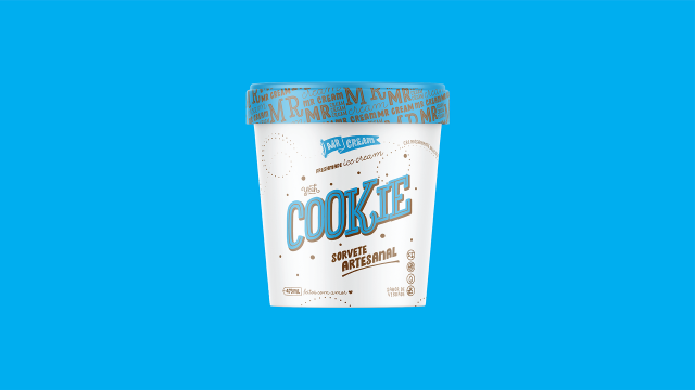
For the creation of the brand and visual identity we used the american traditional concept – a request from the client – with informal and easygoing language that looks to set us apart in the marketplace.
The isologue, a flag, is an element that is often present in American Culture and also transmits the idea of a personal achievement on the personal journey of the businessman.
In order to bring the customer into proximity with the company, we chose a typographic family that is unceremonious and complete.
![[:pt]MrCream-Portfolio-04[:]](https://feitorialab.com/wp-content/uploads/2022/06/MrCream-Portfolio-04-1280x720.png)
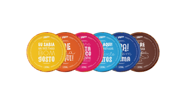
With the knowledge of the fact that the packaging is the first contact point with the consumer, we created calls to action, that aim to tease the consumer in the supermarket aisle, creating sensations and making him emotionally invested at the moment of choice and at the moment of consumption.
![[:pt]MrCream-Portfolio_resto-02[:]](https://feitorialab.com/wp-content/uploads/2022/06/MrCream-Portfolio_resto-02-1280x433.png)
![[:pt]tampas_animadas_1920x1080px[:]](https://feitorialab.com/wp-content/uploads/2022/06/tampas_animadas_1920x1080px.gif)
After researching the local market, we realised that, when working a niche that is so competitive, clarity of information becomes paramount, there cannot be any doubts about what the consumer is purchasing. So we aimed to present everything in a direct and straightforward manner.
![[:pt]MrCream-Portfolio-05[:]](https://feitorialab.com/wp-content/uploads/2022/06/MrCream-Portfolio-05-1280x720.png)
![[:pt]MrCream-Portfolio_resto-05[:]](https://feitorialab.com/wp-content/uploads/2022/06/MrCream-Portfolio_resto-05-1280x720.png)
![[:pt]MrCream-Portfolio-27b[:]](https://feitorialab.com/wp-content/uploads/2022/06/MrCream-Portfolio-27b-1280x720.png)
![[:pt]MrCream-Portfolio-20[:]](https://feitorialab.com/wp-content/uploads/2022/06/MrCream-Portfolio-20-1280x457.png)
![[:pt]MrCream-Portfolio-17[:]](https://feitorialab.com/wp-content/uploads/2022/06/MrCream-Portfolio-17-1280x720.png)
![[:pt]MrCream-Portfolio-14[:]](https://feitorialab.com/wp-content/uploads/2022/06/MrCream-Portfolio-14-1280x720.png)
![[:pt]MrCream-Portfolio-26b[:]](https://feitorialab.com/wp-content/uploads/2022/06/MrCream-Portfolio-26b-1280x720.png)
![[:pt]MrCream-Portfolio-16[:]](https://feitorialab.com/wp-content/uploads/2022/06/MrCream-Portfolio-16-1280x720.png)
![[:pt]MrCream-Portfolio-31[:]](https://feitorialab.com/wp-content/uploads/2022/06/MrCream-Portfolio-31-1280x720.png)
Credits
Designers: Alex Reuter, Guilherme Rosa e Juliano Jover.
Translator: Dihego Kowalski.
![[:pt]menu[:]](https://feitorialab.com/wp-content/uploads/2021/09/menu.png)