COMMITTAL
→ Visual identity
→ Packaging
→ Photography
HIDRABENE ESMALTES
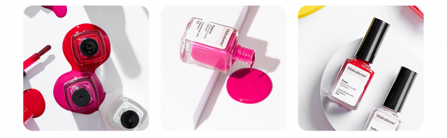
Seeking new markets, Hidrabene enters the nail polish segment and gives us the challenge of designing packaging in an environment with so many competitors and practically no space for design on its bottles.
Betting on classic colors and nomenclatures based on Italian cities, we used a sober language, with a mix of typography to give the necessary touch of refinement, without leaving aside the visual language of the brand, which is predominantly pink. As the main visual element, we designed a drop derived from the movement of the nail polish itself and easily seen as soon as the product is used.
We seek differentiation using printed labels and objective communication containing only possible information for the best decision-making of the end consumer.
A classic read for products that cannot go unnoticed at the point of sale.


CREDITS
Customer Service: Alex Reuter.
Designers: Alex Reuter, Guilherme Rosa e Juliano Jover.
Photography: Jordy Ribeiro.